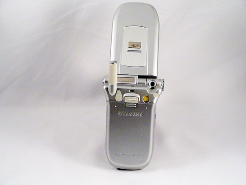
I believe that this phone shows Samsung's first early efforts to break away from making generic phones that sold primarily on price to try and introduce some of its own innovations and sell phones based on novel functionality (judging from the generic silver color and it's overall still generic look, differentiation by industrial design had not yet become a priority). The main innovation here is the swiveling camera. The little camera is placed at the pivot of the hinge for the phone, and placed on a small turret that moves from pointing forward to pointing backward at the holder. This is a variant on what Nokia was doing with the 3250, which came out a year later, so clearly at the time there was a perception that: cameras are important, but including more than one camera is expensive, and people want to point the camera at both themselves and at other things. Thus, one solution is to have a camera that pivots from front-facing to back-facing, so that the LCD display can continue to be used. Another is to have two LCD displays--one facing each direction--so that the phone phone can be moved. Companies tried both kinds of designs, but this is a great example of the somewhat rarer first idea. Did people actually use it this way? I suspect not. Frankly, I suspect there was a lot of wishful thinking about how carriers were going to drive the kind of high bandwidth use that this kind hardware functionality implied, and the carriers never priced that bandwidth low enough, or designed the functionality well enough, for there to be much adoption.
March 2012 Archives
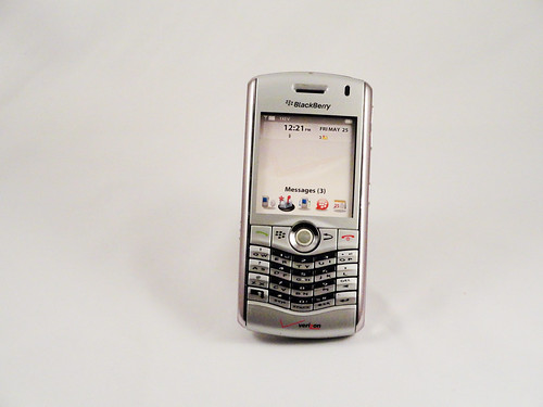
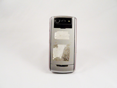
The Pearl was RIM's entry into the phone market. Previous models of Blackberries lived in a universe of their own--they were technically phones in the sense that they were general digital portable communication devices but they were much more geared toward email than any other kind of activity--the Pearl aimed to take on Nokia at its core. This was a real phone in the sense that it was shaped like a traditional candybar phone, it had no full keyboard, and it had a prominent camera. In true Blackberry style, however, the company did focus on creating a good keyboard experience, and the keyboard on the Pearl is surprisingly good considering it abandons the one-key-per-letter philosophy and uses predictive text for typing. The gentle V dip makes it clear that they're still expecting people to hold it like a traditional Blackberry and type with both thumbs (it's essentially a tiny version of full-size ergonomic keyboards that angle the keys). The sexiest part of the design is, of course, the trackball. That's why they named it the Pearl. Nearly unique in mobile phone design, the trackball was not a glorified d-pad, but a fully-functional trackball that was tuned to being used with a single finger. As I remember, it worked really well (and, fwiw, you can still buy Sparkfun's breakout boards with these on them to play with) and accurately predicted how phone interaction would work when touchscreens ruled the land. I also think that it's an under-utilized affordance, and that more finger trackballs could be put on things.
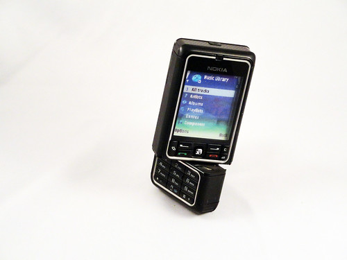
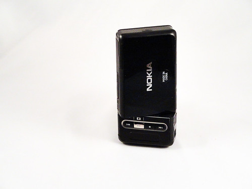
This is one of my favorite cameras from the era when Nokia was really experimenting with form factors. The keypad twists 270 degrees (very satisfyingly, btw, with a great, solid feel and several satisfying index clicks) to move the music and video controls to the front of the camera and to move the camera lens, which is placed (perhaps uniquely in all phone designs) facing right in the bottom righthand corner. You're clearly supposed to flip the camera over, twist it and then look at the screen in portrait mode while pushing the silver camera button, which would fall under the right index finger. I think that this interaction owes a lot to the original Nikon Coolpix cameras, which split down the middle to create a more ergonomic handhold than a flat plane. It's an interesting early experiment in making a phone that's primarily designed to work as a camera and music player (the vestigial keypad guarantees that).
There is little that can be said about this phone that hasn't been said better elsewhere. It is the canonical first generation cell phone. This is a model from 1987 (specifically model F09DSD8826AN, back when what a phone was named or numbered was irrelevant), so it's not among the very first of these transformational mobile phones, those were from the 8000x series starting in 1983, but it's pretty damned close to the beginning, so it's not from the Cambrian Age of phones, but it's certainly from the Silurian at least. Compared the modern digital mobile phones, it's barely even a computer, most of its magic coming not from being a portable networked computer tuned for data--as digital phones were--but from being an incredibly compact, powerful analog radio. It's digital functionality (as I understand) extends to remembering up to 30 phone numbers, using an interface (the keys at the bottom) that was apparently notoriously difficult to use. That no surprise, because the vast majority of the user experience was not in the usability of the keypad, but that you could carry a phone with you. This fact by itself was so important that it dwarfed any other consideration and Motorola was able to manufacture these phones almost unchanged for more than a decade. That's unheard of today, but proof of how incredibly powerful the idea was--and how difficult it must have been to create a competitor. (Oh, and if you really love the design of this phone, you can get a GSM phone that's a nearly identical clone, and doesn't weigh two pounds)
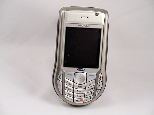
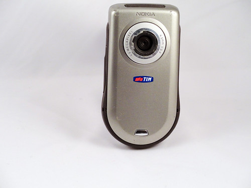
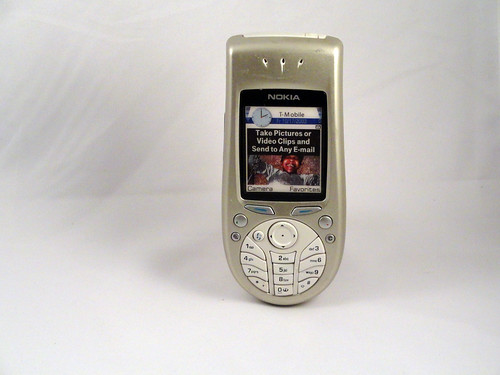
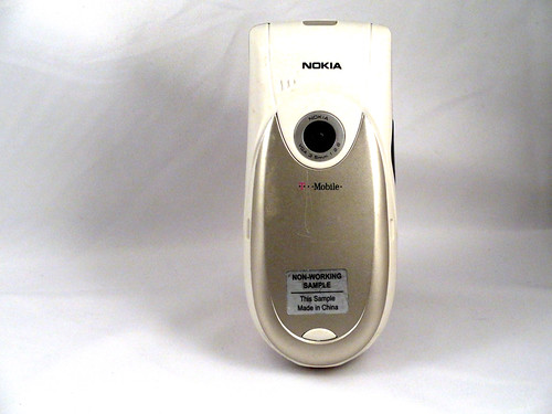
Much like the 3620 that came out two years earlier, the 6630 is one of Nokia's "round on the bottom" phones, tuned to the form of use where you hold the phone with one hand and either operate it with the same hand or the other (unlike the Blackberry derivative phones, which are used symmetrically, with both hands holding the phone identically, and typing with thumbs). It's instructive to see how Nokia had progressed in this design by comparing the earlier phone with this one. The earlier phone had a bunch of small round buttons that reinforced the droplet shape to make the whole thing look more organically round. Those buttons must have been hard to hit, since this phone makes all the button targets about the same size and really attempts to maximize button size, so that they're all tightly packed, but still fitting into the keyboard circle at the bottom. I don't know if this was for ergonomic reasons or esthetic ones, but it makes the whole thing look more deliberate and functional, perhaps less playful. That's oddly fighting with the fact that the phone is ultimately shaped like a dumbbell and inherently comical. This is emphasized by what looks to be an enormous camera lens on the back. Was that really necessary? All these things come together to make this whole phone line seem like a rather odd idea. I can see what they were going for, but the results are unbalanced in virtually every iteration.
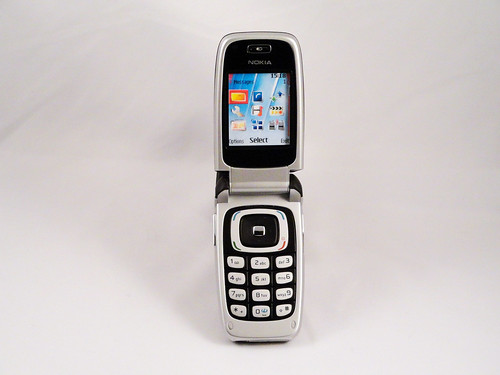
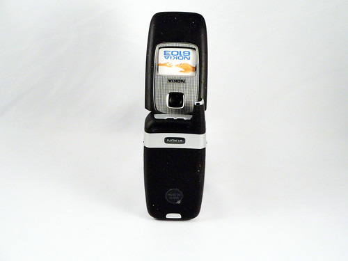
When we think of phones as commodities, we think of phones like this. When looking up reviews of it online, what many of them started with was "it's a lot like the 6101." That says to me that the reviewers considered this class of phones to be interchangeable and generic, a sure sign that a product has become an interchangeable commodity. It could be that the commodification of the mobile phone, a fantastic futuristic device that barely existed 15 years before this phone was made, had hit its peak by this point, and that's what drove the massive demand for something fundamentally new (which is, of course, the iPhone a year later). Stepping back, however, perhaps what makes it generic is that it's a perfection of a form--the small clamshell--that had run its course for the moment. It most certainly is a futuristic device. It's what science fiction always imagined a communicator would look like: a smooth pebble that pops open to reveal the controls of a sophisticated technological instrument that can do everything from send text messages to take photographs. It's just that every other phone in 2006 was from the same future. The market clearly needed a new future to explore.
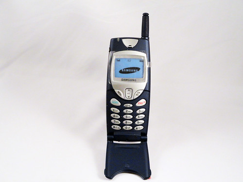
After a half-hour searching, I couldn't find the model number of this phone (help appreciated: email me at blog c/o this site). That may be just as well, since what matters is how it's designed to do what it does. In that, it's an interesting example of one of the last generation of mobile phones that we primarily phones, devices that were designed for talking. Not sending pictures, not browsing the net, just calling people and--to a lesser extent--texting. The texting angle is particularly interesting. This phone texts, but it still has a traditional keypad. However, texting had reached "hockey stick" adoption levels at this point (this source says that between January 1999 and December 2001 the number of text messages in the UK went from 100 million messages a month--already a huge amount--to 1.3 billion per month), but phones had not yet adapted to this new way of using them. Blackberry's great advantage was that RIM saw this behavior and began to design devices to exploit it. This device is still largely tuned to talking. It's big and it has that characteristic plastic flap that simultaneously covered the keypad and made the sound quality better. Because, of course, it's about the sound. It sits in the hand well, and the silver buttons are really easy to see against the dark blue background, because it's a phone for dialing people's numbers. It wasn't until the Danger Hiptop exploded, as I remember, in 2003-2004 that others realized that a new way of communicating had taken over.
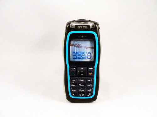
I love the design of this phone. As Nokia's first Internet-enabled phone (according to Wikipedia), this phone was going to stand out no matter what, but Nokia also decided to push the envelope in terms of design, perhaps trying to capture in the phone's design the future that Internet connectivity represented. What they ended up with was something that looks exactly like what a prop from a 70s science fiction film about the year 2004 would look like: bright blue, biomorphic, with LED backlit translucent silicone gripper pads so that you don't lose it while in orbit. It also had a rave lighting ringtone mode that no phone come close to. Here's a video:
In short, it's a phone with enough vision and personality for five phones, and is a high point for Nokia's design, produced when they were probably at the peak of their confidence. It was also a pretty low-end phone, where all of the personality essentially came free with the manufacturing process. More phones should try to be this ambitious.
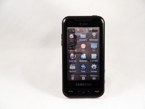
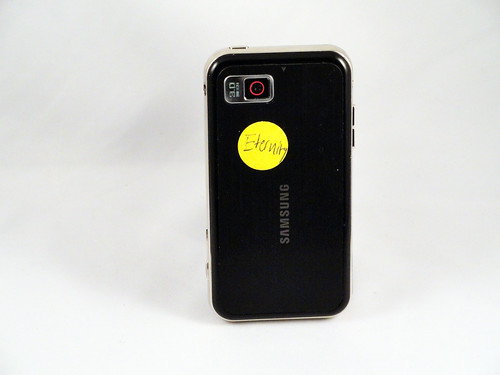
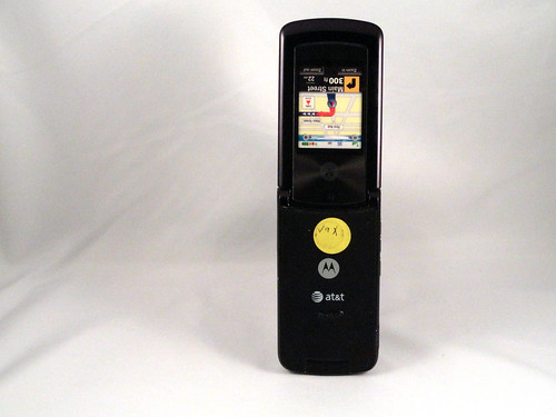
Ah, what's in a name? Without going too far into analyzing how phones are named (which really deserves a thorough analysis, since clearly a lot effort goes into it, with mixed results), the Eternity is interesting for the period it represents: released in mid-2008, it's a direct reaction to the iPhone. I wouldn't be surprised if it was rushed into design less than a year after its release, when it was clear that the iPhone's introduction was a major event. Reading and watching a CNET review from the time of its introduction, it's interesting to see that it was perceived as a medium-end business phone, and as much as the special AT&T features (TV and music) were touted, it didn't seem that that was the core point of interest for most people. That puts this phone into an interesting position: it's a slate, like the iPhone, but its design predates the App Store, so it's still tied to the old model where carriers provide functionality, which means that as an experience, it's limited to what's built into the OS and what the carrier has provided. A couple of months before its introduction in October 2008, Apple released the App Store, which represented the second giant wave of innovation in that space, and which swept the carrier-centric view of phones away, likely forever. By the time the phone was released, the App Store was exploring and exploiting the capabilities of devices like this much more than any single manufacturer or carrier could ever hope to.
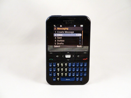
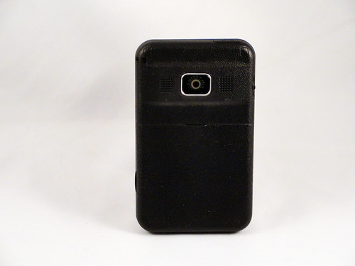
This is another one of those generic phones that your eyes tend to slide over, but it represents the bread and butter of much of the phone industry. It's a direct descendant of the Blackberry, and tuned to optimal functional and economic efficiency by Pantech, which (according to the current Wikipedia entry) is ahead of LG in terms of sales in its domestic Korea. That means that this cheap phone--and it is very cheap: its retail price of $50 means that it probably costs Pantech $10 to make--is what see on the surface of a huge business. As such, it's interesting to see what it does and doesn't do: first, it doesn't have to be recharged for 10 days; second, it's very small and thin (it was described as "the thinnest messaging device" on its release); third, it's really good at texting. And that's it. Like an animal that evolved in a highly specialized ecosystem, this is the product of an evolution of phones for cost-conscious busy people who mostly need to send email and need their phone available all the time. In other words, the ecosystem that BlackBerry pioneered. This, in some ways, is a phone that RIM should have made, if they were willing to have microscopic profit margins and were able to capture a huge market.
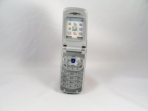
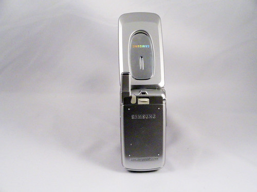
Here's another early Samsung phone, like the C100, that's less important for what it is than what it represents. Form-factor-wise, it's a generic clamshell. At the time, there were a zillion of these and they were all the same. Samsung's S100 is the same silver with a d-pad that all the other generic clamshell phones of the time were. It's even hard to know if it IS an S100. I found a bunch of phones from the era that all look the same and may have the same numerical designation, but with small changes. Samsung was clearly not as brand or industrial design focused as they became later. The most interesting thing to note is that this is probably the last appearance of external antennas on phones. As I understand it, by this point they were no longer technologically necessary, but they were still put on because of the psychological value of having something that represented radio communication. This is akin to that stage in TV design before they achieved distinct social visibility and needed to be disguised like wooden sideboards.
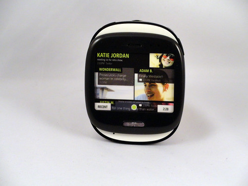
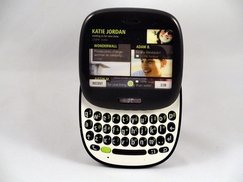
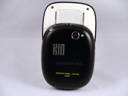
Oh, the Microsoft Kin. The stories of why this went from being one of Microsoft's biggest hopes to one of its biggest failures has been told elsewhere. The short version is that it is one of the shortest-lived consumer products, ever. A number of the interface elements survive in Windows Phone 7, but the hardware platform died so quickly many people never knew it was there. That said, there are actually nice things about the Kin One, which is essentially a slider version of a Blackberry with a touchscreen, thus being a kind of intermediate form between the classic BB-inspired keyboard phones and post-iPhone smartphones. The slider mechanism is actually quite satisfying and the palm-sized pebble form factor is great. The visual design, with hints of lime green and the exposed white plastic tabs at the top and bottom when it's closed, is quirky, but fun. For the teenagers of 2007 that it was designed to entertain, it would have been a great phone. For the teenagers of 2010 when it came out, it was already a has-been.
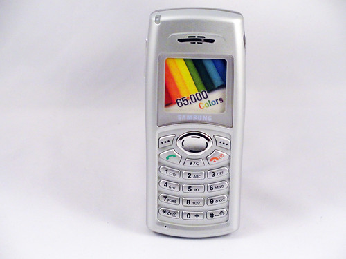
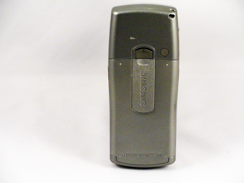
This is a generic Samsung candybar phone from the early 2000s, a pretty straightforward clone of the dominant Nokias of the time. It's pretty easy to hold and its one defining characteristic is that is has a colorful screen (important at a time when there were still phones with black and white screens on the market). It's pretty easy to hold and has all of the buttons in the expected places for a phone like it. What's interesting about it is not its design, but that it marks roughly the beginning of Samsung's agressive move into mobile telephony, where they now play a major role. At this point, they were still a me-too maker of generic GSM phones, but it was the beginning. I believe that this model, like many simple phones, was a staple of mobile phone sales for years in the BRIC countries and emerging economies.
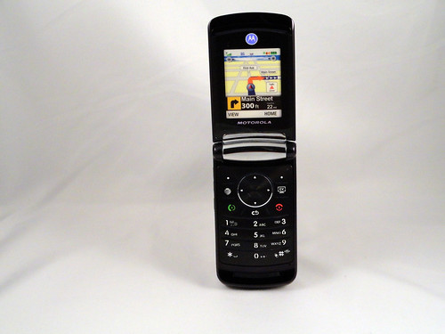
Motorola mastered phone design at a period when phone functionality had become commodified and was not particularly interesting, but how phones looked looked was. This is a second generation RAZR, the pinnacle of their design strength, and the last gasp for the line before it was discontinued. What my photos don't show is how sophisticated the color and finish on the phone are: it's a deep burgundy with a variety of smooth and matte finishes that make it very satisfying to hold. The clamshell opens and closes with the same satisfying thump you get in a luxury car, and the little nubs for catching your finger as you dial have a great feel. Those are the kinds of details that made this phone: not the operating system, or the software user experience or the services. This is the phone as jewelry, well-crafted and designed to impress. I think it's interesting to think about this as a stage in the design of any technology: first, it's functional; then, it's no longer enough to be functional, it has to be flexible; finally, it has to be beautiful. Then, another generation of technology appears and it becomes functional again, before repeating the cycle. (I'm still heavily influenced by the work of the late Colin Martindale in this)
Wow, it took me a long time to find the model number of this phone. I even looked at this awesome visual reference for Nokia phones and it wasn't there. This is one of the variants of the Nokia 3650, which was the first "round on the bottom" Nokia phone. It was an interesting attempt to try to enable easy one-handed use. The circular pad on the bottom is clearly designed to be operated by a thumb while the phone is held in the palm (the 3650 took it even further, but I have one of those and will talk about it later). Trying to maximize screen size AND create good one-handed operation seems like an interesting competitive strategy, but it seems to really unbalance the phone, both visually and how it feels in the hand. I don't think this phone actually IS easy to use one handed. You end up using it two handed, and if that's the case, then why have the oddly-shaped keys? I think there are some really interesting ideas going on here in terms of making tactile targets for thumbs, and enabling one-handed typing and photography, but it ends up as an awkward phone.
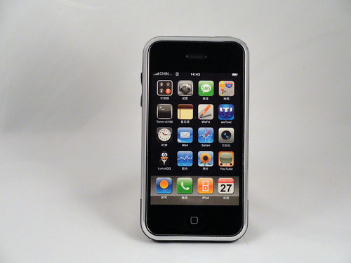
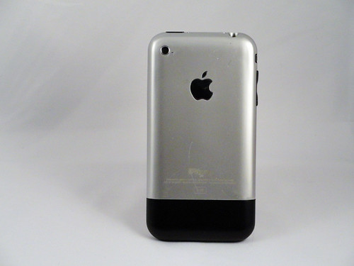
Although this project is essentially about the "pre-cambrian" mobile phone design explosion that came to an end with the iPhone and the beginning of the uniform slate style of phone, I'm ending the week with the thing that brought it all to a close, the iPhone. Kind of. This is a dummy phone (aka a display phone for retail sale) for counterfeit iPhones. So it's a fake of a fake. If you look at the details, it's all a bit wrong--even the size is a bit off, which you can't see from the photo--but it's a great copy. I don't know if this was used to sell actual iPhone and that Apple just refused to make dummy phones, or whether it was used to sell fake iPhones (but why would you go through all the trouble to counterfeit an iPhone--with all of the industrial design) just to sell maybe 10K dummy phones? I suspect that it was used to sell fake iPhones, GSM phones with touch screen buttons that looked like apps, but existed outside of the Apple App Store universe.
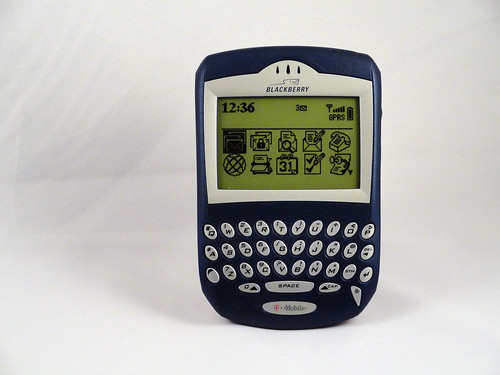
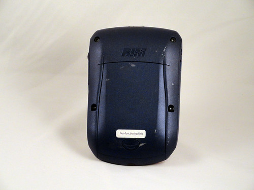
From the early Golden Age of Blackberry, circa 2003, a classic of pure functionality: the keys are right where your thumbs expect, the size is perfect for both two- and one-handed holding, the scroll and click wheel lets you move through lots of email and then click on the ones you want and the phone feels great when held. What does it do? It gets your email and tells the time. Anything else? Not really, though it was the first BB with an integrated phone.
Note: I'm not 100% sure that this is the 6210. If you have other info, please corred it on Flickr.

