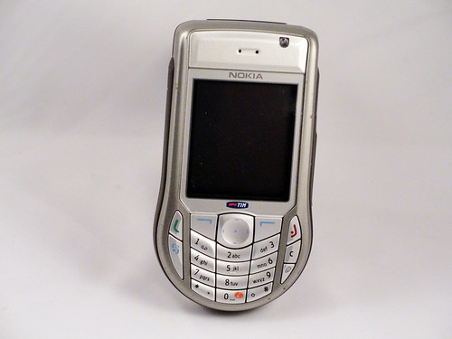
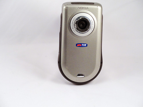
Much like the 3620 that came out two years earlier, the 6630 is one of Nokia's "round on the bottom" phones, tuned to the form of use where you hold the phone with one hand and either operate it with the same hand or the other (unlike the Blackberry derivative phones, which are used symmetrically, with both hands holding the phone identically, and typing with thumbs). It's instructive to see how Nokia had progressed in this design by comparing the earlier phone with this one. The earlier phone had a bunch of small round buttons that reinforced the droplet shape to make the whole thing look more organically round. Those buttons must have been hard to hit, since this phone makes all the button targets about the same size and really attempts to maximize button size, so that they're all tightly packed, but still fitting into the keyboard circle at the bottom. I don't know if this was for ergonomic reasons or esthetic ones, but it makes the whole thing look more deliberate and functional, perhaps less playful. That's oddly fighting with the fact that the phone is ultimately shaped like a dumbbell and inherently comical. This is emphasized by what looks to be an enormous camera lens on the back. Was that really necessary? All these things come together to make this whole phone line seem like a rather odd idea. I can see what they were going for, but the results are unbalanced in virtually every iteration.
A phone a day: Nokia 6630 (2004)
No TrackBacks
TrackBack URL: http://orangecone.com/cgi-bin/mt/mt-tb.cgi/381
