April 2012 Archives

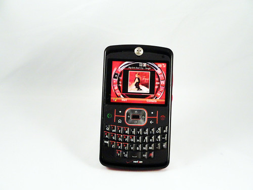
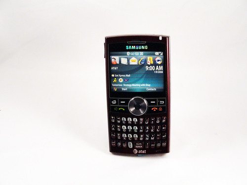
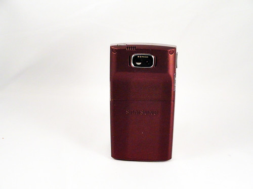
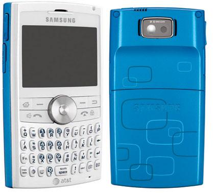
I admit my eyes begin to glaze over with the quantity of me-too generic phones, but past the repetition there's always something interesting. Every phone is an attempt by a company to compete with others making very similar products and to simultaneously advance their own design and manufacturing. Seen from the ground-level, these micro-level incremental changes become significant. Every single device is the product of many people's best work to outdo their competitors and themselves. This phone, which superficially is identical to Samsung's phone from the same era that I profiled a couple of days ago, is trying to do several different things. Both are trying to chip away at RIM's (then) dominance of the business texting market, so their basic form is the Blackberry. With this phone, however, Motorola decided to do two different things: use Windows Mobile as the operating system and create a new visual interface for what they considered the commonly-used functions. Here's a close up:

moto_q9_multimedia_home_sreen.jpg

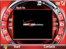
Motorola historically made much more interesting (read: better) hardware than they did software, and this again proves the point. I would list the usability issues with this, but a blog post review from the era already summarized it well:

We will dispense first with the Q9m's highly advertised "Exclusive Multimedia Home Screen." This is, without a doubt, the most ill-conceived home screen I have ever seen. The iPod Shuffle has a better visual interface than the Q9m.

For starters, none of the buttons are labeled properly and there are not descriptions on the screen (tooltips, etc.) of what any of the buttons do. The icons are arranged in a circle, which makes navigating using a directional pad an adventure because nothing is intuitive. It took me a total of two minutes to fully appreciate just how bad the home screen was. Fortunately, the phone (unlike earlier Verizon cell phones) allows you to turn off the terrible interface and switch to the standard Windows Mobile interface.

DSC00120
DSC00121

Background on the A Phone a Day project.

With a name like Blackjack, it's clear who Samsung is gunning for here: Blackberry. For practical purposes the phone is functionally indistinguishable from Blackjack models of the time. The difference, apart from the price (I'm assuming it was cheaper--Samsung was still competing at least partially at price at this point) is the design and finish of the phone. It feels like a business phone and not a phone for teens--the other group of heavy texters: it's solid, heavy and made with materials that feel sophisticated. The rubberized coating on the back is designed to keep the phone stable during (presumed) hours of texting, while the burgundy highlights feel professional (Samsung apparently made a variant for teens in light blue and pink, and it's interesting to see how color changes expectations of functionality). It's actually quite satisfying of a designed object to hold, the product of ten years of refinement of a type. This was released several months after the release of the first iPhone, and I wonder how it felt to the designers to have created a nearly-perfected version of a design that was functionally extinct.

DSC00118
DSC00119

Background on the A Phone a Day project.

Of all of the standard phone form factors, swivel phones have had the least success. I can see why people try them--slicing the phone along its thickness provides nearly twice the surface area to work with--but the swivel mechanism has to be made very carefully (twisting wires and contacts around is a notoriously difficult problem) and none of the individual surfaces end up as big as a slab phone. At that crucial pre-iPhone era where functionality was commodified, however, exploring form factors was seen as a good way to compete. RIM was one of the biggest competitors, and they owned the phones-with-keyboards market, but their keyboards were relatively small. Siemens must have decided that they had an opportunity to use the swivel form factor both to visually differentiate their phone and to create a better, bigger keyboard without impacting the overall size of the phone. In a unique design decision in all phone design (as far as I can tell), they came up with this awesomely wacky X-shaped design. It actually works pretty well, but it feels huge when open, which phones are not really supposed to do (they're, for the most part, discrete devices, even when used publicly), plus it's unclear whether the bigger keyboard adds enough to justify the overall increase in size. Still, after the 2003 70s sfi-fi craziness of the Xelibri phone line, it's actually a somewhat sedate design.

DSC00116
DSC00117

Background on the A Phone a Day project.

This phone is part of what can only be called Nokia's Baroque line. In 2005 they decided to fall fully into the idea of phones as fashion accessories, as a primary means of self-presentation. This was probably a logical move at the time, which in retrospect will probably be seen as a moment form factors began to stabilize and functionality began to stagnate. People had always bought phones for how they looked, and what that look said about them (and they continue to do this), but at a time when competition on what a phone did was stagnant, it was a natural move to compete on how it looked. Nokia's decision was to borrow the techniques and materials of high fashion and furniture design to create devices that were more about how they looked than what they did. This was probably the most conservative and lowest-end phone in that line, but it still has all the components: exotic materials, prodigious surface decoration, a sophisticated color palette. Plus, in addition to the suede and the gold-and-jewel like d-pad, it also borrows directly from fashion, most directly in its use of the fabric tag. Holding it today, it feels kind of cheap, but I think that's because it also understands that fashion IS cheap, that what's important is how a product reads from 10 feet away, not from 2 feet away. This was supposed to be a new class of costume jewelry, not an heirloom, but a fun thing that says something about your choices in commodities.

DSC00114
DSC00115

Background on the A Phone a Day project.

This phone does not particularly stand out in the pile of random phones for specific niches that continue to come out. This is a Danger Sidekick derivative (which is itself a derivative of the Blackberry) that's aimed toward people who send a lot of text messages and/or email. It has a post-iPhone touchscreen form factor, but it's clearly designed to be opened and typed on. What's interesting to me about it is that it's a Symbian device. There were not many non-Nokia Symbian devices, and they all suffered to some extent from Symbian's legacy as the "first" smart phone operating system (there are of course disputes about what a smart phone is and who had the first operating system, but Symbian has a good claim to be the best example of the first generation of smart phones, with iOS being the first of the second generation). To me, the use of Symbian means that LG was hedging their bets. I'm sure that they had their own in-house smart phone operating system under development--all the big companies do, I suspect--but that licensing Symbian was a way to have experience with it should it become successful. As we know, it didn't. That meant that this phone, and every other Symbian device, was locked into an odd role: it had the capability and infrastructure to be an open-ended computing device with a wide variety of different applications running on it (and it already has all of the affordances to be the equivalent of a netbook), but with almost no software available for it. Microsoft and Nokia are in that boat today with Windows Phone 7 and the new Lumia phones, and it'll be an interesting exercise to look back three years from now and see how well they do, and whether they end up like this phone.

DSC00112
DSC00113

Background on the A Phone a Day project.

Ads

Archives

ThingM

A device studio that lives at the intersections of ubiquitous computing, ambient intelligence, industrial design and materials science.

The Smart Furniture Manifesto

Giant poster, suitable for framing! (300K PDF)
Full text and explanation

Recent Photos (from Flickr)

Smart Things: Ubiquitous Computing User Experience Design

By me!
ISBN: 0123748992
Published in September 2010
Available from Amazon

Observing the User Experience: a practitioner's guide to user research

By me!
ISBN: 1558609237
Published April 2003
Available from Amazon

About this Archive

This page is an archive of entries from April 2012 listed from newest to oldest.

March 2012 is the previous archive.

October 2012 is the next archive.

Find recent content on the main index or look in the archives to find all content.