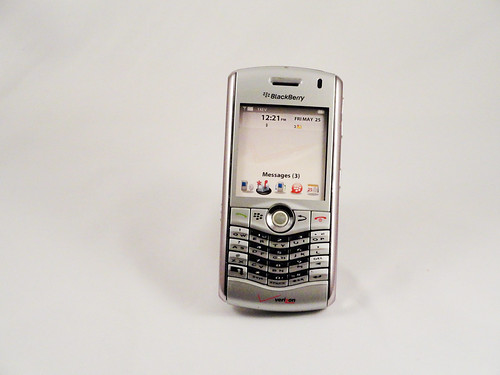
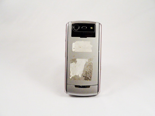
The Pearl was RIM's entry into the phone market. Previous models of Blackberries lived in a universe of their own--they were technically phones in the sense that they were general digital portable communication devices but they were much more geared toward email than any other kind of activity--the Pearl aimed to take on Nokia at its core. This was a real phone in the sense that it was shaped like a traditional candybar phone, it had no full keyboard, and it had a prominent camera. In true Blackberry style, however, the company did focus on creating a good keyboard experience, and the keyboard on the Pearl is surprisingly good considering it abandons the one-key-per-letter philosophy and uses predictive text for typing. The gentle V dip makes it clear that they're still expecting people to hold it like a traditional Blackberry and type with both thumbs (it's essentially a tiny version of full-size ergonomic keyboards that angle the keys). The sexiest part of the design is, of course, the trackball. That's why they named it the Pearl. Nearly unique in mobile phone design, the trackball was not a glorified d-pad, but a fully-functional trackball that was tuned to being used with a single finger. As I remember, it worked really well (and, fwiw, you can still buy Sparkfun's breakout boards with these on them to play with) and accurately predicted how phone interaction would work when touchscreens ruled the land. I also think that it's an under-utilized affordance, and that more finger trackballs could be put on things.
A phone a day: Blackberry Pearl 8130 (2006)
No TrackBacks
TrackBack URL: http://orangecone.com/cgi-bin/mt/mt-tb.cgi/384
