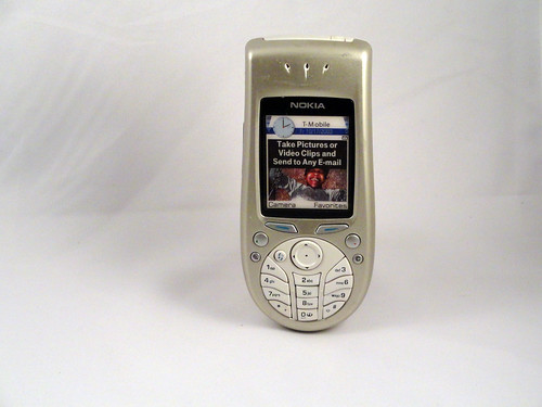
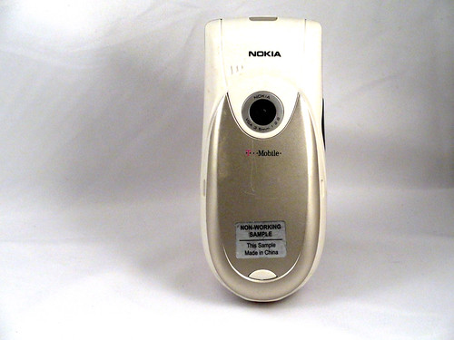
Wow, it took me a long time to find the model number of this phone. I even looked at this awesome visual reference for Nokia phones and it wasn't there. This is one of the variants of the Nokia 3650, which was the first "round on the bottom" Nokia phone. It was an interesting attempt to try to enable easy one-handed use. The circular pad on the bottom is clearly designed to be operated by a thumb while the phone is held in the palm (the 3650 took it even further, but I have one of those and will talk about it later). Trying to maximize screen size AND create good one-handed operation seems like an interesting competitive strategy, but it seems to really unbalance the phone, both visually and how it feels in the hand. I don't think this phone actually IS easy to use one handed. You end up using it two handed, and if that's the case, then why have the oddly-shaped keys? I think there are some really interesting ideas going on here in terms of making tactile targets for thumbs, and enabling one-handed typing and photography, but it ends up as an awkward phone.
A phone a day: Nokia 3620 (2002)
No TrackBacks
TrackBack URL: http://orangecone.com/cgi-bin/mt/mt-tb.cgi/371


