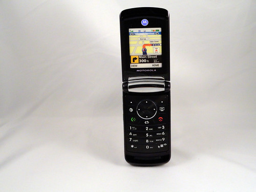
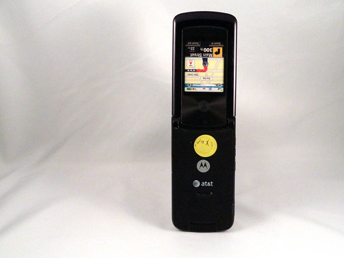
Motorola mastered phone design at a period when phone functionality had become commodified and was not particularly interesting, but how phones looked looked was. This is a second generation RAZR, the pinnacle of their design strength, and the last gasp for the line before it was discontinued. What my photos don't show is how sophisticated the color and finish on the phone are: it's a deep burgundy with a variety of smooth and matte finishes that make it very satisfying to hold. The clamshell opens and closes with the same satisfying thump you get in a luxury car, and the little nubs for catching your finger as you dial have a great feel. Those are the kinds of details that made this phone: not the operating system, or the software user experience or the services. This is the phone as jewelry, well-crafted and designed to impress. I think it's interesting to think about this as a stage in the design of any technology: first, it's functional; then, it's no longer enough to be functional, it has to be flexible; finally, it has to be beautiful. Then, another generation of technology appears and it becomes functional again, before repeating the cycle. (I'm still heavily influenced by the work of the late Colin Martindale in this)
A phone a day: Motorola RAZR2 9x (2007)
No TrackBacks
TrackBack URL: http://orangecone.com/cgi-bin/mt/mt-tb.cgi/372


