This is Part 6 of a pre-print draft of Chapter 6 from Smart Things: Ubiquitous Computing User Experience Design, my upcoming book. (Part 1) (Part 2) The final book will be different and this is no substitute for it, but it's a taste of what the book is about.
Earlier chapters in this series: Chapter 3, Chapter 1Citations to references can be found here.
Chapter 6: Information shadows
Part 6: WineM, an example of design with information shadow
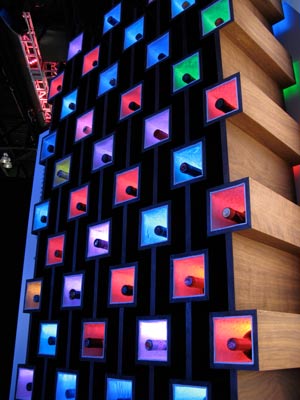
Figure 6-10. ThingM's WineM smart wine rack (Photo by Tod E. Kurt)
In 2007, my company, ThingM, used these ideas to design a smart wine rack (Figure 6-10). It was created to demonstrate one endpoint of a service based on wine information shadows. Every bottle of wine in it has an RFID tag (Figure 6-4), with an RFID reader in every cell of the rack. The rack, in turn, connects to an online information shadow service. This service aggregates wine information from the Internet and all of the racks that are connected to it. [Footnote: As this was a proof of concept, we implemented only bare-bones functionality and worked with a wine data aggregator (Inertia Beverage) to verify that we could get appropriate information in a production environment.]
When someone associates an RFID with a specific wine bottle, the service would connect it to all of the other wines of the same type. Many wine management services can already analyze a wine collection and recommend wines resembling those in the collection. Our service went one step further: every bottle could serve as a subscription to a data feed from the winery and to a social network of enthusiasts with similar interests. A winery could have a sale for existing owners, or recent drinkers, of its wines. Then, every rack that contained a bottle of that wine would get a message, and light up the wine in a specific color, or send a text message that said "your 2004 Domaine Roger Perrin Chateauneuf-du-Pape has mail!"
WineM is an experiment to understand how the potential of information shadows can be expressed in a good user experience. It is designed to keep the user experience focused on the experience of choosing and drinking wine. It minimizes the presence of a full-purpose computer while still providing the full power of Internet information exchange.
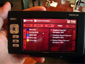
Figure 6-11. WineM control panel (prototyped on a Nokia 770 tablet)
For example, the interface is a faceted classification browser (Figure 6-12). Every click adds another constraint to the search set and lights up the appropriate bottles in the rack. Thus, it's possible to organize the wine not just by year or grape, but also by current market price or number of bottles in stock (or all of the above).
Hallmarks took the difficult process of identifying the manufacturer of a given piece of flatware by its style and instead made it a matter of matching a small stamp to pictures in a catalogue. Similarly, this kind of information exploration would have been very difficult with a traditional wine rack. However, once the bottles had their information shadows stitched to them using RFIDs and a simple database connected to the massive amounts of wine information online, it was relatively easy.
Next month: Chapter 8, Service Avatars
