2006 Milan Furniture Fair Review, part 2: Colors and The Shape

Colors

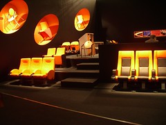
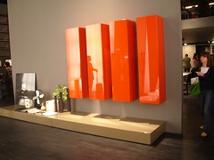
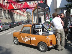
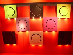
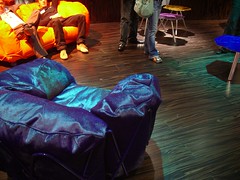
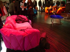
Color is important to me, so I pay a lot of attention to the colors people are using. Two years ago it was orange and Japanese-inspired earthtones (though not together). Last year it was apple green, maybe because it complemented the previous years' orange. Light blue made an appearance, too, since it worked well with the chocolate browns that went with orange and apple green. This year there doesn't seem to be a major single color trend. Some people have gone back to the safety of orange (so to speak), and maybe it's becoming the de facto "third color," which has traditionally been red.

IMGP8239.JPG IMGP8272.JPG IMGP8284.JPG IMGP8426.JPG IMGP8596.JPG

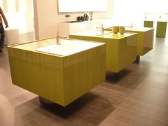
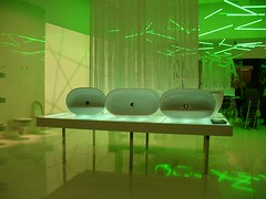
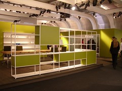
There's also plenty of green, but it's been greyed (grayed?) down from its most exuberant bright variations last year, which looks fresh at first, but I can imagine start to be too intense when there's too much of it. The interesting thing is that in greying apple green down you kinda get the dreaded…AVOCADO! The revenge of the 70s is now complete.

IMGP8267.JPG IMGP8269.JPG IMGP8289.JPG IMGP8294.JPG

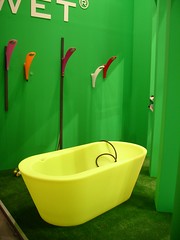
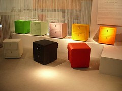
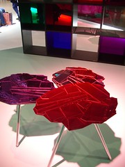
However, the industry has not totally lost its interest in color. The general concept of "color" however is still pretty popular. Groupings of basic primaries and secondaries appear all the time, not unlike the days following Apple's initial iMac introduction (though this may be an artifact of trying to make a display interesting even though 99% of what you sell is in traditional basic black, white, chrome, grey or whatever).

IMGP8270.JPG IMGP8382.JPG

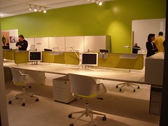
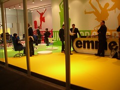
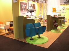
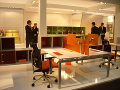
One of the most interesting manifestations of this multicolor approach was in the office furniture section, which had as its theme "wellness@work". I don't know what they meant by that, and it wasn't obvious from the furniture displayed, which was all pretty familiar, but the idea it seemed to be trying to communicate is that work life is better if it looks more like kindergarten. I'm dubious.

IMGP8279.JPG IMGP8280.JPG IMGP8281.JPG IMGP8286.JPG

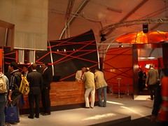
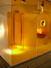
Edra, consistently one of my favorite manufacturers, had excellent, subtle taste in bold colors, something that's hard to pull off.
IMGP8314.JPG IMGP8308.JPG IMGP8309.JPG

The Shape

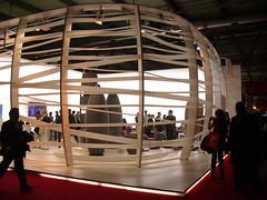
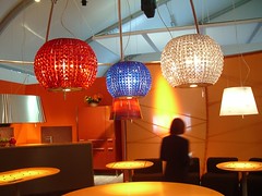
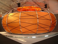
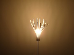
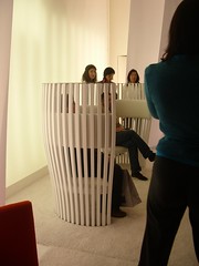
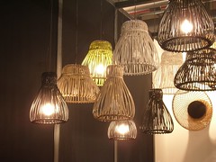
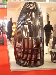
One unexpected trend was the appearance of a single shape as a motif. Maybe it's just that with so many objects, there are going to be lots of trends because there are only so many ways of making stuff and people reinvent the obvious ones repeatedly, but there was this ribbed barrel shape that I noticed a lot, and it seemed to be a genuine trend. What does it mean? I don't know. The rounded right angle corners that dominate so much design come from copying Apple (and what designer doesn't get easy inspiration by riffing off Apple?), from a desire to soften the edges of hard technology, to reference the 60s/70s vision of the future (the last time the future was still optimistic) and to identify with the bent metal pipes of Marcel Breuer's Wassily Chair, again referencing a positivist attitude toward the future and technology. These basket shapes are different. I think they come from Chinese lanterns, an organic and non-Western reference, which says to me that their designers are trying to evoke a new design language. Why? I don't know yet.

IMGP8325.JPG IMGP8384.JPG IMGP8510.JPG IMGP8568.JPG IMGP8614.JPG IMGP8417.JPG IMGP8450.JPG IMGP8477.JPG

No TrackBacks

TrackBack URL: http://orangecone.com/cgi-bin/mt/mt-tb.cgi/197

Ads

Archives

ThingM

A device studio that lives at the intersections of ubiquitous computing, ambient intelligence, industrial design and materials science.

The Smart Furniture Manifesto

Giant poster, suitable for framing! (300K PDF)
Full text and explanation

Recent Photos (from Flickr)

Smart Things: Ubiquitous Computing User Experience Design

By me!
ISBN: 0123748992
Published in September 2010
Available from Amazon

Observing the User Experience: a practitioner's guide to user research

By me!
ISBN: 1558609237
Published April 2003
Available from Amazon

About this Entry

This page contains a single entry by Mike Kuniavsky published on April 21, 2006 6:13 PM.

2006 Milan Furniture Fair Review, part 1: the building was the previous entry in this blog.

Phil keeps going and going with the Roomba hack is the next entry in this blog.

Find recent content on the main index or look in the archives to find all content.