This year, rather than posting a couple of giant posts about what I saw at the Milan Furniture Fair (as I did in 2005 and 2004), I'm going to post a series of smaller notes about the thoughts I had while at the fair. These are not going to be in any kind of priority, but mostly impressions I had as I was looking back at the photographs I took. Here's the first one.
The building
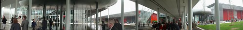
The Fair used to be held in an old warren of buildings that had been built up haphazardly into a complex known as the Amandola Fiere. The new Rho fair building complex, designed by Massimiliano Fuksas, is much larger and cleaner and comfortable in many ways but (and you knew there was a but coming), I think it suffers from classic anti-personal Modernist excesses that I thought had disappeared in the 70s. It is not as desperately human-hostile as the worst excesses of 1950s monumental architecture, but it's definitely built with a good chunk of that kind of Modernist blindness to the user experience.
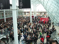
- It's built around a single enormous aisle that connects all 20-some enormous pavilions, which means that there are crowds and bottlenecks at the single path through the space.
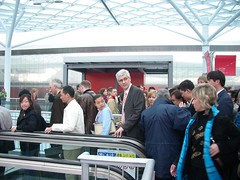
- There's no rapid transportation in it, so unless you know how to find one of the shuttle busses that careen through the outer parking lots, you have to walk what seems like miles (the place is huge and it takes maybe 15 minutes walking at a good clip to get from one end of the aisle to the other).
- There are no obvious architectural cues for where the entrances are, and in fact the obvious places to enter it from the subway (how most people get there) is actually not an entrance, and guards have to be positioned there to direct crowds up escalators over a walkway and then down again to the real entrances.
- Inside, among all of the pavilions, there's virtually no way to tell which one you're in.
- The signage is all identically red and the repeating columns and flat perspective obscure any kind of perspective.
All this means that you do a LOT of walking, which makes the fact that there's no place to sit down that much more ironic, especially considering it's a furniture fair.
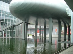
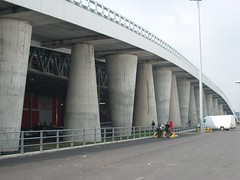
That said, it's not nearly as chaotic as the old Amandola fairground and the facilities seem modern. Plus, I think that the major decorative elements--the giant blimp-like shapes that I think are conference rooms, the glass polygon-mesh roof and the wacky conical columns, are great.
Fabio and I saw Fuksas walking around the fair, by himself, seemingly lost in thought in that "I'm a master architect" kind of way. I think there are some beautiful things about the new fair, but I hope he noticed how people were actually using the space, the trouble they were having, and then fixes it.