Rereading that last post, it seemed kinda grumpy. That's not actually representative of my experience. There was a huge amount at these fairs that I liked a of lot. Here are some notes about that.
Kitsch or classic?
One of the nicest surprises for me in Milan is that it's not just a contemporary furniture fair, it's a furniture fair in general, and there's a huge amount of non-contemporary furniture (the New York Fair is all contemporary). There's cheap anonymous furniture--terribly cheap furniture--hotel furniture (which is cheap and anonymous, but sturdy), there are companies that make futons, designers desperately hoping to get their pieces picked up, there's art by the square yard and six foot high handmade white and gold porcelain vases. Everything that's related to home furniture is there. Northern Italy, as I understand it, has the largest concentration of independent furniture makers anywhere on earth, and they get their own section.Then there's traditional old school furniture. Hand-carved wooden filigree and marquetry. Painstaking craftsmanship that's changed little in 500 years (well, maybe some power tools and acrylic). If contemporary furniture design is trapped in amber, traditional furniture design is intentionally petrified. It serves a market and lives in a parallel universe of its own. I found this fascinating, especially when those manufacturers decide to tackle new ideas, which sometimes produced seriously surreal results (and not in the Dali lip-couch sense, more like de Chirico and Miro):
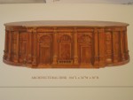
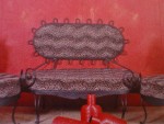
(the round table is by Buontalenti, a French/Polish company, but in the traditional Italian furniture section; the couch thing is by MetalChic)
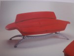
Though contemporary furniture manufacturers come up with some pretty ridiculous designs, too:
Food design
Continuing a show I saw advertised in Turin last year (maybe a dry run?) the Milan fair featured a special theme on food design, where designers and design schools were invited to redesign the whole food process, from the restaurant down to the actual delivery of the product.The Kono Pizza stand tried to reinvent the Italian classic as a combination wrap/ice-cream cone (but hot), and so had to reinvent the whole presentation of the product:
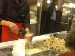
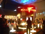
There was also a solid coffee bar (yes, the coffee was solid, though I didn't see it being delivered, so I don't know how solid), which I didn't get pictures of.
This wine store used wine bottles as walls, which I liked:
However, a croissant shop in a disco doesn't really work for me:
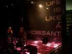
(and how is life like a croissant? Flaky and twisted?)
At the Salone Satellite, an adjunct to the main fair where independent designers exhibit, a number of design schools from various countries created restaurants. Maybe I'm projecting, but it was interesting to see how national character permeates design (maybe intentionally).
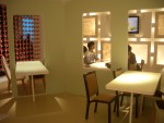
The Osaka University of the Arts' pizza restaurant looked more Japanese than Italian:
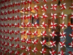
Trace, an installation from RISD, was elegant, beautiful and (they being an American school), firmly grounded in technology. Though I clearly enjoy the technology, I realize that it reflects American technolphilia. This was clearly apparent in how the presentations of Design Academy Eindhoven and Art Center students differered when they showed their work at the Metropolis conference in New York. The Dutch students spent a week collecting street trash and making stuff from it, and were quite proud of the fact that their students could sew, knit and didn't rely on computers. Art Center's students presented much slicker (though not necessarily better designed) and commercial work, but all their work was clearly only possible to manufacture with computers. I think both positions reflect a kind of willing blindness that's too limiting, but it's interesting to see how cultural it is.
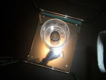
The Japanese restaurant by the University of Art and Design Helsinki seemed to be a lot more about evoking Finnish cold than evoking Japan:
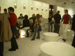
And the Jerusalem-based Bezalel Academy of Art and Design's French restaurant was called "Partingline" and featured a harsh bisection of the space, with divided plates, seats (that only worked when both parts were used) and a bisected space:
Food gadgets
Some ideas are so good, they get to be invented twice. At opposite ends of the Milan fair: cake plates with marks to indicate where to cut to get a given uneven number of slices: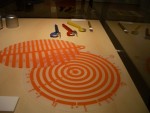

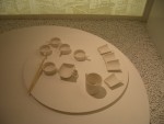
I also liked this set of as sushi utensils made to look like pieces of sliced-up mugs (from the Finnish design school restaurant):
Favorite things
In terms of furniture, my favorite stuff in both shows came from the experimental, more techie side of things.
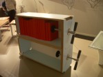
A screw Bookshelf by Rose Cobb:
A heated concrete couch (by three Swedish designers).
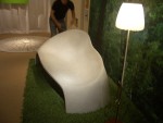
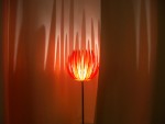
Molly fell in love with this lamp at first sight and bought it on the spot. Though I like the design, I'm really excite because of what it means for mass-market customization. It's printed using a polyester rapid prototyping printer, which means that--theoretically--each one can be different, since they're grown individually. In fact, they include a disk with the lamp design as part of the purchase package. Molly named it "lampy":
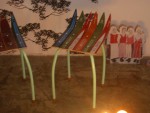
Stools made of old skis by defyra (from the excellent designersblock show, which probably had the highest density of smart, original design of anywhere in either the Mlan or New York shows):
Of course one of my favorite things was experiencing all of the materials. In New York I got to see the amazing transparent concrete everyone's been talking about, and a beautiful murky green plastic with embedded grass which looks like you're swimming through the reeds in a pond, and chain mail made of ceramic rings.
The Side Show
Finally, the weird stuff. It's easy to pick on people for using improper English when trying to look cool, but there was some very amusingly nonsensical copy, which made no sense regardless of the language it was written in: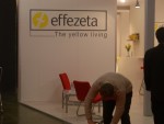
And some installations were, well, indescribable. It's not clear what the exhibit designers were thinking when they made an S&M dungeon living room:
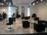
Or this 1970s concept kitchen (look, orange! and, OK, it was the 70s…):

Or this pretty, if impractical, concept design from a Ukranian (I think) design school:
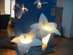
Or this one, from the same show:
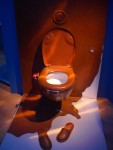
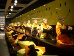
And I still don't know what this was about:
Tomorrow, or soon: the smart furniture!
(also, apologies to all of the designers whose work I'm showing without attribution, I was mostly snapping pictures and not taking too many notes, so please excuse me--if you see this all tell me where to link for any of the things I've mentioned, I'll be happy to put in a link)
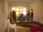



The screw bookshelf is "Books-to-go" by Rose Cobb - http://www.designbyrose.co.uk/. I also love her Modular Chest of Drawers and Turntable. I suppose I share some of her interests: he's a young English designer who moves house a lot. There's a small piece about her here: http://www.guardian.co.uk/weekend/story/0,3605,1084120,00.html