Since my furniture manifesto was being published, I decided to learn something about the furniture business by diving into the deep end. In April, I went to the Milan Furniture Fair (the Salone Internazionale del Mobile) and then International Contemporary Furniture Fair in New York in May. It's hard to distill these enormous fairs into some blog entries, but here are some thoughts/observations. For those who are in the business who may be reading this, excuse me if I state the obvious or jump to conclusions.
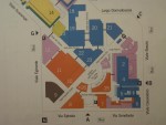
The first thing that surprised me was how enormous and fragmented the industry is. Here's a map of the Milan center that hosts the Salone. It's probably half a square mile in area and on multiple floors:
The second thing that surprised me was how much of furniture is fashion. It's obvious in retrospect, but I'm new at this and previously was only exposed to high design furniture in magazines and stores, I had expected a deep culture of innovation. The reality is expectedly more mundane. The majority of companies and designers are not trying to push any boundaries, but to create the most "now" pieces, the ones that look the most like the archetypes of what "today's" fashion is supposed to be. This leads not to innovation, but nearly stultifying repetition, and that's fine--when any consumer-products industry is seen this way, I suspect it's like this.
High design is a miniscule part of the market, as can be expected (and as Capellini, one of the touchstones of contemporary Italian avant garde design, found out a difficult place to make money).
In terms of identifying the fashions, there were several notable themes:
Corners!
This is the most high-design of the current styles. A major furniture fashion trend is the use of massively rectilinear low, flat, Japanese-influenced elements, often pairing dark woods or woods with obvious grains with chrome. Most of this stuff is in shades of brown and, frankly, I think a lot of it is quite elegant and beautiful, but it's overwhelming and so cold. Presumably the wood grains and earthtones are designed to soften, warm and humanize the cold designs, but they really don't. It all still comes off as looking like you're living in a metal shop: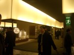
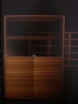
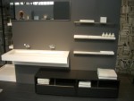
(the first image is from the Cecchini Collection.)
Molly and I saw a more mass-market version of this when we stayed in a recenty-revamped Business Class room (which, in itself, is a clever remapping of airline terminology to hotel rooms) at the SAS Radisson in Oslo. However, in practice it turned out to look more low-rent than it did in the showrooms, which is kind of a testament to how easy it is for this style to degrade to formica+chrome.
Rounded corners!
As a culture, the furniture design culture seems to be recycling Modernism. It's not just stuck in the Bauhaus agenda of expressing material properties through design, but a rampant copying of the Midcentury designers who embraced these ideas. Molly and I counted 4 design-patent skirting variations of Mies' Barcelona chair [link], and we probably passed 10 more. I'm not sure I want to dig into the explanation of this entrenched nostalgia--conservatism masked as avant garde--but it pretty much rules.(I don't have any pictures of these pieces because, well, we've seen them all before and I didn't think to take any)
No corners!
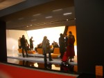
Globular biomorphism is the opposite end, and seems to be prevalent in funky office design: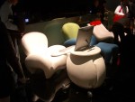
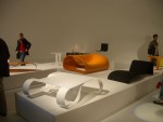
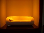
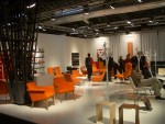
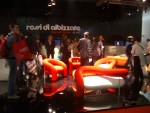
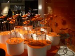
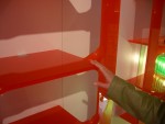
Orange!
As red is the third color (after black and white--in language, art, politics and printing), orange seems to be the fourth when it comes to furniture design. I thought that the International Council--or whatever that organization is called--said that Orange=1998, but clearly not here. It's in full flower.Form follows fashion
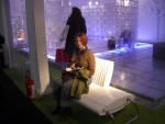
One obvious trend in furniture design that defines it as primarily fashion-driven, rather than function-driven is the amount of terrible, uncomfortable furniture that looks good.Here's Molly trying out a plastic foldable bench/couch:
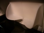
Here's a wall-mounted plastic tet-a-tet couch thing that is an interesting use of injection-molded plastic, but looks nothing so much as an enormous urinal, and is about as comfortable to sit in:
(and props to Henry Petroski and his excellent book The Evolution of Useful Things for the "form follows fashion" phrase)




Hi
You must have a look at our design -- > the deckhopper. We were at Milan in 2001 and we had the same impression -- nothing new, but 'now'! We do our best to design new things - not fashion bounded, ...
Greetz
Eveline