This is Part 4 of a pre-print draft of Chapter 3 from Smart Things: Ubiquitous Computing User Experience Design, my upcoming book. (Part 1) (Part 2) (Part 3) (Part 2) The final book will be different and this is no substitute for it, but it's a taste of what the book is about.
Last month I posted a draft of Chapter 1.
Citations to references can be found here.
Part 4: Sidebar: Too Much Metaphor, Magic Cap
General Magic's Magic Cap was an early operating system for mobile devices. It can be thought of as an early attempt at a user-centered ubiquitous computing experience design. It is also an example of a product that followed its metaphor too far.
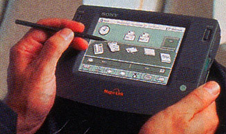
Sony Magic Link (Courtesy Sony)
Designed for portable, networked computing, the launch of Magic Cap in 1994 predated the Palm OS by several years. Magic Cap provided similar functionality to the Palm OS, but with one crucial difference: from the start General Magic had designed Magic Cap for networked communications. Both devices that ran Magic Cap, the Sony Magic Link and the Motorola Envoy, were tablet PCs with built-in networking (the Sony had a phone modem and the Motorola had an early wireless modem).
On the back end, Magic Cap's architecture used software "agents" written in a language called Telescript, which could run outside of the device to perform actions on the Internet and deliver results back to the user. [Footnote: Magic Cap mixed its metaphors, too, describing their software having simultaneously as "agents" (Tardo et al., 1996) and a "cloud" (Hendler, 2000) while using neither of those two concepts in the interface in that way (there is a cloud in the Downtown sky, but it is unrelated to the Internet, which is an office building).]
Key members of the Macintosh development team led General Magic. They decided to leverage their work on the Macintosh interface and extend the desktop metaphor to a networked device environment.
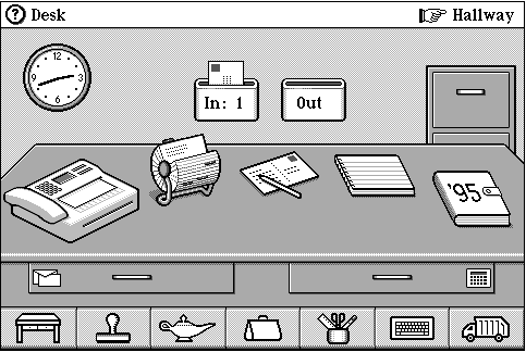
Figure 3-6: Magic Cap home screen.
The Magic Cap home screen (Figure 3-6) centers on an image of an office desk. It is a surprisingly literal interpretation of the desktop metaphor after a decade of mass popularity. Perhaps they zoomed out from the two-dimensional “desktop” view to emphasize how a portable, mobile device would move off the desktop and into the three-dimensionality of a real room.
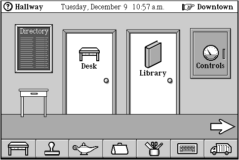
Figure 3-7: Magic Cap hallway.
However, the realistic, spatial implementation of an "office" metaphor constrained them further. Thus, users had to walk down the "hallway" (Figure 3-7) to access functionality located in different rooms.
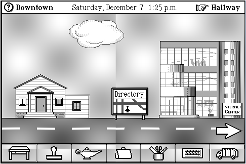
Figure 3-8: Magic Cap Downtown.
The literal interpretation of the office building metaphor even produced a city street. The town center (Figure 3-8) had an Internet office building and a diner with a Web browser accessible through a movie poster. The interaction resembled a sideways scrolling adventure game more than an operating system for business users (Sony's target audience for the device).
It is difficult to say whether the decision to structure the user experience as an adventure through a software suite primarily caused Magic Cap’s business failure. It is clear, however, that the metaphor, and General Magic's literal interpretation of it, significantly constrained the design. Even in the early days of mobile device usage, the literalism may have hurt comprehension as much as it helped. Many screens required significant "signage" to explain what various iconic images meant. Other icons, such as the "magic lamp" icon located at the bottom of every screen, simply did not make sense within the town center metaphor.
Extending the desktop metaphor to buildings may have seemed like a good idea initially, but it became increasingly baroque in its details. Ultimately it turned using the operating system into a long walk through an unknown city full of confusing signs, which is possibly the least magical experience of all.
Next Month: Chapter 6, Information Shadows