Since we began work with The Henry Ford last year, I've been interested in how museums use technology to tell the stories of their artifacts. Having a single timeline narrated by a single curatorial voice and presented on tiny white wall cards cannot explain complex history and the significance of objects. Museums are, occasionally slowly, realizing this and it's fascinating to watch how they use technology to express their new understanding of their role as cultural repositories.
ThingM's focus on the Henry Ford project was communicating context in history museums, but today I watched how well the Detroit Institute of Arts does the same for art. Liz and I spent the afternoon in the recently redesigned DIA, and it was a surprise and a treat.
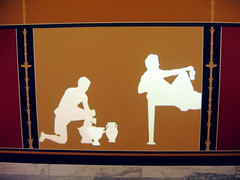
The DIA's collection is heavy on the classics and the 18th and 19th European art collected by its original auto company mogul donors. Not all of that art has stood the test of time and some is potentially embarrassing to display without explanation (chinoiserie anyone?). Fortunately, the DIA did not shy away from the questionable acquisitions or keep the "embarrassing" art in the warehouse. This is not to say that they don't have a great collection, they do, but what fascinated me was how they used their secondary pieces to tell stories, to explain and to contextualize the other work. Rather than galleries of dusty numbered Greek vases, for example, they had a life-size rear video projection that explained the social purpose of each of the vases in the Greek wine ritual. This was informative, since the pictures on the vases suddenly made much more sense once their function was understood. Moreover, the rear projection was in the style of the vase art itself, which tied together the artifacts to the people and their rituals in an immediate, entertaining and direct way.
Another great exhibit used a bunch of late 18th century French decorative art to tell the story of the life of leisure of French aristocrats, devoting each gallery to a time of the day and the artifacts that would have been found in each situation (implicit in the presentation was that this was the before picture; after the French Revolution, well, that's all different). A great installation in this exhibit was the dining gallery, which had a downward-facing video projection of a formal multi-course dinner, filled with Enlightenment-inspired symmetry, royal pomp and dozens of exotic-to-us dishes (wine aspic, for example). You could sit down at the table and watch as hands in fancy outfits places ridiculous dish after ridiculous dish on the table. Great.
Finally, a much lower-tech technological intervention, but one that was interesting (if occasionally awkward because of its placement) was a set of triangular prism-shaped label spinners. Each side of the prism has a different complementary perspective on a given work from a different, named expert (as opposed to a single view by an anonymous curator). Some have historical context, some cultural. It presents a more nuanced exploration of the ideas.
The parts of the museum where they hadn't implemented all of the changes, where it was more like a traditional museum with vitrines, white cards and only occasional explanation seemed impoverished and bland. But on the whole, the redesign (described in detail [2.1MB PDF] in one of the local papers) is highly successful (and judging from the $180 million the museum raised in preparation for it, its success isn't just measured by the quality of the design) and engaging.


