After a discussion with a bunch of nice folks about mapping systems over dinner the other night, I started to think about how all of the point-wise mapping tools (such as Platial and Plazes) are to me, personally. For the most part, they're not (I prefer regions as the unit of markup, or at least in addition to points). Last night Liz and I were talking about San Francisco real estate and the subject of Ellis Act evictions came up. In the process of researching this kind of eviction, we found that there was a list of Ellis Eviction sites which hadn't yet been mapped (well not to our knowledge), so we decided to try our hand at a mashup. It was harder than it's made out to be, and by the end of the evening we had given up on the Javascript and GIS systems, but had discovered several useful tools.
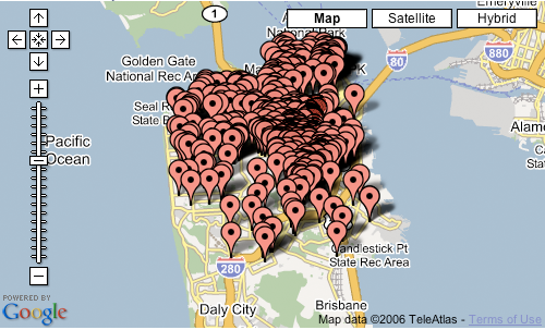
Here's the problem, as I see it, with point-wise mapping of information: when there are enough points, it becomes a forest and it's no longer useful. For example, here's the Ellis data all mapped together on SF using EditGrid, an online spreadsheet that can take any map data and map it with Google maps:
I would like to do is to have some interesting ways of clustering or displaying this information in a way that's not overwhelming visually and not a bear to produce in a GIS system. [Note to GIS system designers: your general purpose tools, which can be used for everything from prospecting for oil to identifying crime patterns, are incredibly difficult to use because they're so general purpose. Just because there's a latitude and longitude attached doesn't mean that the same tool is useful for everything. A nail and a can of peaches are both made of metal, but that doesn't mean you can or should use can openers and hammers interchangeably. Geographic information is like metal: it's a basic material, and the tools you use with it should be tuned to the task. But I digress.] Unfortunately, neither Liz or I was unable to find any such tools (EditGrid is relatively easy, but what I'd like is the equivalent of the Excel chart wizard for maps, and they're still in the early days of integrating their product with Google). We did what we could with what was available (in this case, Mapbuilder.net). Here's a still of all of the Ellis evictions from January 2000 to March 2005. You can start to see trends in both location clusters and in time and this tells a story about real estate in San Francisco. I'm not totally sure what story it tells, but it's a start, and an interesting mapping experiment to have spent an evening on.
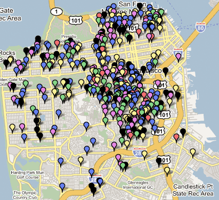
Key:
2005-red (Jan-March)
2004-blue
2003-green
2002-purple
2001-yellow
2000-black
Click on the map to get a live, zoomable, scrollable Google Map, but be warned: Google Maps isn't very good at displaying 500 points on a map and it'll bog down your browser for a while.
If you'd like to use the data yourself, here's my dated and geocoded spreadsheet, which we used the excellent and free Batch Geocode utility, which we also used to convert the dataset into a KML file for Google Earth.


the lack of any sort of data analysis tools in google maps is pretty limited. I'm curious as to how the evictions map out, though, so if I have a spare hour or two this week, I'll see if I can make a nice map in GIS (and perhaps compare it to, say, income data, if I'm feeling ambitious...).
i would hope that google's doing something to improve that bottleneck of "too much info overload" -- i really like the idea... especially tracking transitions over time to better understand where/how things are impacted. a friend sent me this other mashup that tracks heat patterns from traffic which (with any overarching history/experience in the city) is an interesting way of looking at the city's vehicular movement/impact as well. http://blog.fortiusone.com/2006/10/11/heat-maps-for-google-maps-aka-geoiq-mashup
What I'd really like, of course, is the slider that displays the markers by year and month so we can see how the Ellis Act evictions swept across San Francisco neighborhoods. But that went beyond the scope of a single evening project...
Check out dataplace.org
One of the designers presented at the Interactive City conference and I found their data visualization for this sort of issue really interesting.