I went to Burning Man again this year, for the 11th time in a row. My overall feeling is that the art this time around wasn't overall as good as last year, though last year was hard to top since it was head and shoulders better than many of the years leading up to it, and this year's work is, too.
If I list more pieces this year than I have in years past, it's only because this is the first year I took notes.
The Waffle
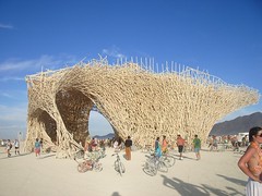
This piece, by a group of Belgian artists, had a different name--Uchronia--but everyone on the playa knew it as The Waffle (much to the lead artist's frustration, as I understand it, but it's a better and less pretentious name, so he should just learn to deal with it). An amazing and conflicting piece: a classic potlatch of waste (hundreds of thousands of dollars worth of brand new wood for dancing in, and then burning to the ground in a matter of minutes), but a stunning installation. This is the kind of pure expression that architects aspire to and rarely get to do (and when they do, and it's for a utilitarian building, they often sacrifice utility for vision; the Waffle had no sacrifices to make, so it was free to be simply amazing). When it burned, it had the look of the Hindenburg disaster or a crashed space ship, and was possibly, as Liz (who watched the World Trade Center crash) said, the largest thing I ever want to see burning.Serpent Mother
It's great to see artists develop their expression, and impressive when a group of people learn to create consistently compelling visions. The Flaming Lotus Girls have developed over the last 5 years into a great team that produces remarkable, monumental fire art. Their piece this year, the Serpent Mother was great. Huge, fun and excellently executed from a technical standpoint, the piece was a crowd hit. The key to it, I believe, is their movement from working purely with propane and electricity to computer control. Richard Mortimer Humphrey--who I worked with on the Stock Puppets--built MIDI-addressable propane valve controllers for them which allow them to precisely control the piece, ratcheting up the slickness and effectiveness by a big notch.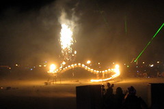 (image by antagonist, found on Flickr)
Starry Bamboo Mandala
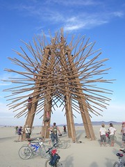
It was hard to beat this piece for pure visual elegance. Beautifully made and looking like an immense 3D arabesque on legs, the mandala was a pleasure to look at, lean on and touch. We visited it in the dark, when it looked like a silent sea urchin-themed sentinel, still guarding the now-dry lake. Great stuff.i.t.
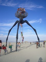
This years' entry in the "most likely to maim a hippie" interactive sculpture contest (won last year by Zach Coffin's Colossus). Michael Christian still rules the biomorphic monumental sculpture world, whimsically creating ever-greater pieces out of bent pipe. The BM theme this year was "Hope and Fear, the Future", so this piece is Michael's vision of the monsters from War of the Worlds, but with festival participants taking the role of the alien. An homage to Louise Bourgeois by way of 1890s science fiction.Hope Flower and Fear Trap
It's kind of amazing how a giant flower made of lace wrapped around a snorkel lift can express pathos, curiosity and profound alienness at the same time, but these did. Liz and I spent a long time pulling and prodding the things and marveling at the great cleverness of the design, but the real magic came from the way that they were operated, like 100-foot-high puppets. These were everything that an art car should be (i.e. not a car).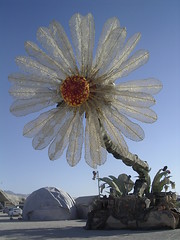 (image by giantmonster, found on Flickr)
Big Round Cubatron
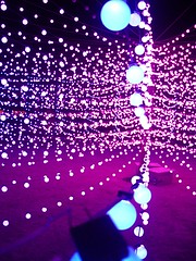
One of the best LED pieces I've ever seen. Using a modified commercial product and a sequel to one of my favorite pieces of several years ago (the Cubatron), it created a pure visual experience that was one of the most intense things I've seen. The artists also provide an excellent description/log of the technical details.
Burninator II
Another computer-controlled propane piece, but with a much different focus than the Serpent Mother. While the Serpent Mother created a character, the Burninator II was pure technology, and kind of scary technology at that. Propane poofer fires are an old Burning Man technology: a liquid propane tank with a regulator fills an expansion vessel with a valve and a pilot light; when the valve is opened the propane rushes out of the expansion vessel and makes a big whoomp sound and fireball. By themselves, they no longer surprise (though they're still fun to operate). What makes Burninator interesting is the magnitude and the effect created by the computer control. The sequenced fire, which created a whomp-whomp-whomp sound as the poofers were triggered looked like it coming right for you, even though it was shooting straight in the air. The combination of sound with the impression of impossibly fast speed made it much more impressive than just a bunch of propane fire cannons.
 (image by SoopahViv, found on Flickr)
Venus Eye Trap
I'm a sucker for good inflatables. This one was particularly whimsical and beautiful.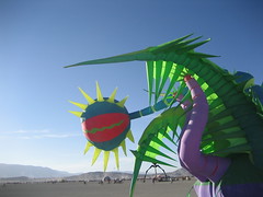 (image by jesseehull, found on Flickr)
Bikes w/Triklits LEDs
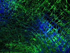
I don't know the name of the people who did these (I suspect the Big Round Cubatron camp) or what they're called, but there was a group that used the same pingpong ball lights that are made by the folks who made the Cubatron, dangling like grapes from umbrella-like trees hanging from the back of bikes. When the whole group rode around, it was great, but very difficult to photograph.Kites
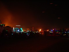
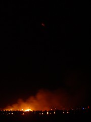
The white kits flying at night during the burns were eerie and moving, like ghosts or (to continue the theme), aliens. Again, it was difficult to photograph them, but you can see them hanging on the right in this photo:And this particularly ghostly one at the top of this photo:
Neverwas Haul
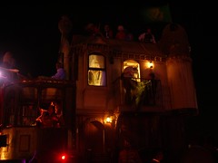
Possibly the best art car ever. A Victorian house on wheels, staffed by people in period dress riding a Miyazaki-meets-Verne hallucination that's (according to their documentation) a criticism of the cultural blindness that technology enables. Beautiful workmanship and another marker in San Francisco's current love affair with making actual steampunk devices (as a return to the origins of Modernism? As a reference to pre-petroleum energy technology? As nostalgia for an era of technological optimism? All of the above, probably.).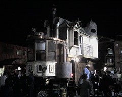 (image by molitov, found on Flickr)



This first time burner enjoyed your thoughts on this year's Playa art. You didn't mention one piece that I thought was so beautiful in its elegance and simplicity. I think it might have only been up for one night but I'm sure I saw it (didn't I?) Someone hung a string of white twinkly lights from a black helium-filled balloon. The lights hung in a perfectly straight line from the almost invisible balloon to the ground or people were allowed to manipulate the string so as to form ripples going up and down the string. It took a while for me to notice that the balloon was actually tethered by another cable to some far off spot in the dark so the string of lights was not the anchor and therefore hung loosely to the ground. From far away or even up close, it was a gorgeous sight.
Thank you for clearing all that up, Carl. Being an observer from the west coast, I didn't know the details and it's good to know the relationship between the various players.
And thank you for all the excellent work. I didn't mention SoLA in this review, but it was one of my favorite pieces in 2005 and again this year.
The connection between pieces like Tensor and SoLA is much closer than you may realize: key parts of the hardware in both cases were actually salvaged from the same commercial source by Kevin and myself. Since you were "admiring his work for a number of years" then you were originally admiring OUR work - we were co-creators of that art for several years, as clearly attributed on Kevin's own webpage. Unfortunately, he had a tendency to say "I" when he should have said "we", and I am constantly reminded that many people came to believe he created it all on his own. The fact is I was the one who first got him into LED art, when he helped me with my first big LED project in 1999.
We each went off to do our own solo projects after some years, but we remained friends and still occasionally exhibited our old work together.
It is rather painful for me that he refused to visit SoLA in 2005, and a bit ironic since a portion of the salvaged hardware (an Ethernet-to-DMX translator) was actually his design. But I can tell you that the original vision for SoLA came from people who weren't familiar with Kevin or his work. Having also talked with the creator of Cubatron, I'm pretty confident he was on his own path dating back some years as well. Innovators and visionaries often work in parallel or converging tracks. It's not always a case of one pioneer blazing a trail for the rest to follow, though I can understand how you might have come to perceive it that way.
Your concise art review is nice, all the same.
Pat: thanks for that update. I had heard something like that, but it's good to get the details.
Ray: I can totally see what you're talking about--it wasn't as resonant as it could have been (why a snake?), but I think the scale--and the fact that it's an artist-driven, rather than a theme park engineer-product (with the similar lack of budget) makes the Serpent Mother very impressive. Ironically, the people who did the fire garden and the people who did the Serpent Mother are the same people. Illumination Village is the Flaming Lotus Girls' camp. ;-)
PS I really liked the placement of the big pieces this hear. It was a voyage of discovery to ride out from the man, stopping first at the Temple, then the Belgian Waffle (while I was there, a burner got big laughs by quipping loudly, "We like your waffles!"
The big surprise, however came when I saw Starry Bamboo Mandala for the first time while looking further out on the playa from inside it. As it was completely obscured from the Man by the Waffle (and I hadn't looked at the art map yet), I hadn't known the Mandala piece was there until that moment, which resulted in an audible, "Wow!" from me.
Nice rundown on the art, Mike.
I have to say that I was a bit disappointed by Serpent Mother. To me it seemed too slick, like something from a theme park FX crew, and simultaneously not very interesting, sculpturally. It puffed fire a lot and as such consistently attracted crowds, but that doesn't make it good art.
For fire art, I prefer low-tech, with organic-looking, hand made structures. Case in point, the walk-through fire garden done by Illumination Village(?) in 2002, which I thought was really captivating.
I am no luddite, though, and have nothing but admiration for both the Cubatron and Big-Flower-on-a-crane folks.
Hey, I just wanted to correct you on The Waffle. The entire structure was built using lumber which would have been burned, because it was too cheap to sell on the market. (Grade C?) They also DONATED all of their heavy equipment to Black Rock. They tried to bring in 4000 liter beers from home but, get this, customs wouldn't let it through. They have a blog here:
http://www.uchronians.org/
Anyway. I thought it was wasteful too, until I heard the story about it. These guys were amazing.
Great art this year. Steam engines, victorian house, flaming serpent, the belgian waffle made out of belgian fries. It was nice to just hang out on the deep playa for hours away from the city. I couldn't get enough. I wish some of those art pieces would stay there. They would sink down years after years looking like remnants from the last party before the apocalypse.
For a few short films about the Flaming Lotus Girls and more check out:
http://www.madnomad.net/menu/index.php?iframe=film
thx!
Thanks for your nice post about the art at burningman. I had a great time. This was my first time to see the man burn and I am so glad I went. It is really hard to put burningman into a picture.
About Bikes w/Triklits LEDs... I got a good pic, you can use it on your page if you like.
http://www.deviantart.com/deviation/39449798/
excellent commentary...glad you captured it all.