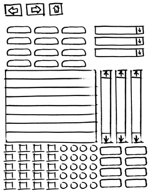
We're going to be doing some paper prototyping in the workshop that I'm going to teach tomorrow in Calgary (we're working from Carolyn Snyder's excellent book on the subject). So people wouldn't have to make every little button from scratch, I decided that it may be useful to have some basic UI elements on a template that people could cut out. Not finding a template that looked rough enough, I quickly made my own. It's suitably rough. ;-) And, here, how you can use it, too:
It's a 70K PDF and all the elements are oversize, so that it's easier to write in/on them. Have fun and let me know if it's of any use.


I have used paper prototypes as well for complex layouts. I have done it since it is often faster to move around paper then move elements in Illustrator or other layout application.
http://www.smokinggun.com/view.php?id=22
(If you want to view this with the accompanying text you have to go into the site. Bad site architecture.)
I see what you're trying to go for now, and that makes perfect sense.
We do a similiar approach when brainstorming branding and design concepts in the sense that *nothing* gets thrown out no matter how dumb it may seem.
You never know if sparks a train of thought that leads to something better when whittling down the concepts to a manageable scope. All part of the process.
Adrian: Interesting idea. I'll have to play with that.
Brendan: the point is to make the elements look rough. I could have printed out the UI elements from Visio, or copied and pasted them from screenshots, but I wanted them to look rough so that it would reinforce the idea that this was a prototype.
The templates, and the paper prototyping process in general, seemed to work well in the workshop today. Everyone had fun and lots of prototypes were made in short order (5 in 15 minutes by one team). If people were worried about making things look "right"--which I feel that good-looking elements would have encouraged--they would have been discouraged from iterating and trying to make them work well.
Why not just print out the elements from Omnigraffle's palette? There are some excellent UI palette plug-ins downloadable from Omni's web site.
Cheers,
BG
I wonder if the magnetic sheets you can get for printers will let you use whiteboard markers on them? Then you could print a reusable set of UI elements that would also stick to a magnetic whiteboard.