Tracking the Flu

I got a flu shot yesterday because a friend of mine is sicker than she's been since high school and I figured I'd do my bit to fight the global pandemic. This morning I decided to see what the global pandemic was up to, and in doing so found the CDC's Influenza Tracking Reports, which have a nice week graph of where the flu is now. However, jumping between various graphs made it hard to see what was actually happening, so I decided to put the graphs side-by-side. That gave me the idea that they could actually be put on top of another, like an animated weather report, so I made this animated graph of how the flu spread across the country over in the last five weeks:

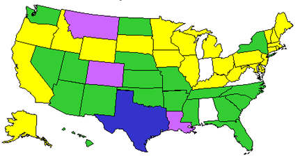
Sadly, the CDC graphs only look like they're identical. Whoever put 'em into the report every month actually uses a different size every time, so you'll have to excuse the ghosting. Also, I created intermediate images between each week's graph to ease the transition.

No TrackBacks

TrackBack URL: http://orangecone.com/cgi-bin/mt/mt-tb.cgi/28

Ads

Archives

ThingM

A device studio that lives at the intersections of ubiquitous computing, ambient intelligence, industrial design and materials science.

The Smart Furniture Manifesto

Giant poster, suitable for framing! (300K PDF)
Full text and explanation

Recent Photos (from Flickr)

Smart Things: Ubiquitous Computing User Experience Design

By me!
ISBN: 0123748992
Published in September 2010
Available from Amazon

Observing the User Experience: a practitioner's guide to user research

By me!
ISBN: 1558609237
Published April 2003
Available from Amazon

About this Entry

This page contains a single entry by Mike Kuniavsky published on December 6, 2003 10:44 AM.

Grafarc.org launched was the previous entry in this blog.

Matt Gonzalez day in the Mission is the next entry in this blog.

Find recent content on the main index or look in the archives to find all content.