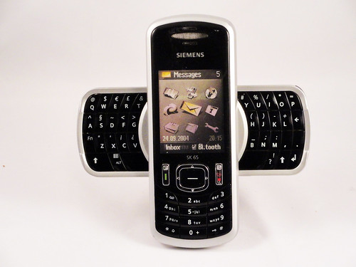
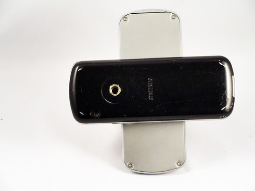
Of all of the standard phone form factors, swivel phones have had the least success. I can see why people try them--slicing the phone along its thickness provides nearly twice the surface area to work with--but the swivel mechanism has to be made very carefully (twisting wires and contacts around is a notoriously difficult problem) and none of the individual surfaces end up as big as a slab phone. At that crucial pre-iPhone era where functionality was commodified, however, exploring form factors was seen as a good way to compete. RIM was one of the biggest competitors, and they owned the phones-with-keyboards market, but their keyboards were relatively small. Siemens must have decided that they had an opportunity to use the swivel form factor both to visually differentiate their phone and to create a better, bigger keyboard without impacting the overall size of the phone. In a unique design decision in all phone design (as far as I can tell), they came up with this awesomely wacky X-shaped design. It actually works pretty well, but it feels huge when open, which phones are not really supposed to do (they're, for the most part, discrete devices, even when used publicly), plus it's unclear whether the bigger keyboard adds enough to justify the overall increase in size. Still, after the 2003 70s sfi-fi craziness of the Xelibri phone line, it's actually a somewhat sedate design.
A phone a day: Siemens sk65 (2005)
No TrackBacks
TrackBack URL: http://orangecone.com/cgi-bin/mt/mt-tb.cgi/388


