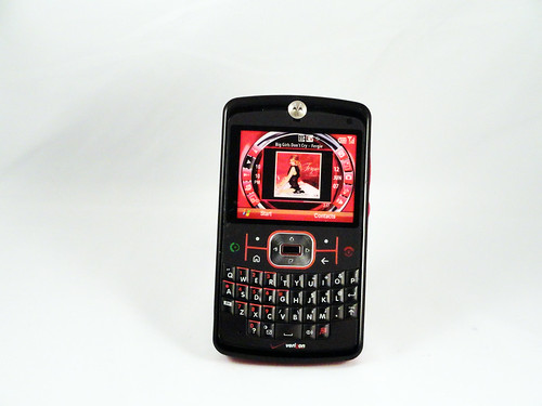
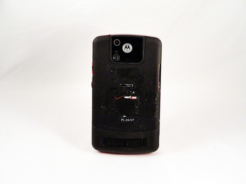
I admit my eyes begin to glaze over with the quantity of me-too generic phones, but past the repetition there's always something interesting. Every phone is an attempt by a company to compete with others making very similar products and to simultaneously advance their own design and manufacturing. Seen from the ground-level, these micro-level incremental changes become significant. Every single device is the product of many people's best work to outdo their competitors and themselves. This phone, which superficially is identical to Samsung's phone from the same era that I profiled a couple of days ago, is trying to do several different things. Both are trying to chip away at RIM's (then) dominance of the business texting market, so their basic form is the Blackberry. With this phone, however, Motorola decided to do two different things: use Windows Mobile as the operating system and create a new visual interface for what they considered the commonly-used functions. Here's a close up:
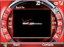
Motorola historically made much more interesting (read: better) hardware than they did software, and this again proves the point. I would list the usability issues with this, but a blog post review from the era already summarized it well:
We will dispense first with the Q9m's highly advertised "Exclusive Multimedia Home Screen." This is, without a doubt, the most ill-conceived home screen I have ever seen. The iPod Shuffle has a better visual interface than the Q9m.For starters, none of the buttons are labeled properly and there are not descriptions on the screen (tooltips, etc.) of what any of the buttons do. The icons are arranged in a circle, which makes navigating using a directional pad an adventure because nothing is intuitive. It took me a total of two minutes to fully appreciate just how bad the home screen was. Fortunately, the phone (unlike earlier Verizon cell phones) allows you to turn off the terrible interface and switch to the standard Windows Mobile interface.
