November 2006 Archives

A group in Switzerland has been doing some interesting experiments with technology embedded in everyday objects that helps people use those objects. Two of their papers were mentioned on Engadget and I enjoyed what they had to say. One paper, Instructions immersed into the real world–How your Furniture can teach you (160K PDF) was presented at Ubicomp 2003; the other, Towards Situation-Aware Affordances: An Experimental Study (240K PDF) was presented at Pervasive 2004. Though their field is giving instructions in the everyday environment, their platform is flatpack furniture (aka IKEA):

If the user takes a wrong action, a red light pattern appears reporting a mistake. Additionally, a green flash pattern shows the right alternative. After boards have been aligned together in the right way, individual green lights direct user’s attention to the holes where the screws have to be inserted and tightened. Once the final assembly state is reached, synchronous flash patterns on all LED’s indicate that the task is finished.

Their results present some comparative experiments with the LED-augmented shelves versus the standard instructions. Their results pretty uniformly favor the augmented version:

[...] there is a measurable time gain when using LED based instructions. [...] errors during assembly can be reduced using instructions in the right place. [...] determining which part fits where is one of the main problems using today’s instructions. [...] 75% of the participants found that the LED based instructions help with exactly this problem.

They also provide a good comparison (in the 2003 paper) of embedded technology versus other kinds of technological approaches:

[Augmented Reality] is cumbersome and typically computationally expensive. Audible instructions offer a cheaper way of immersion but have to tackle with the problem of addressing the appropriate parts by a vocabulary the user is familiar with or has to learn before. There is the possibility of presenting information on a screen [...]. However, the integration of instructions with the task remains unsolved.

Of course it's unlikely IKEA's margins will allow it include this kind of technology in their furniture in the future, but it's an interesting example of how cheap (relatively, by hardware standards) can be used to augment everyday tasks and how furniture can be the conduit of that. I'd also be interested in some exploration of what the embedded technology can do in the furniture after it's been assembled. I've posted about smart bookshelves before and ThingM will be posting about them again in the near future, so this is particularly timely.
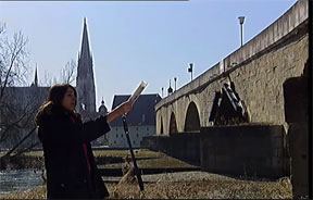
Researchers and designers at Aachen University and the Swiss Federal Institute of Technology have a magical user experience design project called REXplorer. As described in their paper entitled REXplorer: A Pervasive Spell-Casting Game for Tourists as Social Software,

REXplorer is a pervasive and mobile spell-casting game designed for tourists of Regensburg, Germany. The game platform blends location services, mobile photo and video blogging, and phonecam-based interactions to create a fantasy world that brings the history and culture of Regensburg to light. REXplorer applies mobile social software concepts to enhance the game and tourist experience.

They go on to describe the game:


The basic premise of the game is that the historic buildings of Regensburg have magical spirits, secrets, and treasures locked inside of them that can be unleashed with the proper magical spell.

Magic spells are cast with a wand that consists of a mobile phone in a plastic shell, which is running custom software that uses gestural recognition of the motion of the video from the phone's camera to identify certain basic movement shapes, which then invoke "ghosts" that talk about the city's history. The game aspect takes the magical metaphor to a greater extent than I've seen before:

[...] players hear voices from magical spirits trapped inside the buildings through their magic wand (the loudspeaker on the smartphone). If they cast the spell incorrectly, the spirits will be disgruntled and uncooperative. If they cast the spell correctly, the spirits will open up to the participants and divulge stories from the past that contain elements to help lead them on their path to master wizard. Participants may also need to duel against other participants in a spell-casting battle to achieve their goals.

It's a great, thought-through and exciting project. The use of magic as a interaction metaphor in a Medieval town as the backdrop is perfect. Judging from the video, the technical execution is also impressive. Great stuff.

I'll be updating my Magic in UX bibliography momentarily.

Technorati Tags:


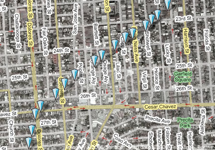
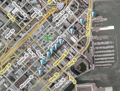
(click for interactive version, courtesy of Platial)

Stewart Brand talked about how building learn, and defined a set of what he called shearing layers. The bottom-most layer of his shearing layers is "Site," which states that the site is eternal. That's certainly true, to a point. Dubai's The World is not an eternal site: it's being built right now, and much of San Francisco is on landfill. However, eternal or not, once the boundaries of site are defined, it's very difficult to change them. Many Italian towns, such as Siena, still show the traces of the Roman coliseums that dominated their centers two thousand years ago, even though the coliseums and the buildings all around them, are long gone.

Modern cities have this, too, and they learn at an urban level. I decided to follow up on an observation my friend Jim made some years back. He told me that you could see where the old railroad right-of-way used to pass through his part of the neighborhood we both live in. San Francisco used to be dominated by railroads which, probably much more than the Gold Rush, built the city in the 19th century. However, throughout most of the 20th, these railroads have been systematically dismantled. Generally, they were dismantled after neighborhoods had grown up around them, and as the railroads sold off the land where track used to lay, the pieces they sold were not necessarily in line with the SF street grid. Even through as much as 100 years may have passed since a right-of-way was sold, undoing all the funny shaped pieces of land is difficult and expensive, so developers build in what's available. What you get then, and what's visible from a satellite map, is a picture of the paths which used to snake through San Francisco, defined by connecting the dots of funny-shaped buildings.

I've made two of these Urban Palimpsests, as I'm calling them, using Platial. The first (on the left, above, of the SOMA area of San Francisco, where I used to have an office. The second is of the area that Jim talked about, tracing the path of a big rail spur through much of the Mission.

I've found several other such railroad palimpsests in the city, each of which reminds me how some decisions are imperceptibly permanent and how the most seemingly permanent things are sometimes temporary.

I rarely voice my opinion about things that are outside the usual design/computing/social effects axis, but--hell--it's a blog and occasionally something outside the usual topics deserves mention. Take, for instance, the current health insurance situation I find myself in. I'm a member of the AIGA (American Institute of Graphic Arts), largely for the health insurance benefits they provide through their membership in TEIGIT (The Entertainment Industry Group Insurance Trust). Now, apart from the occasional amusement of thinking that designers are entertainers, or that I'm sharing insurance coverage with starving actors, I rarely think about it and pay my quarterly premium and move on.

Now, here's the problem: TEGIT gets their insurance from CIGNA, an insurance company; CIGNA just decided to "recalculate" the premiums that the Trust pays and discovered that they've been charging freelance graphic designers and starving actors far too little. They send TEIGIT a note to that effect, and TEIGIT sent me a note. Here's TEIGIT's description of CIGNA's actions and their response (which, reading between the lines, is a combination of shock, panic and anger--all of which I sympthize with):

The revisions and recalculations have resulted in enormous rate increases for some of our Cigna groups. California rate increases average over 82%, with some increases as high as 254%. We met with our Cigna representative, and protested the new rates. We are also pursuing legal avenues and we are contacting the Governor’s Office and the Department of Managed Health Care. Please join us in protesting the rate increases by contacting your elected representatives.

(you can read the whole letter [100K PDF], which TEGIT kindly sent me in electronic form)

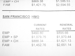
Basically, CIGNA decided that everyone needs to pay between roughly two and three times as much for their health insurance as they currently do, which is already a lot. What does that look like? Let's take a look at CIGNA's provisional rates for San Francisco:

(EMP = employee, SP=spouse, CH=children, FAM=family)
These are per month. Let's do the math. This means that I, EMP, will pay $10800 per year for health coverage and a family pays $32000 per year.

That, bluntly, is an outrage. I urge you to follow TEIGIT's advice and contact a representative and the Department of Labor's Employee Benefits Security Administration, the organization responsible for (I believe) regulatory oversight of health insurers nationwide. Tell them that these terms are absurd and likely designed to either kill TEIGIT in California or force them to move to another insurer, which seems like a kind of corporate blackmail or, certainly, bordering on the illegal. Official investigation by the regulators responsible for monitoring the behavior of insurance companies seems to be in order. Me? I'm looking into health insurance brokers, and I suggest the AIGA do the same: TEIGIT may not last, and graphic designers need insurance.

PS: I realize that the whole health industry in America is skewed, and that in exchange for fast access to technology and strong personal protection laws we have, in a sense, chosen to sacrifice a lot of our money. But this is ridiculous.


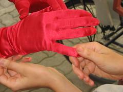
(images (CC), found on Flickr; by Huro Kitty, Sue Richards, Pernell, (C) David Fred)

If you look at the articles in the Ubicomp conference proceedings, you'll find them dominated by location sensing and tracking. Clearly, ubicomp is still about figuring where you are in a space. But what happens when you've done that? What happens to designing the user experience when you know location?

I'm trying to wrap my brain around what it means to design in this environment. Recently I tried to put some boundaries around the complexity with a simple powers-of-ten granularity scale. The goal is to define some classes of experience for which we can design and then assign a term to each class (from the words that regularly come up in discussions of ubicomp/ambient intelligence/geolocation, etc.). Basically, we may not know whether the fruit are apples or oranges, but at least we can say whether they're big or little.

This technique is, of course, indebted to two classics:

The scale

ScaleLabelExamples
1 cm covert RFID, nail polish, cochlear implant
10 cm mobile phone handset, portable media player, wallet
1 m personal chair, car, ATM, payphone
10 m environmental wall, door, chandelier
100 m architectural church clock, billboard, bus
1000 m urban street intersection, landmark, crowd

(note: I'm using metric units because, well, they're designed to work as powers of ten. I'm not playing favorites among measurement systems, because, well, I like the English system a lot because of its excellent pre-Enlightenment idiosyncrasies)

My goal is to create a user-centered hierarchy (rather than hardware-centric) as a way of talking about the perceived effects of ubiquitous computing technologies. In other words, this is an attempt to talk (roughly) about end users' radius of focus in the moment as a way to design for that moment. Thus, these granularities do not necessarily refer to the size of the device, but to the range of effect that device has and the task being investigated. For example, video projector control panels are on the mobile scale, but a big video projector's industrial design can easily be on the personal scale, while its effects are usually on the environmental.

Undoubtedly, like with any classification scheme, there are going to be plenty of things that fall in between, but this is a classification exercise, rather than an attempt to create a canonical classification.

I'm pleased to announce two exciting events, in the form of two websites.

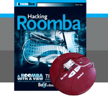
First is the appearance of Tod Kurt's Hacking Roomba book, and its companion site, roombahacking.com. Tod is my friend and business partner, but (that notwithstanding) I still feel the book is still an exciting statement about technology and people's understanding and access to it (and an a fun way to get close to an otherwise difficult subject, robotics). Of the many books about hacking software, and homebrew hardware, this is one of the only ones that focuses on a single, cutting-edge appliance.
For me, this is an important milestone. For many years the trend in device design has been toward less end-user access to core functionality because the incentives for creating clarity about device functionality decreased in proportion to the increase in complexity and price competition. Cheap component prices mean there's little reason for developers to let people other than the manufacturers access the core of everyday technological objects. Even appliances, which designers once labored to make easily fixable, have become nearly disposable. I was recently surprised when I opened a 1970s blender and discovered that it was made to be easily repaired: the individual parts were clearly marked with part numbers and positioned to be easily replaced.
iRobot, whose company culture grew out of the MIT hacking tradition, designed the Roomba otherwise. They included a serial port on nearly every Roomba, and then they revealed the protocol for talking to that interface. Tod was one of the first to jump on this opportunity and wrote an excellent, broad ranging book about how to use this port (and the Roomba as a whole) to explore the possibility of personal robotics. He especially focused on uses outside the typical "robot fighting" genre that the majority of hobby robotics energy goes to. He feels that robots can do other things than push each other out of circles, flip each other over, or be the first to score a goal. His Roombas dance, draw and make music. As Tod puts it, the hacked Roomba can be a lover, not just a fighter.


The second announcement ( which I alluded to above) is that Tod and I have started a company, ThingM (pronounced "thingum" as opposed to "thing em"). We started this company close to a year ago, but we decided to put up a site to coincide with the launch of his Roomba book.
ThingM is a design and development studio focused exclusively on ubiquitous computing. We have many hopes for the company, but my dream is to rethink objects in the age of ubiquitous information processing. I believe that information processing can be considered a new kind of material in design (this is the basis of my Smart Furniture Manifesto, and furniture is one of the "object genres" that we have been studying), and that tangible networked objects can be considered a kind of projection of services, rather than mere standalone entities. At ThingM we aim to create a new class of smart everyday objects that abandon the idea of computers as general-purpose devices with a screen, a keyboards and a mouse. Our goal is to change the fundamental nature of all designed objects using pervasive networking and computing. In this, ThingM can be considered a combination of an interaction design studio, an industrial design studio, an engineering consultancy and a software development house, but really, we're a ubiquitous computing studio. Expect to hear more from us in the upcoming months.

Thanks to Judith Zissman, who helped us envision and produce these two sites (in addition to doing much of the site design and production, editing and basically everything else). Her contribution was instrumental, as it was with the Sketching in Hardware conference over the summer (the first ThingM product, if you look at the bottom ;-). Sonia Harris talked us (really me) through a bunch of overly-nebulous ideas and overly-specific requests to design the ThingM logo. Thank you!

[and thanks to Phil Torrone for blogging Tod's book on MAKE!]

Ads

Archives

ThingM

A device studio that lives at the intersections of ubiquitous computing, ambient intelligence, industrial design and materials science.

The Smart Furniture Manifesto

Giant poster, suitable for framing! (300K PDF)
Full text and explanation

Recent Photos (from Flickr)

Smart Things: Ubiquitous Computing User Experience Design

By me!
ISBN: 0123748992
Published in September 2010
Available from Amazon

Observing the User Experience: a practitioner's guide to user research

By me!
ISBN: 1558609237
Published April 2003
Available from Amazon

Recent Comments

  • Katherina: Information not just material. In our days it is a read more
  • tamberg.myopenid.com: Hi Mike, totally agree on building the IoT in a read more
  • Mutuelle: Man is the reflections of his thought, some name it read more
  • Amanda Carter: You obviously placed a great deal of work into that read more
  • Molly: You might find it interesting to connect with return of read more
  • George: You might want to change "Size" to "form" for terminal. read more
  • Mike: Thanks for the reminder, Robin. I'm aware of that article, read more
  • Robin: It's a slightly different argument (it predates most work in read more
  • Tim: This reminded me of the Pleo video Mark posted awhile read more
  • michael studli: i was wonting to know is the game fun to read more

About this Archive

This page is an archive of entries from November 2006 listed from newest to oldest.

October 2006 is the previous archive.

December 2006 is the next archive.

Find recent content on the main index or look in the archives to find all content.