April 2006 Archives

It appears that Sony was granted a patent in August 2005 on an optical magic wand idea. The description is for "an input device for interfacing with a computer" which "includes a body configured to be held with a human hand" that "includes a light emitting diode" that changes color in a way that "is capable of being detected" by "an image capture device." In other words, it blinks in a specific pattern that's detectable to a camera connected to a computer. I've heard of other systems that encode data into rapidly blinking LEDs (the most obvious is the infrared LEDs that power remote controls), but I think they're thinking of visible light. Maybe not, maybe it's all still IR LEDs, but the key is that it's detected by a general purpose camera, rather than a specialized IR receiver.

My prediction: soon, wands for everyone!

(The link to the patent is here and I was alerted of this by this New Scientist article.)

Why Magic Matters

I believe that as technology becomes increasingly embedded in people's everyday lives, their relationship to it becomes increasingly animist (though I'm using a definition of "animist" that's not strictly anthropological, but referring to an explanation of the working of the world as being primarily psychological, rather than physical).

As a designer, I want to know how to design for these expectations. Why not start by borrowing from a familiar and popular set of myths that offer a system describing the operation of the word which is somewhat animist, occasionally capricious, often controllable and tolerant of the occasionally unexplainable? Namely, the myth of magic. Magic can be an useful framework for describing many of the kinds of functionality that contemporary technology enables. Things such as: action at a distance, objects with memory, nonobvious behavior, etc. "Are you saying we should not tell people how things actually work and tell them it's magic?" That may seem like a pretty irresponsible move, but if the options are telling people nothing (as it is currently) with the hope they create the correct mental models for themselves, or giving them a framework that's known to be a fiction but serves as a conceptual umbrella for explaining the interactions between objects whose technology is (ahem ;-) indistinguishable from magic, maybe magical explanations will produce better experiences?

Others have talked about enchantment, especially John McCarthy of University College Cork, Ireland, who's currently editing an issue of Personal and Ubiquitous Computing on enchantment and published what's probably the earliest paper (1MB PDF) on enchantment in HCI.

[11/19/06 UPDATE: I wrote a more thorough discussion and compiled a bibliography of magic and user experience design.]

One of the most common everyday magical items in myth is the wand. Last year, based on some work I saw at IBM's NPUC conference, I realized that wands were possible using a combination of wireless tracking and gesture recognition. This weekend, I decided to make one, just to see what would happened. It kinda worked. Here, written on an ancient scroll I just wrote, is how you can reproduce my eerie results.

Thee yngredyentse

  1. A Mac running OSX
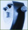
  2. One Gyration "air mouse". This rare beast (found mostly in Froogle) is the key ingredient. It's a mouse that has a gyroscopic internal organ that senses the mouse's orientation. There are several other accelerometer-based mice, but this one seems to perform better, especially with broad arm movements (although it doesn't work well as an actual computer mouse in that situation: to use it as a pointer mouse you need to keep your arm still and just move your wrist).

    (an Amazon link, though you can get them cheaper refurbished)
  3. USB Overdrive, a universal OSX USB human-interface device driver
  4. Quicksilver, the universal launcher utility
  5. The Abracadabra plugin for Quicksilver. There is a good set of instructions for how to use the thing, but for some reason I couldn't download it from within Quicksilver. If you have that problem download it here and then drag it onto Quicksilver to install it.

Thee yncantationne

Here's how you put it all together.
  1. Install the mouse. As a USB human interface device, this means "unpack and plug it in." OSX may ask you to verify a phantom keyboard because the mouse base station (which, in the case of the mouse I bought, is huge--Gyration, wassup with that?) announces itself as both a mouse and a keyboard. I got the mouse without the keyboard, so I just closed that window.
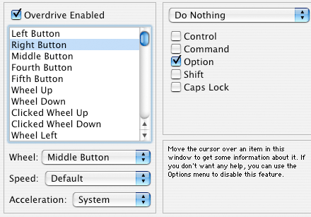
  2. Download and install USB Overdrive. Restart. Open your System Preferences and set it up so that the right mouse button on the Gyration mouse does nothing but hold the Option key down. Your USB Overdrive control panel should look like this:
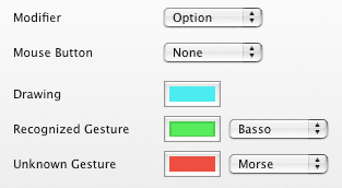
  3. Set the Quicksilver Preferences and modifier to match the one you set for the righthand button in USB Overdrive. Your Quicksilver Preferences should look like this:
    You may want to set sounds at this point, too, since apparently Abracadabra has problems without sounds.
  4. Set the mouse tracking to minimal. Go to the "Keyboard&Mouse" control panel and move the mouse tracking slider all the way left. This is so that the gestures you make in the air do not get distorted by the operating system, which normally makes tracking proportional to movement speed (normally, as you move the mouse faster, the cursor moves proportionally farther). It should look like this:
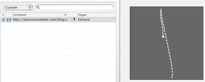
  5. Set a gesture-based trigger in Quicksilver as per these instructions. Keep the gestures simple. I'm still experimenting, but basic back and forth lines seem best. Circles are doable, but hard to master. Maybe this is where the fabled practice all young wizards have to do comes in: you need to create gestures that are useful AND you need to learn how to perform them successfully. THAT, I leave up to you, but here's a basic one:

Now you have the basic ingredients for a functional wand-like device that runs under OSX using mostly free software. Grab the index finger trigger and push the right mouse button on the Gyration mouse, and wave it in the the air (you don't have to wave it at the computer screen, that's part of the fun). Enjoy the magic.

Commentarye

Quicksilver's gesture recognition software isn't the best (it's not like the IBM SHARK stuff I described earlier), but it's better than other alternatives that I've seen. And, because it works with Quicksilver, that means that there's a large library of knowledge about actions that can be triggered with the gestures. To me, the most interesting possibility, and one that I'll be playing with, is that Quicksilver can issue arbitrary commands, including command-line input to software that can control things back in the "real" world. Command-line input to Processing or NADA, for example, will allow easy magic wand control of things like, oh, Roombas, lights, giant mechanical beasts or teleporters. Hide the computer, disguise the mouse, and action at a distance is yours. Kinda.

[Update: it appears that my use of Abracadabra for this project is not an accident. I tried a number of different systems before settling on it and it just seemed right. According to this blog post, that's because a CMU student named Jason Cornwell developed the software for a class, in order to do just this, i.e. to make a magic wand using a gyroscopic mouse. I haven't found any documentation of the project online, but Blacktree acknowledges that he had a hand in making Abracadabra. Thank you Jason!]

[Update 2: Tod Kurt, my business partner in ThingM, took the initiative and blogged what he saw when he took the Gyration mouse apart.]

[Update 3: I expanded my thoughts extensively on the "why magic matters" section of this post in a talk I gave on 10/11/06.]

A public thank you to Phil Torrone of Make, who keeps talking about Tod's bluetooth Roomba hack, and the many various uses he's come up for it. This week, he's gotten it on Valleywag, and on the G4 game channel (click on "Launch the Pile" to see the video). In the G4 video he also namechecks Graffiti Reseach Lab, who are pals of Liz. Go Phil, and thank you for being an evangelist.

Colors

Color is important to me, so I pay a lot of attention to the colors people are using. Two years ago it was orange and Japanese-inspired earthtones (though not together). Last year it was apple green, maybe because it complemented the previous years' orange. Light blue made an appearance, too, since it worked well with the chocolate browns that went with orange and apple green. This year there doesn't seem to be a major single color trend. Some people have gone back to the safety of orange (so to speak), and maybe it's becoming the de facto "third color," which has traditionally been red.

IMGP8239.JPG IMGP8272.JPG IMGP8284.JPG IMGP8426.JPG IMGP8596.JPG

There's also plenty of green, but it's been greyed (grayed?) down from its most exuberant bright variations last year, which looks fresh at first, but I can imagine start to be too intense when there's too much of it. The interesting thing is that in greying apple green down you kinda get the dreaded…AVOCADO! The revenge of the 70s is now complete.

IMGP8267.JPG IMGP8269.JPG IMGP8289.JPG IMGP8294.JPG

However, the industry has not totally lost its interest in color. The general concept of "color" however is still pretty popular. Groupings of basic primaries and secondaries appear all the time, not unlike the days following Apple's initial iMac introduction (though this may be an artifact of trying to make a display interesting even though 99% of what you sell is in traditional basic black, white, chrome, grey or whatever).

IMGP8270.JPG IMGP8382.JPG

One of the most interesting manifestations of this multicolor approach was in the office furniture section, which had as its theme "wellness@work". I don't know what they meant by that, and it wasn't obvious from the furniture displayed, which was all pretty familiar, but the idea it seemed to be trying to communicate is that work life is better if it looks more like kindergarten. I'm dubious.

IMGP8279.JPG IMGP8280.JPG IMGP8281.JPG IMGP8286.JPG

Edra, consistently one of my favorite manufacturers, had excellent, subtle taste in bold colors, something that's hard to pull off.

IMGP8314.JPG IMGP8308.JPG IMGP8309.JPG

The Shape

One unexpected trend was the appearance of a single shape as a motif. Maybe it's just that with so many objects, there are going to be lots of trends because there are only so many ways of making stuff and people reinvent the obvious ones repeatedly, but there was this ribbed barrel shape that I noticed a lot, and it seemed to be a genuine trend. What does it mean? I don't know. The rounded right angle corners that dominate so much design come from copying Apple (and what designer doesn't get easy inspiration by riffing off Apple?), from a desire to soften the edges of hard technology, to reference the 60s/70s vision of the future (the last time the future was still optimistic) and to identify with the bent metal pipes of Marcel Breuer's Wassily Chair, again referencing a positivist attitude toward the future and technology. These basket shapes are different. I think they come from Chinese lanterns, an organic and non-Western reference, which says to me that their designers are trying to evoke a new design language. Why? I don't know yet.

IMGP8325.JPG IMGP8384.JPG IMGP8510.JPG IMGP8568.JPG IMGP8614.JPG IMGP8417.JPG IMGP8450.JPG IMGP8477.JPG

This year, rather than posting a couple of giant posts about what I saw at the Milan Furniture Fair (as I did in 2005 and 2004), I'm going to post a series of smaller notes about the thoughts I had while at the fair. These are not going to be in any kind of priority, but mostly impressions I had as I was looking back at the photographs I took. Here's the first one.

The building

salone_fiere_pan2.jpg

The Fair used to be held in an old warren of buildings that had been built up haphazardly into a complex known as the Amandola Fiere. The new Rho fair building complex, designed by Massimiliano Fuksas, is much larger and cleaner and comfortable in many ways but (and you knew there was a but coming), I think it suffers from classic anti-personal Modernist excesses that I thought had disappeared in the 70s. It is not as desperately human-hostile as the worst excesses of 1950s monumental architecture, but it's definitely built with a good chunk of that kind of Modernist blindness to the user experience.


  • It's built around a single enormous aisle that connects all 20-some enormous pavilions, which means that there are crowds and bottlenecks at the single path through the space.
  • There's no rapid transportation in it, so unless you know how to find one of the shuttle busses that careen through the outer parking lots, you have to walk what seems like miles (the place is huge and it takes maybe 15 minutes walking at a good clip to get from one end of the aisle to the other).
  • There are no obvious architectural cues for where the entrances are, and in fact the obvious places to enter it from the subway (how most people get there) is actually not an entrance, and guards have to be positioned there to direct crowds up escalators over a walkway and then down again to the real entrances.
  • Inside, among all of the pavilions, there's virtually no way to tell which one you're in.
  • The signage is all identically red and the repeating columns and flat perspective obscure any kind of perspective.

All this means that you do a LOT of walking, which makes the fact that there's no place to sit down that much more ironic, especially considering it's a furniture fair.

IMGP8229.JPG IMGP8230.JPG

That said, it's not nearly as chaotic as the old Amandola fairground and the facilities seem modern. Plus, I think that the major decorative elements--the giant blimp-like shapes that I think are conference rooms, the glass polygon-mesh roof and the wacky conical columns, are great.

IMGP8232.JPG IMGP8414.JPG

Fabio and I saw Fuksas walking around the fair, by himself, seemingly lost in thought in that "I'm a master architect" kind of way. I think there are some beautiful things about the new fair, but I hope he noticed how people were actually using the space, the trouble they were having, and then fixes it.

This has been making the rounds today: Max Dean, Raffaello D'Andrea and Matt Donovan's self-assembling chair. It's a really entertaining project. Why a chair?

First of all Dean and D'Andrea (I believe) did "The Table" five years ago, which is a great early piece of robotic furniture that followed people around in a room. That piece, I think, got at a lot of the ambiguous feelings people feel when encountering an animist relationship between themselves and something that looks familiarly inanimate (the artists carefully chose to conceal all the functionality in a traditional table design) but has behavior. There's a classic quote in the video for "The Table" that illustrates this: "I don't think it likes to be touched...Oh, I think it's just me."

Second, I think, chairs have a uniquely anthopomorphic relationship to people, anyway. They have four legs, like animals, and they look (for obvious reason), like sitting people. To see one fall apart is shocking because we don't expect furniture to do that with nothing near it (thus violating our innate sense of the physics of inanimate objects) and because there's a visceral raction to the image of something that's familiar and shaped like a person having their limbs fly off. Maybe that's too much projection, but I think that the initial shock, and the scene of the thing trying to pull itself back together elicit--and are probably designed to elicit--feelings that we wouldn't normally feel for a self-assembling object that didn't have such strong cultural and psychological connections. That's what makes it art, rather than design.

To me, the chair pushes the "uncanny valley of animism" button (excuse my mixed metaphor) less than the table, since it's more obviously mechanical, but it's still a great piece and an interesting exploration of the emotional relationships people have with their domestic objects. And it looks to be a great piece of engineering, too.

I returned from a week at the Milan Furniture Fair yesterday (I've put a large collection of unsorted pictures from the Fair on Flickr). It's my third year going to the Fair, and I always find it a fascinating experience. This year was special, because it marked the first time I was able to participate. Over the last four months I worked with Whirlpool's Global Consumer Design group and and Syneo to put together a book-length description of their in.home experimental design project.

Every two years for the last 4 years Whirlpool does a large-scale conceptualizing and prototyping exercise to examine and extend the limits of appliance design. The previous installment, in.kitchen was two years ago and focused on the kitchen. The one before that, Project F on laundry.

This time Whirlpool decided to try something different. Recognizing that the role of appliances is moving away from their traditional places in the kitchen and laundry room, they decided to explore a household of linked appliances. This involved two major shifts in traditional appliance design thinking: conceptualizing new devices for locations where they've never been and inventing ways that they could all interact as a system, rather than just as standalone devices. Whirlpool and Syneo created 11 new appliance concepts that they took all the way to physical prototype and installed at the Future Technology in the Kitchen exhibition at the Fair. To envision how these products would interact, they developed four use scenarios and had the prototype house "act" them out. The four scenarios represented (roughly) an active morning, a quiet morning, a busy evening and a quiet evening. Together we added specific details to each scenario to create an engaging narrative.

My contribution was as researcher, writer and editor of the book describing the project and contextualizing some of the reasons for why this kind of exploration is important. I can't include the book here here, but I extracted some pages from a draft and compressed them so they would be reasonably downloadable.

Here are:

[note: all of the images in these PDFs have been severely compressed to make for downloadable PDFs]

I think that the project turned out very well and I am really honored to have been able to contribute. Appliance design, as a concept, has the potential to be on the forefront of making domestic technology actually useful, rather than merely exercises in technology. Compare the concepts of "appliance integration" and "home automation": the first one describes the unification of devices that have specific functionality, with--presumably--a similarly narrow focus in terms of the purposes of integration; the latter is an abstract concept that implies that in "automation" in itself is somehow beneficial, without specifying what's being automated.

But I digress. It was a great project to work on and I'm very grateful to Whirlpool for initiating it and to Syneo for bringing me in.

Here are some pictures I took of the setup at the Furniture Fair:

IMGP8233.JPG IMGP8237.JPG IMGP8380.JPG IMGP8381.JPG

Ads

Archives

ThingM

A device studio that lives at the intersections of ubiquitous computing, ambient intelligence, industrial design and materials science.

The Smart Furniture Manifesto

Giant poster, suitable for framing! (300K PDF)
Full text and explanation

Recent Photos (from Flickr)

Smart Things: Ubiquitous Computing User Experience Design

By me!
ISBN: 0123748992
Published in September 2010
Available from Amazon

Observing the User Experience: a practitioner's guide to user research

By me!
ISBN: 1558609237
Published April 2003
Available from Amazon

Recent Comments

  • Katherina: Information not just material. In our days it is a read more
  • tamberg.myopenid.com: Hi Mike, totally agree on building the IoT in a read more
  • Mutuelle: Man is the reflections of his thought, some name it read more
  • Amanda Carter: You obviously placed a great deal of work into that read more
  • Molly: You might find it interesting to connect with return of read more
  • George: You might want to change "Size" to "form" for terminal. read more
  • Mike: Thanks for the reminder, Robin. I'm aware of that article, read more
  • Robin: It's a slightly different argument (it predates most work in read more
  • Tim: This reminded me of the Pleo video Mark posted awhile read more
  • michael studli: i was wonting to know is the game fun to read more

About this Archive

This page is an archive of entries from April 2006 listed from newest to oldest.

March 2006 is the previous archive.

May 2006 is the next archive.

Find recent content on the main index or look in the archives to find all content.