May 2010 Archives

I was recently at a bar with a bunch of other technology designers. The conversation turned to the postal service.

Problem: the US Postal Service is in financial trouble

America's postal service was partially privatized in the 1980s, so it needs to make about as much money as it costs to operate if it's to survive. It's having a difficult time doing that and has lost billions of dollars per year for the last several years, borrowing from the federal government to stay afloat. As the second-largest civilian employer in the US after Wal-Mart (that's a sobering statistic in itself, on several levels), this means that it has quite a bit of overhead, while being at the receiving end of two technologically-induced competitive challenges:
  • Casual letters have largely been replaced by email
  • And package delivery has to compete with FedEx, UPS, DHL
Moreover, these other delivery services don't necessarily have to honor the post office's mandated responsibility to deliver mail to anywhere in the US (this is called the "universal service obligation").

Proposal: the Postal Service should become the geographic DNS….

Here's what I came up with in the bar: the US Postal Service (USPS) needs to become the equivalent of the Domain Name Service for geographic locations. DNS is the digital service that translates human-readable domain names such as orangecone.com into IP addresses, such as 168.75.111.15.

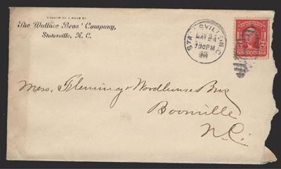
This, more or less, is exactly what the USPS already does, but it's still tied to the sender writing the actual physical address on the letter. However, as any recipient of a slightly mis-addressed letter that still arrived knows, the service is actually pretty good at figuring out where the letter is going. The USPS is already resolving ambiguous address data into physical locations.
It's been doing it for years:
(Image Public Domain from Wikimedia)
Why not make name-to-location resolution the primary role of the postal service?
For example, rather than having your address be "Your Name, 1234 Oak Street, Town, State, Zip Code" you could pay to have it be "Your Name, Town, USA." Microsoft could pay to have their address just be "Microsoft, USA." It works for "Santa Claus," why can't the USPS charge MS to make it work for them?

On the back end, the postal service could provide a number of routing services using the infrastructure they already have. The "Microsoft" letter could go either to a regional office or to a central location, depending on what Microsoft wanted to pay for.

…and charge for it.

This would create a market like the market for domain names, which is very lucrative and active, but—unlike the domain name space—the post office would own all of it. They could just set up a name registry like what GoDaddy does, let people register names and then regulate the secondary market, much as how ICANN manages domain names. For the same reason that I can't register mcdonalds.com, I wouldn't be able to register "McDonald's, USA," and if I did, then there would be an arbitration process.

Let's look at the numbers.

According to the 2002 US Census, there are approximately 6 million small businesses in the US that have employees (there are 18 million other firms with no employees). For the purposes of extreme simplification, assuming that the smallest businesses aren't interested at all (which is probably not all true). That leaves almost 2.5 million businesses with 5 or more employees.

Given this single figure, here are three scenarios:

  • Worst case: 1% of firms are interested in paying $100 a year to have this service. That equates to annual revenue of $2,500,000. Not bad, and could probably pay for itself, perhaps charging more than $100 for services for the largest firms (such as routing Microsoft's mail appropriately).
  • Median case: let's assume that 30% of the firms buy in. That's $75MM per year.
  • If 60% take it up, then that's $150MM per year.
That's just the businesses. If 1% of the 300 million US residents are interested in paying $10 per year, that's an immediate annual income of $30MM for the USPS. 30% adoption would generate another $900MM per year.

My point is that they could just copy the way that DNS works from a service design perspective to create a highly lucrative line of business that sits on top of, and uses the infrastructure of, the business they already have. A business with an enormous increasing ongoing revenue stream.

And then become the primary provider of geographic Point of Interest resolution

Moreover, once the system was established, it wouldn't have to be limited to just moving physical products around. It could become the universal digital way to resolve points of interest to physical locations. Many companies are busy building businesses around creating point of interest (POI) database. The postal service essentially "owns" all of the physical location data, and a lot of the POI data is probably already in their system, just not in a way that's been exposed to the world.

They also have an extensive network of people and machines (the largest civilian vehicle fleet in the world, according to Wikipedia) that could continually add to the database.

Then they could charge for bulk data rental for other services to build on this.
As the importance of location based information grows, the value of a USPS API will only grow, while the value of their primary business (moving stuff around) shrinks.

The USPS is a special organization that has a unique structure (part independent corporation, part government agency) which gives them a significant competitive advantage. They also have enormous resources for converting physical location information into data, and vice versa. They are also losing 4 billion dollars a year (1MB PDF). Moving atoms will only become more expensive as energy becomes more expensive. The USPS needs to start moving bits.
This is Part 4 of a pre-print draft of Chapter 3 from Smart Things: Ubiquitous Computing User Experience Design, my upcoming book. (Part 1) (Part 2) (Part 3) (Part 2) The final book will be different and this is no substitute for it, but it's a taste of what the book is about.

Last month I posted a draft of Chapter 1.

Citations to references can be found here.

Part 4: Sidebar: Too Much Metaphor, Magic Cap

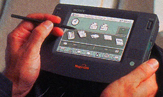
General Magic's Magic Cap was an early operating system for mobile devices. It can be thought of as an early attempt at a user-centered ubiquitous computing experience design. It is also an example of a product that followed its metaphor too far.


Sony Magic Link (Courtesy Sony)

Designed for portable, networked computing, the launch of Magic Cap in 1994 predated the Palm OS by several years. Magic Cap provided similar functionality to the Palm OS, but with one crucial difference: from the start General Magic had designed Magic Cap for networked communications. Both devices that ran Magic Cap, the Sony Magic Link and the Motorola Envoy, were tablet PCs with built-in networking (the Sony had a phone modem and the Motorola had an early wireless modem).

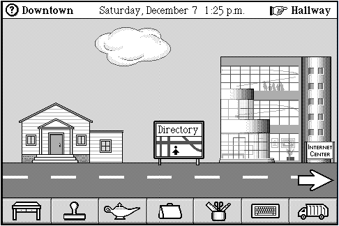
On the back end, Magic Cap's architecture used software "agents" written in a language called Telescript, which could run outside of the device to perform actions on the Internet and deliver results back to the user. [Footnote: Magic Cap mixed its metaphors, too, describing their software having simultaneously as "agents" (Tardo et al., 1996) and a "cloud" (Hendler, 2000) while using neither of those two concepts in the interface in that way (there is a cloud in the Downtown sky, but it is unrelated to the Internet, which is an office building).]

Key members of the Macintosh development team led General Magic. They decided to leverage their work on the Macintosh interface and extend the desktop metaphor to a networked device environment.


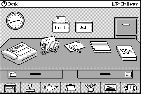
Figure 3-6: Magic Cap home screen.

The Magic Cap home screen (Figure 3-6) centers on an image of an office desk. It is a surprisingly literal interpretation of the desktop metaphor after a decade of mass popularity. Perhaps they zoomed out from the two-dimensional “desktop” view to emphasize how a portable, mobile device would move off the desktop and into the three-dimensionality of a real room.


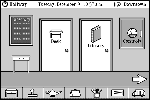
Figure 3-7: Magic Cap hallway.

However, the realistic, spatial implementation of an "office" metaphor constrained them further. Thus, users had to walk down the "hallway" (Figure 3-7) to access functionality located in different rooms.


Figure 3-8: Magic Cap Downtown.

The literal interpretation of the office building metaphor even produced a city street. The town center (Figure 3-8) had an Internet office building and a diner with a Web browser accessible through a movie poster. The interaction resembled a sideways scrolling adventure game more than an operating system for business users (Sony's target audience for the device).

It is difficult to say whether the decision to structure the user experience as an adventure through a software suite primarily caused Magic Cap’s business failure. It is clear, however, that the metaphor, and General Magic's literal interpretation of it, significantly constrained the design. Even in the early days of mobile device usage, the literalism may have hurt comprehension as much as it helped. Many screens required significant "signage" to explain what various iconic images meant. Other icons, such as the "magic lamp" icon located at the bottom of every screen, simply did not make sense within the town center metaphor.

Extending the desktop metaphor to buildings may have seemed like a good idea initially, but it became increasingly baroque in its details. Ultimately it turned using the operating system into a long walk through an unknown city full of confusing signs, which is possibly the least magical experience of all.

Next Month: Chapter 6, Information Shadows

This is Part 3 of a pre-print draft of Chapter 3 from Smart Things: Ubiquitous Computing User Experience Design, my upcoming book. (Part 1) (Part 2) (Part 4)The final book will be different and this is no substitute for it, but it's a taste of what the book is about.

Last month I posted a draft of Chapter 1

Citations to references can be found here.

Part 3: Designing with Metaphors

Metaphors are complicated tools. They inspire us to make new associations and can communicate complex ideas quickly, but they also constrain thought. Connections that may make sense in the metaphor's source concept may not exist in the target. For example, Netscape's Navigator browser provided little guidance on how to reach a destination, like an actual navigator would. If its exploration metaphor is interpreted literally, browsers are more like boats, and search engines (which, coincidentally, little resemble engines from a user's perspective) are the navigators. As documented by Blackwell (2006), the history of metaphors in interaction design has gone through boom times -- the 1980s success of the desktop metaphor -- to times of extreme criticism and failure (the infamous Microsoft Office 97 paperclip). [Footnote: Blackwell (2006) is indispensable for those interested in the history and cultural role of metaphor in human computer interaction.] Despite the criticism, however, metaphors remain powerful and valuable tools. They are one of the most straightforward ways to tap into existing knowledge to create a familiar narrative out of novel functionality.

This chapter provides a set of benchmarks for thinking metaphorically about ubicomp UX design. If the assumptions behind a project recall one of these metaphors, it is possible to ask the following questions about the design metaphor as a way to understand the project's limits and possibilities -- and your own as a designer.


  • What is the comparison that this metaphor is making? What class does it say that the design and the metaphor belong to?

  • What is the list of tools and activities associated with the source concept? How would those map to the experience being designed?

  • What are the visual images the source concept evokes? What are the interaction patterns that it implies? Are there necessarily positive outcomes to those patterns? Negative ones?

  • What is the purpose of using the metaphor? What exactly do you need it to accomplish? What associations is it supposed to evoke and what actions will the metaphorical associations make easier?

  • What are the boundaries of the metaphor? At what point do the differences between domains become so great that the metaphor hurts more than it helps?

Sidebar: Dan Saffer's Guidelines

The following guidelines from ubicomp designer Dan Saffer (2005) provide a sequence for approaching the design of interaction metaphors and designing with metaphors. It begins with a focus on the culture of use and ends with advice for identifying and discarding metaphors that are no longer valuable.
  1. Metaphors are cultural. Different cultures have different conceptual frameworks, especially about abstract ideas like time. Be conscious of differences when picking metaphors that span multiple cultures. Not only are metaphors culturally specific, but they can also be limited to specific audiences within that culture. If you do not have a desktop, the desktop metaphor could be meaningless to you.
  2. Metaphors are contextual. Be aware of the context in which the metaphor is used. What can work in one medium or domain may not work elsewhere. Unless you are deliberately juxtaposing for effect, metaphors within a product should fit the context in which they will be used. The subject matter of most projects will likely be rich with its own metaphors. Finding and utilizing them can make powerful connections between the product and its context of use.
  3. Fit the metaphor to the functionality, not the other way around. Metaphor should be a tool to help users comprehend unfamiliar content or functionality. So when using a metaphor within a product, start with the new, unfamiliar (to users) material you have and make that the subject of the metaphor, not the referrer. Awkward situations are more likely to happen when functionality is shoehorned into a metaphor. In the best case, metaphors should support concepts, not be supported by concepts or be the concept.
  4. Use metaphor to uncover otherwise hidden aspects of the material. While "banking is a game" might be an inappropriate metaphor when used inside a product, it could be a powerful metaphor to use during concept development to show what banking is not. And even perhaps what it is.
  5. Discard process metaphors when necessary. Metaphors that have been used in brainstorming or during the design process can grow constrained or simply be inappropriate for users. In some cases, it is better to have no metaphor at all than an inappropriate one.
  6. Do not let your metaphor ruin key features. Designers need to realize that all metaphors can obscure as much as they illuminate, and they should choose their metaphors so they do not obscure or distort key features. Microsoft╒s recycling bin in Windows OS is cute, but is less clear than a trash can or a dumpster would be.
  7. Choose metaphors that are appropriately scalable. The desktop metaphor has lasted as long as it has because it scales very well. Many varied tasks fit well into its framework; likewise, the folder metaphor. Other metaphoric choices (an envelope instead of a folder, say) may not have scaled so well. (On the other hand, using the metaphor of a workbench instead of a desktop might have supported many activities, not just working with paper.)
  8. Let your metaphors degrade and die. Once an appropriate metaphor is understood, it becomes nearly unconscious ("dead"), only to become apparent again with effort. Although this has been criticized, this is a good thing, as intermediate and advanced users should not have to bother with the metaphor and deal more directly with the underlying material. It is only inappropriate metaphors that continue to hinder more experienced users. This is, in fact, a good test for whether or not a metaphor is appropriate. Metaphors can be a double-edged sword.

The rest of this chapter are my own guidelines for metaphor design.

  1. Create Specific Metaphors

    To give the widest possible overview, the previous list organizes metaphors into very broad categories. In practice, metaphors for each specific project are much narrower. In deciding to make an enchanted object, for example, designers pick a specific magic item to emulate (say, a magic mirror). Then, the rest of the design process can move from the first principle that "in video conferencing the computer screen is a kind of magic mirror."

    Design decisions flow from this more narrow metaphor, but the broader metaphor provides guidance for how that specific experience fits into a larger set of ideas. If computers are invisible, for example, how do people know where they are? Are they just invisible to people, or also to each other? How does someone tell this specific information processing-enabled invisible experience apart from all the others? How do they know where one invisible computer ends and the others begin?

  2. Good metaphors describe function, not appearance


    Metaphors should describe deep functional similarities, not superficial resemblance. A well-chosen metaphor maps many of the experiential qualities of one kind of interaction to another. Magic wands in myth, for example, are swung around and pointed at objects to activate actions. The Nintendo Wii captures these qualities well, creating a relatively clear relationship between familiar stories and a new game controller. A game controller that looked like a traditional magic wand (glittery star on top, etc.) but operated like an ink pen would be simply confusing.
  3. Metaphors Imply People


    When we propose that a computer be presented as a metaphorical office or typewriter, one of the things we are really describing is the intended user of this computer, describing him or her as an office worker or typist.

    - Blackwell (2006)

    Metaphors establish not only ideas about the meaning of physical affordances and potential ways to use them, but also about the people involved. A metaphor communicates a set of roles for people involved in the device's use. For example, a digital device resembling a stethoscope implies that the user is similar to a medical clinician and that its intended use is diagnostic. If the device is not medical (i.e., rapid transit personnel use it to verify passengers' RFID passes), the mismatch can produce awkward misunderstandings. The transit workers may feel misrepresented by the device, and the passengers may worry about what exactly it is scanning.

    Schank and Abelson (1977) theorized that people reason about the world using expected sequences of actions akin to film scripts. Metaphors embody those scripts by affecting the design of an object╒s form and functionality. By linking the new to the familiar, metaphors communicate how people and devices should act together. Devices are props to carry out those scripts. (Yet another metaphor!) The more explicitly devices rely on metaphor, the more explicitly they reference known characters and how they behave. If the script referenced by the prop does not fit the needs of the people actually using it, or is unfamiliar to them, the prop will be less successful. Thus, the choice of the metaphor should start with the expectations, needs, desires, and actions of the people involved.

  4. Use metaphors to inspire, not constrain


    Almost any metaphor, even an arbitrary one, can trigger new ways of thinking about a product or new solutions to a design problem.

    - Saffer (2005)

    In the 1920s, surrealist artists invented a game of map misdirection. Using a map of one city, they would try to navigate another city. They would pick a destination, and simply follow the map. For example, a trip in Berlin using a map of Paris would end at a barber shop in the suburbs instead of the Eiffel Tower. In the process, apart from having some absurdist fun, they would learn more about both Berlin and Paris.

    Similarly, generating new ideas is one of the most powerful results of using metaphor to design user experiences. When mapping one idea to another, the differences between the two domains highlight aspects of both that might not otherwise be noticed. A "butler" device that can understand some spoken comments, for example, probably reaches the limits of its actual understanding very quickly. The designer may well imagine what an actual butler would do in a similar situation. The metaphor raises the question: How do people communicate when they do not understand a phrase, even if they understand each individual word? It also points to a new domain of functionality: more than speech recognition, the system might need to be presented more like a student with limited knowledge of a foreign language than a smoothly polite butler. Similarly, the system may need to imitate how people pause to think in a conversation as a way to explain pauses for processing.

  5. Use metaphors to explain, not hide


    Metaphors can help explain the functionality of unfamiliar technologies and inspire reflection on how relationships between people and interactive systems unfold. They are, by definition, a distortion of the capabilities and functionality of the technology they are used to explain. If not approached carefully, that distortion can hide vital aspects of the technology from users. The right level of concealment is highly context-dependent, as Saffer's guidelines point out. On one end of the spectrum, toys designed to stimulate the imagination of children can fully embrace the magical metaphor. Misalignments between what children believe is happening and the toys actual functioning are tolerable if they support open-ended, imaginative play. At the other end, airplane cockpit designers must confirm that any metaphorical relationship helps pilots respond correctly to changing conditions and is more cognitively efficient than a non-metaphorical design. Thus, interfaces that simulate hydraulic flaps but control a mechanism that is not actually hydraulic12 need careful evaluation to make sure that they really assist pilots.

Ultimately, metaphors may be most useful during first encounters with a new technology. Declaring that a new technology resembles a familiar one, even if that apparent resemblance is only skin-deep, may lower anxiety and help people transfer existing skills to a new tool. In the transition to a new tool, a few conceptual misunderstandings, or inefficient use, may be a small price to pay for reducing a normal reluctance to try something new. However, as the technology becomes familiar, the metaphor may lose its value. Eventually, the metaphor that seemed so helpful may start creating more problems than it solves. Where this point lies is unique to every product and every group of new users. Recognizing that metaphors have failed can be humbling, but metaphors, like all tools, need regular maintenance.

Tomorrow: Chapter 3, Part 4: Too Much Metaphor, Magic Cap

This is Part 2 of a pre-print draft of Chapter 3 from Smart Things: Ubiquitous Computing User Experience Design, my upcoming book. (Part 1) (Part 3) (Part 4) The final book will be different and this is no substitute for it, but it's a taste of what the book is about.

Last month I posted a draft of Chapter 1

Citations to references can be found here.

Chapter 3: Interaction metaphors

Part 2: A Catalog of Ubicomp UX Metaphors

Metaphors already form the conceptual scaffolding for many prominent ubiquitous computing projects and products. Though rarely labeled as such in the projects' description, user experience metaphors guide many assumptions about the projects' value, desirability, and how people will use it.

The following metaphors are ones that I have observed in ubicomp user experience design. This list is certainly not exhaustive and there are many natural overlaps in the concepts involved. I include it here to prompt creative thinking about how people relate to new technologies and how to design for them.

[Footnote: See Barr et al. (2002) for a different taxonomy of user interface metaphors.]


(Image from PICOL)

Organizational Metaphors

These metaphors describe ideas that include how systems of interacting ubiquitous computing technologies relate to each other and to the people who use them.
  1. THE FACTORY The world is a factory.
    Domotics can be defined as the set of elements that, when installed, interconnected and automatically controlled at home, release the user from the routine of intervening in everyday actions and, at the same time, provide optimised control of comfort, energy consumption, security and communications.
    - Bravo et al. (2006)
    Our kitchen supports the automatic generation of web-ready recipe pages, with other possible applications including actual cooking assistance, and communication or education across distances, cultures and generations.
    - Siio et al. (2004)

    The field of "home automation," for example, treats the house as a kind of factory by implying that repetitive activities should be automated to maximize production of leisure. In this metaphor, people own the factory. Their role is to act as overseers, organizing an efficient assembly line of appliances to produce ever more free time. The implication is that automation will automatically make more time for pleasurable activities.

    Most "labor-saving" products fall into this category. Their core assumption is that technology should and will eliminate repetitive actions.

    [Footnote: As documented in Cowan (1983), one of the unintended consequences of such technologies is that they tend to raise expectations, rather than eliminate labor. From an experience design perspective this could be because they do not try to address how that time could be filled, and whether the repetitive work is drudgery in the first place.]

  2. PUBLIC UTILITY
    Information processing is a utility, like electricity.

    If computers of the kind I have advocated become the computers of the future, then computing may someday be organized as a public utility just as the telephone system is a public utility.
    John McCarthy (1961), quoted in Garfinkel and Abelson (1999)

    From the earliest days, computing has been characterized as a new kind of electrification. Ubiquitous computing likewise continued to embrace it.6. The metaphor's implication is that information processing will be as accessible, in as many places, as electricity. In this view, the movement of computing out of personal computers is analogous to early twentieth century electrification of ordinary homes and workplaces, and will create applications as pervasive as electric lighting. In this metaphor, the walls and floors of the spaces we inhabit house conduits filled with information processing that enlivens devices as electricity powers lamps.

    Many telecommunications networks implicitly rely on this model of information processing by treating the traffic they carry with a neutral distance. The idea of "network neutrality" in effect demands that the Internet backbone treat packets as the electrical infrastructure treats electrons. Some electrons may heat a lamp filament, while others turn a motor. The electrical infrastructure does not differentiate in supplying them — it raises prices based only on aggregate network demand.

  3. BACK TO NATURE
    Ubiquitous computing returns us to a pre-industrial life.

    There is more information available at our fingertips during a walk in the woods than in any computer system, yet people find a walk among trees relaxing and computers frustrating.
    - Weiser (1991)

    This metaphor implies that technology and nature can coexist in a way that de-emphasizes technology to the point that it becomes indistinguishable from nature.

    [Footnote: Without, it should be noted, defining what "nature" is. See Marx's (1964) description about how American notions of pastoral coexistence with Industrial Revolution technology, the "Machine in the Garden," resulted in the disruption of American pastoral life.]

    Projects that use this metaphor emphasize the "organic" nature of interaction (such as Rekimoto, 2008) and the way that computers can free people to leave their offices to sit on the beach.

    [Footnote: It should be noted that one project that literally put computers into the forest. Ambient Wood (Rogers et al., 2004) focused on the educational possibilities of ubicomp technology outside the classroom, rather than attempting to create a pre-industrial landscape.]

  4. THE VAPOR
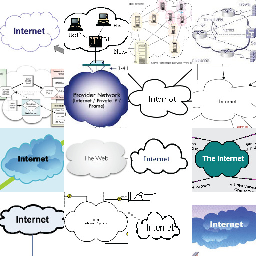
    Computation is a cloud that surrounds us.

    This metaphor compares the permanent availability of information and information processing to a vapor enveloping (and possible penetrating) every person and every object. Like Pigpen’s cloud of dust in the Peanuts comic strip by Charles Schulz, everyone perpetually moves within a cloud of digital information. The clouds extend beyond our reach and do not have a defined shape or boundary. Events that happen in the cloud may be outside of the control of any one person in it.

    Projects such as Urban Atmospheres (Paulos and Jenkins, 2005), Digital Aura (Ferscha et al., 2004) and Personal InfoCloud (Vander Wal, 2005) evoke this idea. The terms "pervasive computing" and "ambient intelligence" derive from this metaphor: in pervading an area, vapors process information ambiently.

  5. PARALLEL UNIVERSES
    Technology gives us access to a parallel universe with different laws.

    It [appears] to the user that the virtual and real objects coexist in the same space, similar to the effects achieved in the film Who Framed Roger Rabbit?
    - Azuma (1997)

    A vision of "cyberspace" underlies many views of Internet-based information access. In this vision, computers create, reveal, or possibly contain a parallel universe. Implicit in this vision is the notion that while technology may provide access to another universe, the universe exists independently of the technology. For example, the term "physical computing" implies that other kinds of computing are not physical, they are not here, which means that they happen elsewhere, perhaps a parallel universe. In this vision, the device creates a window, and beyond that window lies a radically different world with its own physics and geography. Science fiction gives us the canonical examples of this alternate space, from William Gibson’s original notion of cyberspace to Neal Stephenson’s Street in Snow Crash (Stephenson, 1992).

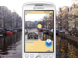
    Augmented reality applications often rely on this metaphor as well. When the screen of a mobile device superimposes digital images on a live camera feed, it is presented as a window on another world where, like Roger Rabbit's Toon Town, data and humans cohabit. Similarly, Hertzian space (Dunne and Raby, 2001) is presented as a parallel dimension created by devices using the radio frequency spectrum, and the term "physical computing" implies that other kinds of computing are not physical, they are not here, which means that they happen elsewhere, perhaps a parallel universe.

  6. THE INESCAPABLE PRISON
    Omnipresent technology imprisons us.

    When every action is recorded for perpetuity, in a seemingly objective manner, and there is a likelihood that the consequences will be realised, then Bentham's Panopticon becomes fully realised.
    - Dodge and Kitchin (2007)

    This dystopian metaphor implies that information technology will imprison its users, empowering governments, organizations, and individuals to create novel forms of tyranny. As people increase their dependence on information technology and share personal information, they decrease their ability to act (and possibly think) freely. If taken too far, or left unchecked, proponents of this metaphor suggest a coercive environment might emerge. For example, Albrecht and McIntyre (2005) argue that governments and corporations will inevitably use RFIDs to uniquely identify and track devices and individuals to force people to behave in certain ways. Others suggest that omnipresent sensing and recording devices will create a situation of sousveillance (Mann et al., 2003): a world in which people are constantly spying on each other and being spied upon.


Interaction Metaphors

The second class of ubiquitous computing metaphors concerns how people will interact with these technologies.
  1. TERMINALS EVERYWHERE Every surface is a display.

    This metaphor takes the laptop as its point of departure and imagines the functionality of laptops embedded into a variety of flat surfaces. General purpose, network-connected displays expand or contract and become embedded in furniture, architecture, or clothing, but their imagined functionality remains basically the same. The metaphor implies that interaction with these displays may differ in some details, but that we will use them for much the same purposes as we do today.

    The Microsoft Surface is an example of a device that follows this interaction metaphor by imagining a coffee table as a data terminal.

  2. INVISIBILITY
    Computers are ever present, but transparent.

    It is invisible, everywhere computing that does not live on a personal device of any sort, but is in the woodwork everywhere.
    -Weiser (1994)

    The implication of Weiser's quote, the title of Don Norman's The Invisible Computer (Norman, 1998) and the European "Disappearing Computer" initiative (Streitz and Nixon, 2005) implied that computers can vanish from human perception while continuing somehow to exist. The metaphor establishes a powerful image: everyday life stays exactly the same as today, but is simultaneously altered by invisible computing everywhere.

    How do we interact with these invisible computers? Since Weiser's original statement, scientists, engineers, and designers have struggled to implement invisibility. One model is the car. Though contemporary automobiles contain dozens of microprocessors, most drivers will never recognize many of these tiny computers as such. [Footnote: Cars have included multiple computers in the form of dedicated microprocessors since the early 1980s. Yakal (1983) listed five in the 1984 Lincoln Continental alone.] Instead, they just feel the brakes react to road conditions, turn on satellite radio, and cheerfully ignore the automatic gear adjustment.

  3. ANIMISM
    Digital devices become animals or people.

    I don't want to argue with my car about where I want to go.
    - Mark Weiser, quoted in The Plenitude (Gold, 2002)
    Any uniquely detectable physical object may become a Passenger.
    Streitz et al. (1999)

    One broad definition of animism is the belief that objects have will, intelligence, and memory, and that they interact with and affect our lives in a deliberate, intelligent, and somehow conscious way (Kuniavsky, 2003). Animist metaphors for devices illustrate that we might interact with them as we interact with friends, pets, or pests.

    Virtually every project that emphasizes how devices react to people is in a sense animist. The Nabaztag is a rabbit. Roomba robotic vacuum cleaners were designed to emulate insect behavior (Kurt, 2006). And one widely cited scientific project is described as an "aware home" and "living laboratory" (Kidd et al., 1999).

  4. PROSTHETICS
    Ubicomp extends our bodies.

    To me, the primary motivation behind the information appliance is clear: simplicity. Design the tool to fit the task so well that the tool becomes a part of the task, feeling like a natural extension of the person.
    - Norman (1998)
    The computer is a more sophisticated extension of the central nervous system than ordinary electric relays and circuits.
    - McLuhan (1968)


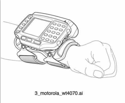
    Figure 3-4: Motorola WT4070/90 wearable terminal.
    (Copyright 2008 Motorola)

    Technology attached to human bodies that is not biological acts as a kind of prosthetic (Figure 3-4). In this view, ubiquitous computing replaces human biological functions with silicon ones, or gives people a kind of super power by amplifying their natural senses. The comic book superhero Batman is an archetypal prosthetic technology user. Special crime-fighting technologies enhance Batman's natural abilities, but they do not remove the need to engage with the world directly. Batman fights crime in person, with his hands, instead of sending a remote-controlled robot to do his fighting for him.

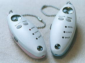
    From the notorious Lovegety dating device (CNN, 1998) to the adidas_1 running shoe, many wearable computing products want to extend natural senses and physical capabilities. With industrialized countries facing a wave of aging population, cognitive abilities are also up for augmentation as well. The Forget-me-not (Lamming and Flynn, 1994) is one of the earliest computer-based attempts to aid memory.

  5. ENCHANTED OBJECTS
    Electronic devices behave like enchanted objects.


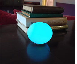
    Figure 3-5: Ambient Orb by Ambient Devices.
    (Courtesy Ambient Devices)

    Some devices add computational functionality to well-known — if often fictional — objects. By referencing the name, form, or behavior of magical objects in myths and fairy tales, their makers ask users to ignore the technical details and focus on the resulting experience.

    One waves around a Nintendo Wiimote, for example, much like a magic wand, while the Ambient Orb (Figure 3-5) resembles a fortune teller's crystal ball. Accenture's Magic Medicine Cabinet (Wan, 1999) "takes advantage of the situated nature of the medicine cabinet but extends it from a passive storage space into an interactive appliance." Enchantment — the addition of a magical spell to an existing object — implies that the object is mostly like its mundane counterpart, but with key behavioral differences created by information processing technology.


Mixed Metaphors

Sun Microsystems Unveils Open Cloud Platform.
- Press release headline, March 18, 2009

Since explicit metaphor design is not a typical part of experience design, it is not surprising that many, possibly even most, ubicomp projects mix metaphors freely. For example, Starner et al. (1997) described an augmented reality system that acts as a "butler/confidante" that enhances memory by overlaying the results on a video image of the current surroundings projected through a worn video display. Parsing the description carefully, it seems that the system is a human-like prosthetic that presents a parallel universe of personal memory data. Mixed metaphors might not make systems any less functional or valuable in practice, but looking for inconsistencies and contradictions in metaphors does identify potential design issues to resolve. Does the system represent itself as a single butler or perhaps as multiple butler–agents? Is the butler's reasoning expected to appear human? Does the butler disappear when the heads-up display is removed, or could you call him (it?) on the phone?

Tomorrow: Chapter 3, Part 3: Designing with metaphors

This is Part 1 of a pre-print draft of Chapter 3 from Smart Things: Ubiquitous Computing User Experience Design, my upcoming book. (Part 2) (Part 3) (Part 4) The final book will be different and this is no substitute for it, but it's a taste of what the book is about.

Last month I posted a draft of Chapter 1

Citations to references can be found here.

[Note: don't let the theoretical nature of Chapter 1 and this chapter give you the idea that the book is all theory. It's designed to be a practical tool for working designers, but I feel that a theoretical grounding is important to put the practical examples and advice in context.]

Chapter 3: Interaction metaphors

Part 1

No simple analogical model is sufficient to completely explain the operation of a computer system. Computer systems are too different from familiar, everyday non-computational systems.
- Halasz and Moran, "Analogy Considered Harmful," 1982

First of all, we made the screen layout resemble a desktop; displaying pictures of objects you'll have no trouble recognizing. File folders. Clipboards. Even a trash can.
- Apple Macintosh advertisement, Newsweek, 1984

Designing new technologies with unfamiliar interactions is a constant challenge in ubicomp user experience design. How can an object that may not be obviously computational communicate its capabilities without requiring enormous amounts of external documentation or training?

Mapping one category of ideas to another is the basis of linguistic metaphor, which The MIT Encyclopedia of the Cognitive Sciences (Wilson and Kiel, 1999) defined as a "class inclusion assertion." In this definition, a metaphorical comparison implies that two things belong to the same class of objects, even if the two things do not seem to share any directly comparable characteristics.
[Footnote: The MIT Encyclopedia of Cognitive Science (Wilson and Keil, 1999) gave the example of "my lawyer is a shark" as a linguistic metaphor. Metaphors are also not the only way to compare two objects. Marcus (1998) listed a number of non-metaphoric concepts that compare two sets of ideas. His list includes models, analogies, similes, metonymy, and synecdoche.]
Hence lawyers are sharks and love is a flower. Once established, a metaphorical relationship allows reasoning about an unfamiliar concept using what we know about the more familiar one. The details will not match exactly, and terrible analogies regularly surface (how does calling the Internet "a series of tubes" [Footnote: As per former US Senator Ted Steven's infamous June 28, 2006, description.] help us understand e-mail?), but metaphorical comparison can be a basis for reasoning when little is known. Going further, Lakoff and Johnson (1999) argued that cognition is entirely metaphorical. For them, abstract ideas can only be comprehended in terms of metaphors to concrete concepts, even when the metaphorical match is imperfect. For example, they write time is often characterized in terms of money. People talk about how much time something will take, or whether an activity will save time even though it is not possible to stockpile time or to trade it for goods or services as we might with money.

Metaphors have long been part of how we think about design. In 1923, the architect Le Corbusier famously wrote that "a house is a machine for living in." It was a statement crafted to evoke the architectural capabilities of the new materials and engineering techniques of the twentieth century, even as it implied that building dwellers are more like cogs in the machine than operators of it. In the 1970s and early 1980s, another famous metaphorical comparison of life inside buildings to the operation of machines became a key factor in popularizing personal computing.

Before the late 1970s and early 1980s, computers were largely controlled by typing words into command-line and "glass teletype" interfaces. Xerox PARC's office desk metaphor, popularized by Apple's Macintosh computer, made many capabilities of the computer system (such as storing files in hierarchical directories) accessible through representations of familiar office objects (such as folders). This mapping proved very successful. Even though the onscreen objects did not behave exactly like their real-world counterparts -- no one keeps a stack of glass windows on the top of their office desk, for example -- evocations of familiar objects were more helpful than a command-line-based operating system in acquainting a larger audience with the capabilities of their personal computers. A machine, it seems, could be a house for living in. [Footnote: Thanks to Liz Goodman for this observation.]

The position of ubiquitous computing resembles that of computing before the 1970s: we have a palette of new technologies without metaphors to communicate their power or operation. If Lakoff and Johnson are correct, and reasoning is largely metaphorical, then people encountering these unfamiliar technologies will always rely on metaphors to interpret them. From a design perspective, then, it makes sense to discuss the kinds of associations new technologies could or should prompt. And it also makes sense to identify the metaphors designers consciously or unthinkingly employ. Just as it may be impossible to reason without metaphors, it also may be impossible to design without them. Design requires using tools skillfully, and metaphors are the tools of thought.

[Note: I am deeply indebted to John Lawler, whose "Metaphors we compute by" (1987) class at the University of Michigan's Residential College was fundamental to my thinking about how people interact with computers. I also thank Bruce Sterling for his review of an early draft of this chapter, and to Dan Saffer for giving me permission to reprint his guidelines for design with metaphor.]

Tomorrow: Chapter 3, Part 2: A Catalog of Ubicomp UX Metaphors

Ads

Archives

ThingM

A device studio that lives at the intersections of ubiquitous computing, ambient intelligence, industrial design and materials science.

The Smart Furniture Manifesto

Giant poster, suitable for framing! (300K PDF)
Full text and explanation

Recent Photos (from Flickr)

Smart Things: Ubiquitous Computing User Experience Design

By me!
ISBN: 0123748992
Published in September 2010
Available from Amazon

Observing the User Experience: a practitioner's guide to user research

By me!
ISBN: 1558609237
Published April 2003
Available from Amazon

Recent Comments

  • Katherina: Information not just material. In our days it is a read more
  • tamberg.myopenid.com: Hi Mike, totally agree on building the IoT in a read more
  • Mutuelle: Man is the reflections of his thought, some name it read more
  • Amanda Carter: You obviously placed a great deal of work into that read more
  • Molly: You might find it interesting to connect with return of read more
  • George: You might want to change "Size" to "form" for terminal. read more
  • Mike: Thanks for the reminder, Robin. I'm aware of that article, read more
  • Robin: It's a slightly different argument (it predates most work in read more
  • Tim: This reminded me of the Pleo video Mark posted awhile read more
  • michael studli: i was wonting to know is the game fun to read more

About this Archive

This page is an archive of entries from May 2010 listed from newest to oldest.

April 2010 is the previous archive.

June 2010 is the next archive.

Find recent content on the main index or look in the archives to find all content.