November 2008 Archives

I was one of the international keynote presenters at this year's Dansk IT Usability and Design conference. I would first like to thank them for the invitation: it was a pleasure to spend a couple of days in Copenhagen and an honor to present to such a distinguished organization (they're an IT organization that just turned FIFTY!).

In my presentation I rolled up a bunch of my ideas from the last six months and added some examples of some new projects (such as Disney/TechnoSource's Clickables-PixieHollow product line) and I talked about the iPhone's applianceness.

You can download the presentation (792K PDF) with extensive notes.

The gist of this keynote, as with many of the presentations I've been giving over the last six months, is that a combination of ubiquitous computing, wireless networking and item-level identification is changing the nature of people's relationship to everyday objects. This change, in turn, creates a number of deep user experience design challenges as objects become intertwined with services and as computation becomes a more ingrained part of how the object is designed. In other words, objects that we find familiar now dematerialize into services, while abstract ideas that had been services before materialize as new, and unfamiliar, appliances. This crossover is pretty alien and implies a rethinking of relationships and design processes.

I'm still working on the practical implications that these big ideas boil down to, but I'm beginning to see the outline of what it implies for the world in which design is going to happen for the next 5-10 years.

I recently lamented in Twitter that my blog posting has become shovelware from my presentations. That mostly shows how busy I am--which is actually good--but it's also a shame, since I like having the time to use this as the public notebook it's supposed to be. However, even though I don't have time to update the blog as often I would like, I realized that I'm still generating content that's not in formal presentation or book form. It just (as Paul Boutin recently noted in Wired) just happens in different channels. Here's two more pieces of shovelware, one from a familiar source (a talk I gave at UC Berkeley's School of Information) and one from a different source.

Materials that dematerialize

(image CC by Only Sequel)

In what's becoming a ThingM tradition, I spoke last Thursday at Prof. Kimiko Ryokai's Tangible Interfaces class at UC Berkeley. Tod spoke to the same class last school year. My presentation was called Materials that Dematerialize ( 740K PDF) and it brought together several high-level thoughts I've had recently about how the social effects of ubiquitous computing and Internet of Things technologies create challenges for experience designers. Specifically, it brings together the themes of "information processing as a material" and "information shadows that turn everyday objects into services" that I've recently been thinking about.

Cloud computing, ubicomp, service design, interaction design

IMGP0205.JPG

Here's a discussion that I had with Tom Igoe and Brian Slesinsky on Facebook in response to another Twitter post I had made (you can find the original here).

Mike Kuniavsky at 6:02pm November 10
A thought: service design is what links cloud computing and ubicomp. It meets industrial/interaction design at the device/service interface.

Tom Igoe at 6:14pm November 10
How exactly does cloud computing differ from the web?

Mike Kuniavsky at 6:20pm November 10
There's terminology slippage, for sure. You could also ask how the Web is different from the 'Net. I think it's a question of where the data lives and whether devices are expected to be the homes of data, or whether data primarily lives in centralized services that live on the Net and are exposed and manipulated by a variety of devices, some of which are physical, some of which live on the Web or other distribution mechanisms. I agree that I think that "grid computing," "distributed computing," "cloud computing" and "service oriented architecture" are probably all describing the same concept. I'm trying to use the most evocative terms and to relate them.

Tom Igoe at 6:29pm November 10
I think the web and the net, there's a qualitative leap there, because the former made visual communication easy, right? I'm still undecided on whether cloud computing offers any new insights on what we're doing.

Service design kinda does, in that it suggests a different way of approaching the problem, in terms of who owns the assets. Though it's basically what Ray Anderson was on about in "Mid Course Correction," but his thinking on that pre-dates service design, and his action probably pre-dates the web. Seems service design mostly gives a name to the concept, and the net -- and the web, if you want -- make it easier to implement.

Sometimes I wonder what ubicomp would have looked like if the web hadn't happened. I suspect the banks and credit card companies would have made it happen anyway.

Brian Slesinsky at 9:34pm November 10
If you don't know or care which machine(s) your application is running on, it lives in the cloud.

Mike Kuniavsky at 11:24am November 11
The question is in the definition of "application." It used to be relatively straightforward to figure out where "the code" ran, but when a widget on my phone sends an SMS to a service that's then syndicated to an aggregator which then generates addition information that's then displayed back on my phone, what's the "application"? That's why the service becomes the focus of the design, because there are now many possible ways that a person can interact with a single set of functions, still have it feel like a single thing at the core, even though there is no single "application" that's running on a single "machine." Think of how the service of banking is provided through ATMs, online banking, phone banking and human tellers, all of which run different codebases on different hardware, and yet still deal with the same money.

[On a tangential note, I was first exposed to the ideas of cloud computing when it was presented as the Andrew File System, a distributed file system that was being worked on at the University of Michigan in the late 80s and early 90s when I was there. It's interesting to see how the ideas of using networks to distribute computing evolve. In many ways the core ideas don't change, but the model of what people need changes, and what was considered esoteric and irrelevant suddenly becomes interesting when framed a different way. In this case, the distributed file system was abandoned and forgotten until it re-emerged as a service distribution infrastructure.]

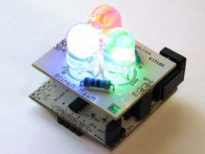
Woohoo! ThingM's second product, BlinkM MaxM, has hit the store shelves (first at Sparkfun, soon at FunGizmos).

It's (to quote myself), "BlinkMs bigger, crazy sibling. It's an intensely-bright smart LED for prototyping that comes as a package of two components, a control module (MaxM Master) and a daughter board with three ultrabright LEDs (MaxM Blaster). [...] Its trio of LEDs are 50 times as bright as a standard BlinkM and more than 1000 times as bright as a standard LED."

I'm also proud of its interactivity. It has 4 analog input lines so that in addition to being an LED replacement that's smart, it's also interactive. We expect to have some examples showing it in a range of applications soon. I'm most excited by the automotive application possibilities. Since it runs on 12v, you can hook it up to car batteries or (and this is a "don't try this if you don't know what you're doing" type of suggestion) directly to the car's electrical system. The possibilities for gaudy, interactive car lighting are infinite. I'm very excited.

I wrote an article on ubiquitous computing user experience design for ACM's interactions magazine. The final article is only available to subscribers, but here's a preprint version of it:

Ubiquitous Computing User Experience Design

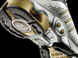
I think 2005 was the year we began living in the world of commonplace ubiquitous computing devices. That year Apple put out the screenless iPod Shuffle, Adidas launched the adidas_1 shoe, and iRobot launched the Discovery—its second-generation vacuum robot.

Sadly, even though we live in that world, the user experience design of most everyday ubiquitous computing devices—things you see in gadget blogs—is typically terrible. That’s because we do not address ubicomp user experience design as a distinct branch of interaction design, much as we did not treat interaction design as separate from visual design in the early days of the Web.

In the last couple of years, I have conducted research for and designed a number of ubicomp user experiences. In the process, I've seen some of the seams between industrial design, interaction design, architecture, and ubiquitous computing user experience design. In this article, I have tried to pull together some approaches that seem particularly valuable in the ubiquitous computing user experience world. None is unique to it: They’re all general design guidelines, but they seem to apply particularly well to the particular design challenges of this field.

Make Tools, Not Platforms

Like the fashion aphorism that just because you can wear two things together, it doesn’t mean you should, the ability to do arbitrary information processing does not imply the need to design yet another general-purpose device. We have laptops and phones for that.

It is because CPU power is so cheap that ubicomp UX design should concentrate all design and processing on a narrowly focused set of functionalities. Yes, a single device can be a dictionary, a calendar, a notebook, an alarm clock, a TV, an audio recorder, play every media format, and work as an 8-bit game machine, but doesn’t that just sound like an underpowered laptop?
Define Services Before Designing Devices

Service design gives to ubicomp UX the notion that every object is more than just a stand-alone tool; it's now the representative of a service. A physical, networked object is an avatar of a service that can be accessed in many other ways. This requires that affordances for the immediate task be included in the design of the product experience, and that the relationship between various pieces be taken into consideration.

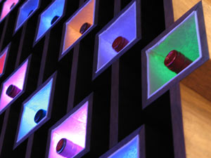
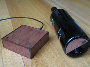
ThingM, my company, developed WineM, our prototype smart wine rack, as an avatar of a service. The rack uses RFIDs on each bottle to track where every bottle is and then displays information using glowing LEDs behind the bottles. When we designed it, we treated the rack as one way to provide access to a service that associated a specific bottle with metadata about it, which was in turn part of a system that linked wine producers, distributors, retailers, and consumers together in such a way that everyone in the chain benefited from adopting the technology. The rack is a particularly visual manifestation of the service, but the service would be available through an API that could be accessed through many avenues.
Don't Overload Affordances

Ubicomp UX inverts several basic assumptions of traditional screen-based interaction design. While Web and software design aim to represent physical-world tasks on a monitor, the goal of ubicomp devices is to skip representation and directly enable activities in the world. Likewise, while many of the challenges of screen interaction design involve using rich general-purpose input and output methods in a novel way, many ubicomp products use narrow-focus, specialized devices.

Mixing the two philosophies can create confusion. Your doorknob doesn’t double as a volume control for your stereo, though in today’s fly-by-wire world, it can. For example, when BMW developed its iDrive system, which mapped a large number of different functions to a single input device, the mismatch in expectations created interface havoc that took the company many revisions to correct.
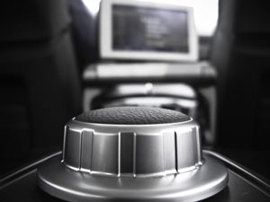

(image copyright Nick Humphries, CC Licensed)

Don’t Reinvent the Wheel

Although the ubiquitous computing industry is new, the field itself is close to 20 years old; it predates the Web. It’s relatively unusual that a technology takes as long to leave the research world and enter the market, and it’s a situation that provides an unusually rich backlog of academic and corporate research projects to learn from. Virtually every idea appearing commercially has been tried and documented in conference proceedings. When doing background research for a museum project, we discovered more than 20 closely related academic and commercial projects. Reading those gave us important guideposts that let us focus on creative solutions that improved on what had come before, without first having to recreate it. It took a couple of days of reading and synthesis—and saved us weeks of wrong directions.

Respect the Society of Devices

Few devices exist in a vacuum. General-purpose computers are designed largely to stand alone or exist as a hub connecting a bunch of peripherals. Technology-savvy Westerners simultaneously carry (or ride in) a large number of devices, everything from laptops to smart key fobs.
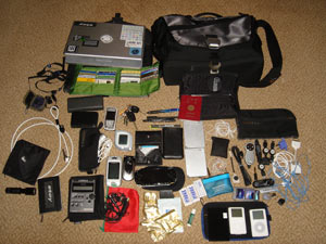

(image copyright Joichi Ito, CC Licensed)

Riffing off of Marvin Minsky’s Society of Mind, let’s call this technology cloud the society of devices. Each device does something specific, and some are more powerful than others. How do they all work together? How do they integrate into the larger set of devices and services out in the world?

On the interaction-design level, this means understanding users and their needs in light of the all of the devices that they may have. For example, while it’s possible to get email on many different devices, presenting it in a way that respects the unique constraints of a device and stays consistent with other devices becomes key when helping people transition between them. Text email accomplishes this using a universal format (text) with a well-defined structure (To:, From:, etc.). The minute that an attachment is included or there is HTML in the message, that consistency vanishes.
Create Physical Behaviors, Not Visual Representations

Screen interface design is essentially a visual practice, with some audio. But screens are expensive, power hungry, and large. Too many quickly overwhelm vision, our primary sense, and become a distraction, rather than a tool. However, not all information is so primary that it requires the attention of our primary sense.

Industrial design incorporates the physical senses of temperature, texture, and vibration into devices. Ubicomp UX is essentially the coupling of these two sets of ideas to create behaviors that match information priority with available sensory bandwidth and less cognitive load.

For example, say I’m looking for a new apartment in the town where I already live. I don’t need to move, but I’d like to. I set my (hypothetical) GPS unit to download a data stream of apartments that match my criteria of price, size, neighborhood, and proximity to at least three cafes with free Wi-Fi. As I drive/ride/walk around the city when I approach one of these locations, the GPS vibrates in proportion to how well it matches my criteria. I don’t need to look at it; I just need to feel it to get the crucial piece of information.


(photo by Timo Arnall)

Use Information Processing As a Material

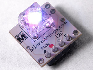
When a designer can include information processing in a product for very little cost, the calculation becomes not one of complexity, but of competitive advantage. Including a CPU to produce behaviors in a product becomes a line item when deciding what to make it out of, rather than the expensive core around which to wrap a case. And like a material, that information processing capability creates some new capabilities, and imposes new constraints. We designed BlinkM, a smart LED, with this in mind. It’s designed for interaction designers, industrial designers, and artists to prototype sketch ideas in hardware. The user experience around it emphasizes its role as a material. We designed it to be inexpensive, robust, and to offer just enough capabilities to be easy to work with immediately, while still remaining openended.
I believe that ubiquitous computing technologies are incredibly powerful. However, ubicomp user experience design is still a very young discipline, without a track record of obvious best practices. In its failures, we see the inadequacy of applying older design paradigms to the capabilities of new technologies. If design people first encounter new technologies through design, then careful reflection on our design processes early on is essential for increasing the chances of technology’s positive impact. That time is now.
Ads

Archives

ThingM

A device studio that lives at the intersections of ubiquitous computing, ambient intelligence, industrial design and materials science.

The Smart Furniture Manifesto

Giant poster, suitable for framing! (300K PDF)
Full text and explanation

Recent Photos (from Flickr)

Smart Things: Ubiquitous Computing User Experience Design

By me!
ISBN: 0123748992
Published in September 2010
Available from Amazon

Observing the User Experience: a practitioner's guide to user research

By me!
ISBN: 1558609237
Published April 2003
Available from Amazon

Recent Comments

  • Katherina: Information not just material. In our days it is a read more
  • tamberg.myopenid.com: Hi Mike, totally agree on building the IoT in a read more
  • Mutuelle: Man is the reflections of his thought, some name it read more
  • Amanda Carter: You obviously placed a great deal of work into that read more
  • Molly: You might find it interesting to connect with return of read more
  • George: You might want to change "Size" to "form" for terminal. read more
  • Mike: Thanks for the reminder, Robin. I'm aware of that article, read more
  • Robin: It's a slightly different argument (it predates most work in read more
  • Tim: This reminded me of the Pleo video Mark posted awhile read more
  • michael studli: i was wonting to know is the game fun to read more

About this Archive

This page is an archive of entries from November 2008 listed from newest to oldest.

September 2008 is the previous archive.

December 2008 is the next archive.

Find recent content on the main index or look in the archives to find all content.