January 2008 Archives

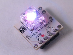
ThingM's first product, BlinkM is now for sale from Sparkfun. BlinkM is a smart LED. What's a smart LED? Well, on the one hand, it's the atomic unit of ubiquitous computing: an RGB LED and a CPU. Input, processing, networking, and output in one package. If technology worked like chemistry, it would be analogous to hydrogen; if it worked like biology, to algae. OK, maybe that overstates the point, but it's the simplest device that we could imagine that represents the essence of ubicomp, and it was the one we could, as a self-funded startup, afford to develop and manufacture relatively quickly (development started in November, though it's based on work we did with WineM).

It's designed for hobbyists, designers and artists who want to add low-power colored light to their projects, but don't want to mess with pulsed width modulation or color theory. Give it an RGB number, or select a color from the color picker, and it glows that color; enter two colors, and it'll do a smooth fade between them. Want to simulate the breathing sleep light on a Mac computer but in purple, it'll do that.

Take a look at the description for the full story.

In all honestly, we're really excited that we developed and are selling this (and by "we," Tod really did all of the heavy lifting on the engineering, software, documentation and video). I know, I know, soon we will have to deal with the customer service (we're keeping it in the ex-Adaptive Path family by using Satisfaction, the company co-founded by fellow AP founder alum Lane Becker), but right now it feels pretty great.

We'd like to thank the people who helped us out along the way:

  • John Houck wrote most of the Sequencer in Processing and Java.
  • Elizabeth Goodman designed the initial UI design for the Sequencer
  • Nathan Seidle, of Sparkfun, for advice and for the initial order (placed months before prototypes even existed!)
  • Mykle Hansen, for being our first and only alpha tester
  • Dave Vondle, for data sheet advice and for the first bulk order, also placed long before they actually existed
  • The alumni of the Sketching in Hardware conferences, who gave us a lot of valuable advice in the early stages of the project
  • David, Anders, and all of the other beta testers
About a year ago I bought several books in an old set of Dickens' collected works from a book store that was going out of business. I bought them initially because of the nice texture that 19th century books have, but after reading Susanna Clarke's excellent Jonathan Strange & Mr. Norrell while doing "research" about magic, I decided to go back to read some of the Dickens that was her inspiration. I'm currently reading Bleak House, and apart from being kind of an amusing experience typographically (the letter spacing is definitely different than today's books and the books are slightly oversize and printed in small, two-column type to minimize paper cost, and I find I actually like the form factor), it's an interesting experience because the book keeps yielding pieces of its history in a way that modern artifacts rarely do. Here are some clues:

The inscription in the front has an oddly defensive quality, but is written with full names as a kind of explicit "message in a bottle" to future purchasers, to show that there were real people who really owned this book and that parting with it was not a wholly easy process:

IMGP2160.JPG

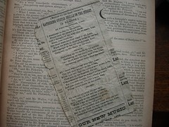
Then there was this piece of music, which was either being used as a bookmark or just kept in the book for safekeeping. It also gives a good date for when the last time the book was read, which was likely the first time it was read, 1879:

IMGP2161.JPG

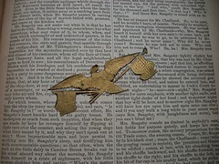
Finally, this fell out this morning. I believe it's a souvenir of the US Centennial:

IMGP2159.JPG

Apart from the amusing way to date the publication of the book (which is not rare in any way--I checked on Ebay) to the mid-late 1870s, these artifacts reminded me of the personalization traditional artifacts exhibit that today's digital artifacts do not. You can't stick a newspaper clipping into a Kindle and forget about it (though, admittedly, "time capsule" is a tertiary purpose for a book, too) and it would be weird to inscribing a mobile phone with its owners' history. Yet that's regularly found on furniture, in books, and even in older clothes. It gives these objects a depth that's meaningful in ways that transcend functionality, esthetics or design. There was an old SNL sketch about a Sentimental Pawn Shop which parodies the fact that sentiment and history have no material value. Th pieces of the original owners' lives that have fallen out of these books actually brings back some of that value, not in monetary terms, but in the experience of ownership. I'm keeping all of the things I found in the books in the books and wondering how I can design digital artifacts that will exhibit some of the same qualities.

The title implies more mean than this blog post will have in it, but in my research on digital rings, I discovered an amusing factoid: the first people to have worn digital jewelry on a regular basis are the children of the public schools in Celebration, Florida, the New Urbanist Disney planned community.

In this article, from 1999. Here are some interesting pieces:

Residents like to call Celebration a "perfect town," but even perfection needs security. That need has led to use of access control at Celebration School, a K-12 county-run institution.

[...]

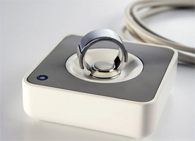
All 930 students move freely around the campus through locked doors using a new system of Java-enabled Schlage Primus industrial door locks, modified by Lares Technology Inc., San Antonio, Texas, to work with the Java computer application. Each student is issued a Java Ring, built by Dallas Semiconductor, Dallas.

[...]

Celebration conducted the initial trial for the system when they equipped 100 middle school students with the iButton in a Java Ring, said Mori. "We wanted to see if the rings were of benefit to students. Now, it's a wearable accessory for the kids. We found that for some kids the rings work very well, but some wanted a key fob or a watch. In the beginning everyone was given a ring, but now they have the option of purchasing a watch or a key fob.

Without reading too much into suburban perfection requiring an incredibly technologically sophisticated security and monitoring system, it's interesting that the first sizable deployment of smart jewelry will have turned out to be for a bunch of 13 year-olds in a Disney planned community.

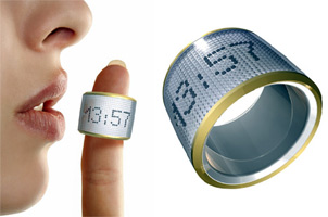
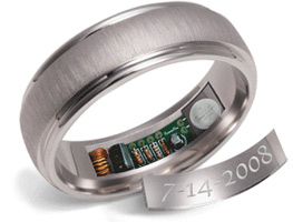
Hideaki Matsui's ring-based concept made the blog rounds this week, and it's only the latest of a trend of ring-shaped ubicomp devices (as helpfully cataloged by Yanko Design):


Right now they replicate simple functions that may be done better by other technologies (Matsui's design, for example, is very close to IBM's Personal Area Network from 1996, but embodied in a ring). However, that's not the point. What's interesting to me is that people have started to think about the capabilities of rings as a form factor for the development of devices. It no longer seems far fetched to design functionality in this way. As with many objects that are a product of their time, the idea is reinvented seemingly simultaneously in multiple locations as culture churns through the possibilities. That process generally predicts the actual development of an actually useful product (followed by a lot of people grousing that htye thought of it first). That's exciting because it means that an actually useful enchanted ring device may be forthcoming.

This also tangentially reminds me of NTTDoCoMo's FingerWhisper bone conduction phone speaker project (which was supplanted in the market by Bluetooth headsets, but had lots of potential), and I predict it's only a matter of time before someone comes out with a cell phone concept that's a ring or a bracelet, or both.


(photo from Flickr, (cc) dailydog)

CHIFOO, the CHI forum of Oregon, invited me to speak at their January gathering, and it was an honor and a pleasure to accept their invitation. Their lecture theme this year is "From Ideation to Innovation," and I used the theme as an opportunity to describe our recent projects, including our work with the Henry Ford, and our products, and the theoretical framework that we're developing to think about ubiquitous computing user experience design and incorporating the principles of agile software development into design.

The full presentation is available as a 1M PDF.

Here's a highlight, the ThingM theoretical framework:


1. Information Processing is a Material
When a designer can include information processing in a product for very little cost, the calculation becomes not one of engineering complexity, that’s relatively cheap, but one of competitive advantage. What you do with that CPU becomes part of the design of the product and needs to be designed with the same attention to the other parts as any of the materials being used. And just like a material, it creates some new capabilities, and imposes new constraints.
2. Applianceness
Coined by Bill Sharpe of the Appliance Studio, states that applianceness is "the set of properties that guide the design process towards simple, helpful devices that exploit the potential of embedded information technology in everyday things." The core of the idea for me is that focus in functionality is more important than arbitrary flexibility. When computation is cheap, we no longer have to make general purpose computers. (Sharpe and his colleagues at an earlier incarnation of the Appliance Studio also did an excellent set of design principle cards (120K) that I still carry around)
3. Physical Objects Cast Information Shadows
In our modern world, everything exists simultaneously in the physical world and in the world of data. Nearly every object’s information shadow can be examined and manipulated without having to touch the physical object. Think of the Amazon and Google book APIs. Information shadows have lives of their own. Wine has a particularly rich one.
4. Devices are Service Avatars
Networks mean that the same information can be accessed and manipulated through a variety of devices. Most value rests in information, rather in the device that’s communicating it, which means that the devices become secondary. A number of familiar information appliances--cell phones, ATMs--are basically worthless without the networks they’re attached to. They are physical manifestations, avatars, projections into physical space of services, but are not services themselves. This means that when thinking about how to design user experiences for ubiquitous computing, the design of the service becomes as important as the design of the device. (I wrote more about this idea a couple of years ago)
5. Granularity Determines Key Aspects of Experience Design
Ubiquitous computing devices can come in all sorts of sizes and the user experience design for them must take this into account. This has been true since the earliest days at PARC when Weiser defined the tab, pad and board as names for the scales of the devices they were developing. I use a different set of terms, but the key idea is the same: what works at one granularity doesn't necessarily work at another.
6. Magic is a Powerful Interaction Metaphor
The concept of enchanted objects can help generate ideas about interaction and as a way to create user experiences that are easier to explain. People have a tendency to create animist explanations for the behavior of technologies that exhibit unpredictable behaviors. They treat their Roombas like pets, they get mad at their laptops, they think their iPod is obsessed with a band, etc. We can use these natural associations to design ubiquitous computing interactions. (I've written and talked about this idea more extensively before)

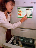
Doing some research for my upcoming CHIFOO presentation, I realized that there have been a number of attempts at merging computers and refrigerators. Here's a timeline:

1998: The V-sync "Internet Refrigerator"

"With a speedy Pentium II microprocessor and huge hard drive, it packs more computing power than most home PCs, and has separate compartments for fruit and vegetables."

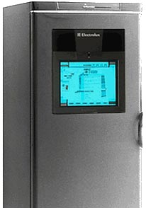
1999: The Electrolux Screenfridge

"Electrolux earlier this year unveiled the Screenfridge, a connected refrigerator designed to allow users to order groceries over the Internet, but the product has yet to ship."

2000: Whirlpool/Cisco fridge

"While the Whirlpool refrigerator won't cook an omelet, it does have an integrated Web-browser to search for recipes that match the food items people have on hand. In case you have no idea how to make an omelet, you can prepare the meal by watching a celebrity chef on the Web pad."

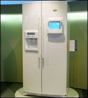
2002: Whirlpool's Connected refrigerator

"Whirlpool's refrigerator transforms into a multimedia communications centre. The owner can surf the Internet, receive e-mails, listen to the radio, watch TV, videos and DVDs and even talk on the phone."

2003: LG's Digital Multimedia Side-By-Side Fridge Freezer with LCD Display

"It's the ultimate in kitchen technology with a built-in MP3 player for downloading and playing music from the internet, e-mail and video mail using a built-in camera and microphone. It even has full internet access so you can re-stock the refrigerator on-line or check on the latest news and weather - all without leaving the kitchen. And it's great for storing food too."

2006: Electrolux Screenfridge (again)

"The Screen Fridge is connected to broadband and TV via wireless connection. 15" touch screen and pop-up keyboard. As if Internet, email, phone, radio and MP3 player are not enough, Electrolux adds highly advanced calendar and video messaging system so the kitchen truly becomes the center hub in your house."

2007: Whirlpool centralpark

"Custom choices will include satellite radio, a Web tablet with interactive message board and family calendar, a digital picture frame, a DVD/CD player and more."

I like to watch how companies try the same idea over and over and how the ideas evolve. Initially, the computer fridges were just tablet PCs stuck into the door of a conventional refrigerator. Why were they there? Who was going to be using it? How were they going to be used? No clue. And sure you could do all the stuff they advertised (listen to music, make a phone call) because you could do anything you could do on a laptop. You could compose a Powerpoint or write software, too, but you wouldn't do that, or anything else, because there was no clear reason for it. The products quickly disappeared with the end of the first dotcom boom.

Then a resurgence happened. What was different? I think that companies, helped by the staff user researchers they hired in the interim, started to realize that it wasn't the computer that was important, but what people did with it. Not until the most recent Whirlpool offering does the idea of a computer fridge disappear entirely to be replaced by a series of functions that various modules can do. Each module is, of course, a computer, and every module can probably do the same functions as the other modules from a computational perspective. But that's not the point. The point is that the modules have different interfaces. They're different tools. Focused tools. Tools where the design uses a computer to help the user accomplish a task, just as they use waterproof plastic for the buttons and stainless steel for the shell.

[4/20/08 UPDATE: I noticed that in the proceedings to the 2008 Internet of Things conference there's a paper by Matthias Rothensee called "User Acceptance of the Intelligent Fridge: Empirical Results from a Simulation." His conclusions, from the abstract, are "It was found that generally a smart fridge is evaluated as moderately useful, easy to use and people would tend to buy it, if it was already available. Emotional responses differed between the assistance functions. Displaying information on durability of products, as well as giving feedback on nutrition health and economics are the most appreciated applications." That sounds like, not surprisingly based on the market response, faint praise at best, but I haven't read the paper yet.]

Comment spam was causing Movable Type to regularly use up all the available memory on this machine, so I've turned off comments for now. If you want to comment on anything, send a note to 'blog' c/o this domain and I'll respond to you in email and, unless you ask me not to, I'll post it with the entry you're referring to.

Sorry. I like Movable Type and I've been using it for several years, but I don't have time to debug it right now.

My keynote for O'Reilly's Emerging Technology conference last year has been posted to ITConversations. The talk is called "The Coming Age of Magic." It's an argument for the use of magic as a user experience design metaphor when creating objects that exhibit behaviors. In other words, I believe that magic can be a useful metaphor for making ubiquitous computing devices more comprehensible and usable. My presentation takes the form of three linked arguments about emergence:


  • The emergence of ubiquitous computing from market forces acting on, and in concert with, CPU prices
  • The emergence of animist reactions to devices that have behaviors that go beyond action-reaction physics
  • The emergence of magic as a metaphor for the design of ubicomp devices

You can download the full text and slides of the presentation (710K PDF) and follow along with the MP3 from the link above, which also has the fun 15 minute post-keynote Q&A session on it.


Also, "Observing the User Experience" was translated into Japanese and is available from Amazon Japan.

Ads

Archives

ThingM

A device studio that lives at the intersections of ubiquitous computing, ambient intelligence, industrial design and materials science.

The Smart Furniture Manifesto

Giant poster, suitable for framing! (300K PDF)
Full text and explanation

Recent Photos (from Flickr)

Smart Things: Ubiquitous Computing User Experience Design

By me!
ISBN: 0123748992
Published in September 2010
Available from Amazon

Observing the User Experience: a practitioner's guide to user research

By me!
ISBN: 1558609237
Published April 2003
Available from Amazon

Recent Comments

  • Katherina: Information not just material. In our days it is a read more
  • tamberg.myopenid.com: Hi Mike, totally agree on building the IoT in a read more
  • Mutuelle: Man is the reflections of his thought, some name it read more
  • Amanda Carter: You obviously placed a great deal of work into that read more
  • Molly: You might find it interesting to connect with return of read more
  • George: You might want to change "Size" to "form" for terminal. read more
  • Mike: Thanks for the reminder, Robin. I'm aware of that article, read more
  • Robin: It's a slightly different argument (it predates most work in read more
  • Tim: This reminded me of the Pleo video Mark posted awhile read more
  • michael studli: i was wonting to know is the game fun to read more

About this Archive

This page is an archive of entries from January 2008 listed from newest to oldest.

December 2007 is the previous archive.

February 2008 is the next archive.

Find recent content on the main index or look in the archives to find all content.