October 2006 Archives

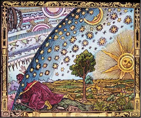
Tonight I gave a talk at the San Francisco dorkbot meeting. It was a great opportunity (thank you, Karen!) and an honor to share the stage with Tim Hunkin. In the talk, I presented a short history of the desktop metaphor as a way of thinking about screen-based user interface design and laid out my thoughts for why magic should be a metaphor for the user experience design of ubiquitous computing. I also presented a number of examples of how it's already happening, but without the explicit use of magic as a metaphor. I end by saying:

So, in conclusion, the age of magic is coming.

Chip manufacturers low-power roadmaps and congealing wireless communication standards ensure that there are going to be many more objects like this.

I believe that we need to systematically approach the user experience design of these devices. One way that's been shown to be successful is the adoption of a strong metaphor that can be leveraged to explain the functionality of many of the ideas embedded in a new set of technological tools. I believe that magic as a metaphor is an incredibly rich vein that can be mined for interesting and familiar user experience design tropes. It would be a mistake to pass up the opportunity to use it extensively at this early stage in the proliferation of these devices and ideas.

My slides and notes(630K PDF) have everything I said in them, although where I have mosaics in the PDF, I used animations in the talk.

Tod pointed me to this excellent article by the late Jef Raskin, Macintosh catalyst, designer and author of The Humane Interface.

He rightly identifies a lack of ways of comparing outcomes produced by technologies as supporting th creation of superstitious beliefs. He uses fishing lures and stereo cables as examples of technologies that have lots of superstition surrounding them.

When out angling for rock fish, you generally use the same lure as everybody else. There is not much technique to it, so the number of fish you catch is proportional to the time your lure is in the water. Those who spend time fiddling with the equipment beforehand catch fewer fish. It's a mathematical certainty.

[...]

Superstitions grow rampant when testing is subjective, difficult, and (usually) not performed at all. There is a purely magical belief in the idea that you can hear the difference between different brands of audio cables, for example.

He then relates an experiment he conducted that showed that people's preconceptions affect their perception. This is a point explored in detail by Nass and Reeves in The Media Equation. He concludes by noting that

Computer systems exhibit all the behaviors best suited to create superstitious responses. You will try something, it won't work, so you try it again—the exact same way—and this time it works, or not. That's random reinforcement.

[...]

We rarely understand, in any detail, the processes going on behind the tasks we do with computers. We're using megabytes of code written by others, code that is indifferently documented and inadequately tested, and which is being used in ways and in combinations unforeseen by its creators.

No wonder we tend to act as if computers are run by magic.

I agree with him entirely, but I'm not sure what his recommendations would have been about how to avoid this reaction; clearly faulty, superstitious models based on incomplete information have existed for a long time (as one of commentors to Raskin's piece says, it's the basis of religion). But we will never have complete information and we can't expect the users of technology to go out and get it. Without going too far into philosophy, everything we know is an incomplete model. As technology becomes more complex, our models will grow ever more distant from the reality of what's going on, so Raskin's Complaint is totally valid, yet it's not clear (for me, anyway) how we can use it to determine where to go next.

NOTE: I've updated my Partial Bibliography of Magic in UX Design with Raskin's paper and the excerpt from Steven Levy's iPod story I had blogged about earlier.

[Tangentially, it's interesting to note the seemingly opposite directions that our understanding of technology and science are going: over the last couple of hundred years we've continually improved our models of how things--life, physics, society--work, while our tools have grown proportionally less comprehensible. Will there be a meeting at some point, where our study of our tools becomes as involved and complex as our study of our world? Will there be a crossover, where the study of our tools becomes a more relevant point of scientific inquiry than the study of the "natural" universe?]

Cassidy points me to a book excerpt by Steven Levy, a writer whose work I've been following for years. In it, analyzes why his iPod, and many people's iPods, seem to have preferences of their own. He approaches it with a sense of humor, but it's clear that initially he believes he's seeing a phenomenon he can't explain in mechanistic, or even software, terms and that the only way to explain it is through psychology:

It began to dawn on me that there were songs, and even artists, that my iPod had taken a dislike to, if not a formal boycott.

His investigations reveal that he's not the only one who believe their iPods can express preferences:

it appeared that nearly everybody's iPod seemed to have a favorite artist, or two, or three. Or, they believed, when their iPod performed a shuffle, it would decide which artist it was in the mood for and then flood the listening session with that performer's works.

Moreover, once the door had opened to psychological explanations, parapsychological (i.e. animist and magical) explanations weren't far behind:

"Over the last couple of days that I've been [putting my library on shuffle], I may think of a certain song or band, and lo and behold, that winds up being the next song or band played," writes a blogger named Kapgar. "It's like some sort of symbiotic relationship."

[..]

"It has moods," [another person] added. "Sunday and Monday nights, bluesy. Rocks at night during the week. Does folk on Monday and Wednesday mornings. Bluegrass on Thursday mornings and Sunday afternoons."

Levy tries to analyze what could be going on, why the iPod engineers claim that it's random, but it behaves in a way that implies it has behavior (maybe will? certainly caprice, in Levy's narrative).

Apple insists that there is no computational flaw in its execution. "It is completely random. It is absolutely, unequivocally random," says Jeff Robbin, one of the original authors of iTunes and later head of the iTunes development team.

Despite this, he doesn't believe it. He continues to look for something for a reason that his iPod has intentions and behavior. In other words, he's looking for the ghost in the machine. Ultimately, he gives up looking for the ghost and begins to investigate perception.

John Allen Paulos, a Temple University mathematician, agreed. […] "We often interpret and impose patterns on events that are random," he says. "Especially with something like songs. Songs evoke emotion, and some stick in our minds more than others." […] "Our brains aren't wired to understand randomness - there's even a huge industry that takes advantage of people's inability to deal with random distributions. It's called gambling."

Eventually, he comes up with an explanation that suits him:

Why does Autofill produce nine Springsteen songs out of 188? Because that is what almost always happens in normal distributions of items from databases. Clusters of something are to be expected. […] What we perceive as shuffle favoritism is well within expected mathematical bounds. [And] the seemingly magical effects of the shuffle function - a spooky just-rightness, even brilliance, that comes from great song juxtapositions - [are] also consequences of randomness.

This is an excellent analysis of how a mathematical, physical phenomena becomes perceived as psychological, even by people who know a lot and should know better (this phenomenon is well-documented by Nassim Nicholas Talib in his book, Fooled by Randomness). It also shows how easily we slip into animist explanations when we can't understand how something works. When physical explanations are exhausted, our other primary explanatory frameworks become psychological and magical. Look at how much explanation Levy required, how much detailed delving and convincing had to happen over a period of several years to get him to believe that a mysterious and magical phenomenon was genuinely random. I suspect few people will go to the extent that Levy did to try and understand what was happening, and many will just accept the simpler model: that there's something magical about their technology.

Levy finishes his story with an epilogue:

The non-randomness illusion was so prevalent that ultimately Apple felt compelled to address it. In the version of iTunes rolled out in September 2005, there appeared a new feature: smart shuffle. […]If you pull the lever to the right, the iPod will mess with its usual distribution pattern, intentionally spacing out songs by a given artist."

This, to me, is the key point in the story: that design changes were implemented not based on the reality of the situation, but on the perception of the reality. Matching people's expectation is a core concept in user experience design. Most of the time designing to expectations, even if that design does not match an underlying reality (i.e. the user model does not match the system model, to use Don Norman's excellent dichotomy) will be the right choice. But as Bruce Sterling pointed out so well in his keynote at Ubicomp 2006, it creates an interesting new set of challenges and responsibilities for user experience designers: while trying to match people's models, we should not fall into techno-mysticism, lying about what's really going on, rather than using a model to simplify coginitive load. I predict there will be many more user experience design tradeoffs such as this in the future.
After a discussion with a bunch of nice folks about mapping systems over dinner the other night, I started to think about how all of the point-wise mapping tools (such as Platial and Plazes) are to me, personally. For the most part, they're not (I prefer regions as the unit of markup, or at least in addition to points). Last night Liz and I were talking about San Francisco real estate and the subject of Ellis Act evictions came up. In the process of researching this kind of eviction, we found that there was a list of Ellis Eviction sites which hadn't yet been mapped (well not to our knowledge), so we decided to try our hand at a mashup. It was harder than it's made out to be, and by the end of the evening we had given up on the Javascript and GIS systems, but had discovered several useful tools.

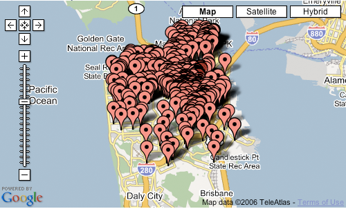
Here's the problem, as I see it, with point-wise mapping of information: when there are enough points, it becomes a forest and it's no longer useful. For example, here's the Ellis data all mapped together on SF using EditGrid, an online spreadsheet that can take any map data and map it with Google maps:

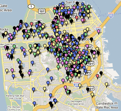
I would like to do is to have some interesting ways of clustering or displaying this information in a way that's not overwhelming visually and not a bear to produce in a GIS system. [Note to GIS system designers: your general purpose tools, which can be used for everything from prospecting for oil to identifying crime patterns, are incredibly difficult to use because they're so general purpose. Just because there's a latitude and longitude attached doesn't mean that the same tool is useful for everything. A nail and a can of peaches are both made of metal, but that doesn't mean you can or should use can openers and hammers interchangeably. Geographic information is like metal: it's a basic material, and the tools you use with it should be tuned to the task. But I digress.] Unfortunately, neither Liz or I was unable to find any such tools (EditGrid is relatively easy, but what I'd like is the equivalent of the Excel chart wizard for maps, and they're still in the early days of integrating their product with Google). We did what we could with what was available (in this case, Mapbuilder.net). Here's a still of all of the Ellis evictions from January 2000 to March 2005. You can start to see trends in both location clusters and in time and this tells a story about real estate in San Francisco. I'm not totally sure what story it tells, but it's a start, and an interesting mapping experiment to have spent an evening on.

Key:
2005-red (Jan-March)
2004-blue
2003-green
2002-purple
2001-yellow
2000-black

Click on the map to get a live, zoomable, scrollable Google Map, but be warned: Google Maps isn't very good at displaying 500 points on a map and it'll bog down your browser for a while.

If you'd like to use the data yourself, here's my dated and geocoded spreadsheet, which we used the excellent and free Batch Geocode utility, which we also used to convert the dataset into a KML file for Google Earth.

Ads

Archives

ThingM

A device studio that lives at the intersections of ubiquitous computing, ambient intelligence, industrial design and materials science.

The Smart Furniture Manifesto

Giant poster, suitable for framing! (300K PDF)
Full text and explanation

Recent Photos (from Flickr)

Smart Things: Ubiquitous Computing User Experience Design

By me!
ISBN: 0123748992
Published in September 2010
Available from Amazon

Observing the User Experience: a practitioner's guide to user research

By me!
ISBN: 1558609237
Published April 2003
Available from Amazon

Recent Comments

  • Katherina: Information not just material. In our days it is a read more
  • tamberg.myopenid.com: Hi Mike, totally agree on building the IoT in a read more
  • Mutuelle: Man is the reflections of his thought, some name it read more
  • Amanda Carter: You obviously placed a great deal of work into that read more
  • Molly: You might find it interesting to connect with return of read more
  • George: You might want to change "Size" to "form" for terminal. read more
  • Mike: Thanks for the reminder, Robin. I'm aware of that article, read more
  • Robin: It's a slightly different argument (it predates most work in read more
  • Tim: This reminded me of the Pleo video Mark posted awhile read more
  • michael studli: i was wonting to know is the game fun to read more

About this Archive

This page is an archive of entries from October 2006 listed from newest to oldest.

September 2006 is the previous archive.

November 2006 is the next archive.

Find recent content on the main index or look in the archives to find all content.