December 2003 Archives

From my bedroom I can see 8 WiFi access points (thank you San Francisco ;-). Two are locked. Why? On the one hand, there are potential security problems--packet sniffing by Bad People and the like--but I think it's something else. I think it's a relationship to bandwidth that's akin to property. People don't have a framework within which to evaluate the pros and cons of sharing bandwidth with strangers--what does it mean to me if someone uses some of the bits I'm paying for? So they retreat to a concept they understand, a mapping of their relationship to their property to their bandwidth. I'm not comfortable letting someone I don't know set up their lawn chair on my front lawn, even if it doesn't hurt me or my lawn, so why should I let them freeload on my bandwidth? Or, at least, that's how I feel the thinking goes.
It's as if there's a confusion between ownership and property. I think that the confusion comes in the reversal of a truism: if something is my property, I own it, but that doesn't necessarily mean that because I own something, it's property.
Yet that's how people treat it. Two examples:


  • I was in a loft recently that a friend of a friend moved into. He got broadband, set up his WiFi base station. "I was going to leave mine open, but then I saw that everyone else's were locked, so I said 'fine' and locked mine, too." It's a classic tit-for-tat Prisoner's Dilemma response, effectively creating a kind of responsive fence-building around what's perceived as property.
  • More and more cafes are starting to give away free wireless, possibly in response to other cafes giving away wireless. Morning Due cafe, near my house, used to charge for WiFi access. Then Maxfield's Cafe, a block away, started giving it away for free. Maxfield's is always full. Now Morning Due is giving away WiFi "for a limited time." The fact that they're doing it "for a limited time" means they're not completely bought into this idea of "giving away" their property, but they see what it did for Maxfield's and they're reluctantly trying it out. But there's still clearly a feeling that it's property and parting with it without reciprocity is somehow losing something. What is being lost is unclear, but it's a very deeply-held mapping that somehow there's something that's lost.

What's interesting to me about this is how similar this reaction is to people's relationship with all kinds of other intangible goods. The ownership of rights and ideas gets similar treatment--and similarly confused responses--because we don't have the intellectual tools to comprehend them as having different properties--obeying different laws of physics in a sense--than physical goods.
It'll be interesting to see how our world changes as other things are added to this list (individual identity? race? allegiance?). It's also interesting that what were purely philosophical exercises (how to tell what is reality from what is illusion?) now become questions of daily life--well, OK, at least for me. ;-)
My favorite new brand experience (though not really new, just new to me) is the Lush soap store, which opened a branch in SF a couple of months ago, but which has been in Europe for about eight years. Lush is built on a simple premise: they sell soap as if it was food. They take all of the symbolism of a gourmet deli and map it to soap: big pieces of soap get cut into small chunks and sold by weight, products are labeled as to whether they're vegan, big wooden bins are filled with spheres (is it an orange or a bath bomb?), etc. What's most interesting to me about it is that it's a brilliant insight about how people--women, really, since I'm sure their target market is at least 80% female--shop for "intimate consumables" (for lack of a better term). In a food store, quality is usually judged by how something looks, how it feels to touch it and, most importantly, how it smells. Traditional soap tried to hide all three (except for smell, which leaked out of packages not really designed to let it out). It's an admission that factors such as how well something works or how well it was made or where it was made don't really matter: what matters is the immediate experience. It's also an interesting counterpoint to the presentation of cosmetic products as a kind of medicine, which is the other big trend. Sephora looks like a high-class drug store, with the implication that you need to trust them to make something so high tech that you'll never understand it, but it'll be good for you. Lush makes everything seem so low tech that you feel comfortable choosing simply on immediate experience and impulse.
The insight that people shop for these goods by immediate kinesthetic experience, and the soap-food remapping that follows it, is really fascinating to me. It's a small shift that creates a whole world of design ideas. It's almost dream-like in its simplicity ("doctor, I had this dream where I walked into the deli and all of the food was made of soap..."). What's also interesting is how it's all about the trade dress, the look and feel of the store, and not really about a designed brand identity. The Lush logo doesn't look like their store, and they don't seem to have a particularly consistent visual presentation (for a $60 million company, their Web site looks almost amateurish), but the trade dress is so strong, that it may not matter (and maybe they're trying to look rough around the edges--but I kinda doubt it...).
The futurists, who liked to play with the idea of food (make food look like things that are inedible! Make things that aren't food look like food!), would be proud.

Traveling to Minneapolis to spend time with Molly's family, I realized why holiday travel may be one of the most dangerous activities we engage in as a culture. It's the potential for disease transmission. Holiday travel brings together three things that individually increase how much airborne diseases get transferred:


  • Population movement. The point is to move around a lot.
  • The cold and flu season. ...at a time when diseases naturally peak.
  • Children. ...with kids, who have developing immune systems, and so are more susceptible to various diseases, thus more likely to be contagious.

Now, this is not to say that holiday travel is a bad thing--I had a very nice time in Minneapolis (where the highs were about what the lows in San Francisco are, but where the buildings are so much better insulated)--but I found it amusing that somehow our world had managed to find a way to bring together three of the most likely disease-causing factors into one. At no other time of the year are all three of these factors true. I wonder what the economic impact of this is. One the one hand, people are spending a ton of dough on presents and plane tickets; on the other, many are going to get sick and be out of work for some period of time after the holiday. How does it balance out?

I've been writing so much lately for work that it's time to think in pictures a bit. Here's some I took recently.

One of my favorite new tech ideas is the low-power ad-hoc network. It's simple, powerful and leverages the fact that people in a given geographic location are likely to have similar interests. I like it because it's a fundamentally human-level concept, rather than being about making the technology somehow more efficient (though it does that, too, by reducing the amount of communication that's likely unrelated to what people are interested in and thus reducing the needs for filtering/routing information).

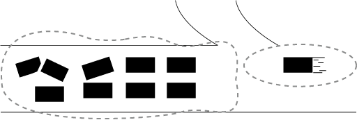
While stuck in traffic in Turin, I had the idea of making ad-hoc automotive networks that could reduce traffic congestion. When you're pulling up a long line of cars, you generally have no idea how long the line is or how quickly it's moving. From the foreshortened perspective on the tail of the line, it's virtually impossible to judge whether you should pull off at the next off-ramp, wait it out or offroad across the median and go the other way. However, a tight pack of cars is the perfect situation for an ad-hoc network:

As a car approaches a pack of other cars, it connects to their network. The pack of cars can tell the new car the average speed and size of the network (and if there's GPS information, maybe even the beginning and end of the pack), which the driver--maybe with the help of some mapping software--can use to determine whether to stay in the pack or get off at the next available opportunity:

Moreover, once the network is established, there can be all kinds of things that the network can do. There can be games, shared music collections, chat, dating, whatever. Moreover, this removes the need for a large all-seeing/all-knowing centralized traffic control system, which I think has been one of the problems of the intelligent highway world, and not all cars need to participate in it--just enough for a network to be established (though this one fact--the sparse network effect--could be the one thing that slows/prevents adoption of this system). The WiFi caravan shows that it can be done technically.

...oh, and this idea doesn't even take into account information that could be passed to the network, and to individual cars, by oncoming traffic--they know all kinds of things about the road we're about to travel on that we don't, what can they tell us?

I just installed Jay Allen's excellent Movable Type Blacklist Movable Type spam blocking utility (yes, people have figured out that if you put comments about penile enlargement and the years' hottest toys in old blog messages, they'll probably get ranked higher in Google, while remaining relatively unnoticed to the blog owners/readers). It's yet another content filtration technology and the latest carnivore in the spam ecology. It seems to work quite well and Jay is giving it away, which is great. I'm actually quite amused by the evolution of spam and anti-spam technology. In a sense, it's a microcosm of the kind of content filtering/organization problems that we're going to be running into from here on. It just happens to be at the crudest, most basic level of parasite/antibiotic relationship, but it's also a harbinger of the kinds of attention-getting versus attention-focusing tensions that are likely to only increase.

I also installed Alexei Kosut's MTSpeling plugin, which also works quite well.

One of my favorite attempts at brand extension (although not altogether a successful one, I suspect) was the My First Sony line of kids technology. Those products were probably the biggest impact that the Memphis Group style of the 80s had on pop culture (apart from the set design in Ruthless People, that is). Now the idea is back, in the form of Disney's new electronics for kids. I can already see a set of these in every designer's house. Hell, if the TV was a little bigger and an LCD, I'd buy one right now.

Oh and thanks to Gizmodo for the link My new favorite consumer product geek site.

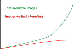
While photographing Renaissance masterpieces in Florence, I was struck by the decreasing value of images. The cost of making images has been dropping precipitously over the last 150 years, since photography. In the Renaissance, they had to choose their subject matter very carefully, because a single image took a long time to make and, by virtue of its rarity, often had to serve a broad audience and communicate many messages simultaneously. This is especially true of the major masterworks, which are often dense and broad (in terms of audience) in content, but it's even in casual decorations, which often had at least two purposes: to cover up a surface and to communicate ownership or status. Since photography, I think that the number of images (and this is a very abstract measurement, of course) that are produced per capita has probably been going up at an exponential rate. Today, there's a deluge of images--I can get 2000 digital photographs onto a memory stick the size of a cracker, five years ago this would have consumed a backpack of 35mm film, fifty years ago it would have consumed a truckload of 120 film, one hundred years ago it would have consumed a train car of glass plates, five hundred years ago it would have consumed, well, the Uffizi.

This has had the effect that images have become both much more personal, as they can be made and shared in ever smaller quantities, and much more ephemeral. To create a painting for just a couple of people was an extravagant indulgence and it became a permanent heirloom, to share a digital camera snapshot with just one person--or even to not share it at all, to keep it completely private--is trivial, to throw it away is just as easy.

This all leads to the current problem: the firehose of information. We all know about it, and have for quite a while, but it keeps ramping up, growing. In terms of my image calculation above, I hypothesize that this is because our ability to find important images, to find meaning in our representations of the world, hasn't grown nearly as quickly. It's grown, but there's a gap between the number of images we find that represent our world in an interesting way and the number of images that we can choose from. That gap is the firehose and closing it is what an enormous amount of energy is devoted to:

When discussing this with Fabio he put it very poetically: rather than creating ever newer technologies for remembering, we should think about creating technologies that help us forget. I'm not sure I completely agree with the idea that we should be discarding our information (we never know what will be interesting later--I often find that what's going on in the background of old photographs and painting to be as interesting as what the photographer thought was the most important thing), but I definitely agree that there's a value in technologies that forget for us, that filter for us, that make some things more important.

Which brings me to an idea I had back in May, a UI implementation of a baby idea embodying some of the philosophical discussion above: I want there to be a slider in all my Windows Explorer windows that allows me to hide/highlight files based on date. A time horizon that I could choose, which would "forget" things for me based on when they were made. This is more than just sorting by creation date, it's actually making the stuff disappear. Of course it would reappear if I moved the slider, but it would allow me to sort things based on other meaningful criteria while also also sorting them based on time. One end would be all files, the other end would be files/folders changed today. The rest would follow the Find File conventions. Here's a sketch:

So, Microsoft, build me this. Thanks.

[a side note: I've been using Adobe Photoshop Album to manage my digital photos and I like how it lets you manage images. It's essentially a faceted classification tool and an easy one at that. It even has a time slider that's quite nice, although it's absolute, rather than relative to "today."]

Addendum: It seems that Berkeley's School of Information Management and Systems has also been measuring how much information is being produced. This is the more general case of my thought above and the results seem to follow my gut-level curve.

While in Italy, Ray and I went to Florence for a couple of days. It rained the whole time, which was actually not bad. No lines, pretty nighttime photography, the feeling that we were in kind of a real city, rather than a real city that's become a cartoon version of itself (which it, of course, has, though not as much as Venice where there are companies that will partially chip the plaster off of old buildings to make them look age-worn). Here are some pictures.

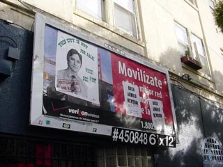
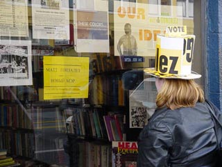
It's mayoral election time in SF and for the first time in many years there's a challengers to the Democrats. Not surprisingly, this being San Francisco, the challenger, Matt Gonzalez of the Green party, is from even further left (or at least presents himself as) than the Democrat, Gavin Newsom. The classic Buffalo Springfield's lyrics are quite appropriate in the Mission today:


What a field-day for the heat
A thousand people in the street
Singing songs and carrying signs
Mostly say, hooray for our side

And, apart from the "heat" part, since it's neither hot nor are the cops out in force, it's a classic San Francisco self-congratulatory celebration. Not that there's anything wrong with it, but maybe some of these signs--and at least one of the several Gonzalez-elegizing guitar-toting troubadours who were walking through the Mission--could have been better placed in parts of the city that Gonzalez is not sure to win.


Frankly, I'm pretty happy about it, too. Both of the candidates are young, smart and reasonable. I think that Gonzalez is more reasonable Newsom in enough things that I'm voting for him, but I think the city wins in the long run with either one.

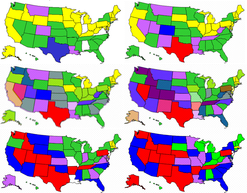
I got a flu shot yesterday because a friend of mine is sicker than she's been since high school and I figured I'd do my bit to fight the global pandemic. This morning I decided to see what the global pandemic was up to, and in doing so found the CDC's Influenza Tracking Reports, which have a nice week graph of where the flu is now. However, jumping between various graphs made it hard to see what was actually happening, so I decided to put the graphs side-by-side. That gave me the idea that they could actually be put on top of another, like an animated weather report, so I made this animated graph of how the flu spread across the country over in the last five weeks:

Sadly, the CDC graphs only look like they're identical. Whoever put 'em into the report every month actually uses a different size every time, so you'll have to excuse the ghosting. Also, I created intermediate images between each week's graph to ease the transition.

My good friend Cassidy has been taking pictures of graffiti for years. A couple of years ago he realized that he had taken pictures of the same piece of wall many times, with many different pieces of graffiti on it. So he started a project to unify all of the pictures of all of the walls he's photographed and allow someone to peel back the layers and see how a wall "learns" (in the Stewart Brand sense) based on the graffiti that's on it. After a year of pretty intense effort--a lot of perspective correction and painstaking matching of photographs that were not meant to be matched when taken--the project is up at grafarc.org and it looks great. Go Cassidy!

An announcement of someone developing a GPS-enabled handheld game system. This is yet more of the conversion of "all electronic objects about the size of your hand" that I'm expecting will be in high gear soon--pretty much until phones, cameras, gps devices, remotes and anything else that looks like that become a single object. The question will then be what to call that object.

But back to the game. First of all, it really underscores the fact that kids don't have nearly the same rights that adults do. An object that let someone else track your whereabouts remotely would certainly be much more difficult to propose and accept if targeted toward adults. And the possible misuses of that information are really extreme. If I was a kid in a group of kids with these things, the first thing I'd do is swap 'em with my friends so that our parents wouldn't know whose kid they were tracking, and then swap those with friends from neighboring towns, etc. Second of all, it seems like they're missing the most interesting part of this: that geolocation can be a critical part of the game, not just as a surveillance device. Sheesh, if you're going to be building the hardware and communication infrastructure into this thing to do all of the tracking, why not make it an actual feature for the user of the system?

Gizmodo led me to a story about a robotic chair. This one appears to be of the "prelude to armored exoskeleton" design philosophy and is a replacement for a wheelchair, rather than a general-purpose tool, but it's an interesting development in the merging of technology and furniture.

So exploring some of my animist ideas further, I found a nice summary of technological determinism in philosophy. The basic idea is as follows:

Rather than as a product of society and an integral part of it, technology is presented as an independent, self-controlling, self-determining, self-generating, self-propelling, self-perpetuating and self-expanding force. It is seen as out of human control, changing under its own momentum and 'blindly' shaping society.

Although I don't agree with that statement as a philosophy, I do believe that it plays a part in the way that (some? many?) people think about technology. In other words, because some people think that technological artifacts exist in a quasi-separate world (for example, Mark Pauline of SRL has talked about freeing machines from their slavery to humans and Kevin Kelly quotes Pauline in the same paragraph as Marvin Minsky, who basically says the same thing), they are likely to interact with them as beings from a separate world.

It's interesting that there's a long history of people describing their discomfort with technology in anthropomorphic philosophical terms.

So although I spent the last couple of days looking at Renaissance art in Florence with Ray I've been thinking about contemporary art (among other things). One thought that has been floating around my head for years now is that the contemporary art world rewards obsessive-compulsive behavior like not other single psychological trait. Why?

My pet theory is that art history is caught in a paradigm where it's looking for trends, styles or common theme indicators, even as those ideas have become more-or-less meaningless since Pop (at least if you agree with Arthur Danto, which I generally do). Pop--which, really, was a reaction to the exhaustion of Abstract Expressionism--neatly erased the notion of a dominant style. However, people (art critics, curators, etc.) are still looking for things that will give meaning in an era without a dominant style to compare with. So, in an attempt to try to find some meaning in the art that's crossing their view, many curators and critics have latched on to repetition as a proxy for vision. This is not necessarily wrong--there can be a beauty and depth in repetition (Donald Judd and Agnes Martin are particularly good at this)--but it's led to a lot of lame art that's just repetition for repetition's sake, obsession for obsession's sake.

So, in light of this, I'm updating the old art school maxim:
If you can't make it good, make it big;
if you can't make it big, make it red;
if you can't make it red, make 50 more.

Ads

Archives

ThingM

A device studio that lives at the intersections of ubiquitous computing, ambient intelligence, industrial design and materials science.

The Smart Furniture Manifesto

Giant poster, suitable for framing! (300K PDF)
Full text and explanation

Recent Photos (from Flickr)

Smart Things: Ubiquitous Computing User Experience Design

By me!
ISBN: 0123748992
Published in September 2010
Available from Amazon

Observing the User Experience: a practitioner's guide to user research

By me!
ISBN: 1558609237
Published April 2003
Available from Amazon

Recent Comments

  • Katherina: Information not just material. In our days it is a read more
  • tamberg.myopenid.com: Hi Mike, totally agree on building the IoT in a read more
  • Mutuelle: Man is the reflections of his thought, some name it read more
  • Amanda Carter: You obviously placed a great deal of work into that read more
  • Molly: You might find it interesting to connect with return of read more
  • George: You might want to change "Size" to "form" for terminal. read more
  • Mike: Thanks for the reminder, Robin. I'm aware of that article, read more
  • Robin: It's a slightly different argument (it predates most work in read more
  • Tim: This reminded me of the Pleo video Mark posted awhile read more
  • michael studli: i was wonting to know is the game fun to read more

About this Archive

This page is an archive of entries from December 2003 listed from newest to oldest.

November 2003 is the previous archive.

January 2004 is the next archive.

Find recent content on the main index or look in the archives to find all content.