August 2006 Archives

Back in December, I wrote a profile of a remarkable Portland filmmaker, Mike Wilder, for MAKE magazine. It's now been published in their Backyard Biology Issue. The actual link to the story will likely go live after the issue has left the newsstands, but here's a teaser (from an earlier draft).

"When I was 7 or 8 we went to EPCOT and saw an amazing 3D film that was produced by the Kodak people. In one of the scenes, a character threw a gold ring at the audience. And everyone in that audience reached out simultaneously to grab the ring. That just fucking blew my mind."

Twenty years later, Mike Wilder made his own 3D science movie. Working alone in the closet of his one-room basement apartment with less than $500, he made the first 3D time-lapse movie using robots made of Legos of tiny carnivorous plants. Let me repeat that: a 3D time-lapse film of carnivorous plants.. Made with robots. That are made of Legos. In a closet. For $500.

I recommend that you go and buy a copy of the DVD from Mike before people get the issue and he sells out.

Video scenarios present people interacting with fictional technology by faking the actual functionality through the use of film techniques. I'm a big fan of the technique, since they can free designers from obsessing about the how of technology design and focus on the what, who and why. People's needs form the core of good video scenario, rather than technological capabilities. Once people's needs have been identified and interactions explored, the more rigorous work of technology development can start, but the idea of making little movies that demonstrate interaction ideas is really liberating. Plus, they're entertaining to make and watch, and the process of making can identify problems with interaction concepts that mere descriptions don't.

At the 2006 Milan Furniture Fair, back in April, I was particularly pleased to watch a set of video scenarios for the design of technology products created by students of the Kingston University product and furniture design program. They took the idea of detaching technology from interaction and ran with it, clearly stating that their concern was not with how their products did what they did, but that they did them "as if by magic".

The ideas that came out of this exercise are whimsical, interesting and highly creative: a rolling suitcase that follows you, a mug vacuums up spilled coffee, dust turns into bubbles that float to a specific person and pass on a message (and 28 others). Great stuff.

Sympathetic magic is a common magical belief that I believe underlies much of the thinking behind animist relationships to the world. Essentially, it holds that something that resembles something else holds a magical link to it, and that resemblance between a controllable thing and an uncontrollable one leads to the ability to control one with the other. Ginseng's health properties may well have been inspired by its shape as the "man root". The wild, but tamable, nature of bulls may have led to them as the symbol of tamable nature (and made Taurus the spring constellation), while the untamable nature of lions made them the symbol of untamable resistance and the wild (and made Leo the fall constellation). Etc. Images are a particularly powerful sympathetic magical element and it's possible to regularly observe people in all cultures creating mystical associations between images and their subjects.

A second common magical concept is the talisman, or amulet. These often have a sympathetic component as either representations of or pieces of something that is considered powerful.

The products of technology are no stranger to either of these ideas. From photography onwards technology has allowed for the rapid creation of highly identifiable images of objects, creating lots of raw material for associations, and industrial production cranks out all the talismans one can imagine. Thus, it's not surprising that there are technological items that are designed for the expression of sympathetic magic.

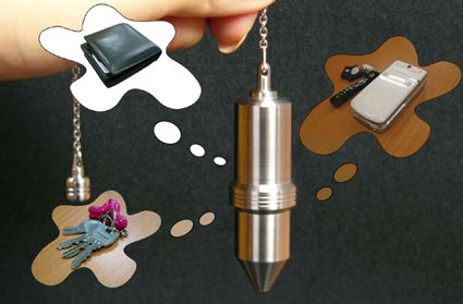
Here's a recent digital example (from Engadget) :

It's described (in Engadget) thus:


In addition to acting like a plain old storage device, the pendant promises to help you find your lost items just by loading photos of them onto the drive.

In other words, it's a dowsing rod for your stuff.

This goes well with last year's technomancy device. That device was more psychological and personal, but still a product of sympathetic magic, as its functionality depended on the similarity between the peace associated with the sound of water and one's desired mental state.

ISEA/ZeroOne San Jose ended yesterday. The artists, Anu (the producer), Liz and I took most of the C4F3 projects down last night. It's difficult to step back from a project that you've been involved in and evaluate it objectively, so I won't try. I had a great time and was proud and honored to be involved in the festival. I thought that the works in the C4F3 were great and I was amazed at how much effort the artists, jurors, production people, designers (and everyone else) put into the project. Thank you.

I didn't see everything in the festival. Of the things I was able to see, these five projects I saw and liked a lot. These are in no particular order and there are probably 20 others that I thought were great.

  • Mission Eternity, etoy

    IMGP9905.JPG

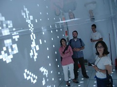
    Etoy's Mission Eternity is one of the most coherent, ambitious and wholly-realized conceptual projects I've seen in a long time. The basic notion is to use the power of networked digital technology and inexpensive storage to keep aspects of us alive after we're dead. On one conceptual level, it externalizes the network of memories and documents we leave behind, and places them into a digital world, which is projected into the physical one as a shipping container sarcophagus filled. The sarcophagus is simultaneously a display, an environment and metaphor, and as it ages, etoy will replace the LEDs with the ashes of the people whose digital selves they manage. I think it's brilliant, deep and ambitious. Go etoy.

  • Altitude Zero, Hu Jie Ming

    IMGP9942.JPG

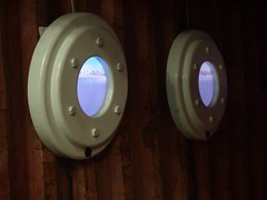
    Tucked in one of the Container Culture shipping containers, Hu's piece is an excellent, simple and subtle interactive experience. As you approach the simulated portholes, the view changes from a boat's view of one port city to another. The initial similarity of the views underscores the differences in the views and gives Hu an opportunity to quietly comment on each city and on the nature of living at the edge of the ocean, in general. The flotsam for each city is different (I think) and it's probably meaningful. However, I was mostly entertained by the pure joy of watching the portholes teleport me from one place to another.

  • Nocturne, Colin Ives

    IMGP9939.JPG

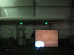
    Again, simple interaction coupled with a clever visual trick makes for an elegant piece. In the fox piece, my favorite of the three that make up this piece, a video projector acts as a spotlight. A slide projector provides the "normal" view. The two are showing images that line up. We interrupt the slide projector beam as we approach the piece and cast a shadow, except the part with the spotlight. This moment creates some interesting surprise and draws attention to the spotlight. Ives wants us to look closer at our relationship with the things around us at night, and this projector relationship (for me) really forces that, simply and directly.

  • Bioteknica Lab Remix, Shawn Bailey, Oron Catts, Jennifer Willet and Ionat Zurr

    IMGP9932.JPG

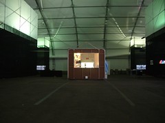
    I didn't understand this piece at first. I saw that it was a simulation of a biotech lab, but there's a lot of fetishism of the esthetics of science in the technology art world and that's not exciting to me. What's interesting is that this is a "remix" of Bioteknica's actual lab, which means that this is a simulation of their actual working environment (down to the water cooler), where they actually use the technologies of bioscience to create visual art (put simply, they grow cells to make sculptures). Their art practice is a commentary on and exploration of the practice of biotechnology in a similar way that Richard Serra explores shipbuilding with his monumental metal pieces. However, without the permanent product, all they can show is a simulation of how they create their work. It's an unassuming hut that has a lot of innovative ideas behind it.

  • Karaoke Ice, Nancy Nowacek, Katie Salen, and Marina Zurkow

    IMGP9916.JPG

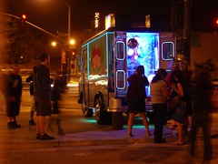
    A simple idea--popular songs played back in the style of an ice cream truck, with karaoke where the cooler is supposed to be--taken to an obsessive level of finish. An exuberantly absurd statement.

Also, Steve Dietz' contextualization of the festival, in the form of his Edge Conditions show at the San Jose Museum of Art, is excellent. Possibly the best show of digital art I've ever seen in a museum (and I'm not just logrolling because he was the festival director and co-chair on the C4F3, it's really a great show).

IMGP9776.JPG IMGP9778.JPG

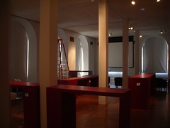
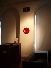
Come to the ISEA/ZeroOne electronic art festival in San Jose next week! The festival features The C4F3, a cafe of augmented objects at the San Jose Museum of Art for which I'm a primary curatorial lead (aka "co-chair" in juried festival speak). If you've wondered where a significant chunk of my last two years has gone, this is it. There's a (partial) list of artworks that are going to be in the C4F3.

There are all kinds of shows (from SRL to Bill Viola to Peter Greenaway working as a VJ and remixing his own films in realtime) and great art pieces. etoy is installing their latest shipping container experience in front of the museum as I type this.

C4F3 details:


Open from Monday, August 7 until Sunday August 13.
Opening hours:
8 a.m.-5 p.m. Monday
8 a.m.-10 p.m. Tuesday-Saturday
noon-5 p.m. Sunday

San Jose Museum of Art
110 S. Market St.
San Jose
(408) 294-2787.

Meet the C4F3 Artists 2-2:30 p.m Tuesday

The San Jose Mercury News has a Good section on navigating the festival as part of their extensive coverage of the festival as a whole.

The C4F3 is designed by my good friends at Syneo in Milan.

Ads

Archives

ThingM

A device studio that lives at the intersections of ubiquitous computing, ambient intelligence, industrial design and materials science.

The Smart Furniture Manifesto

Giant poster, suitable for framing! (300K PDF)
Full text and explanation

Recent Photos (from Flickr)

Smart Things: Ubiquitous Computing User Experience Design

By me!
ISBN: 0123748992
Published in September 2010
Available from Amazon

Observing the User Experience: a practitioner's guide to user research

By me!
ISBN: 1558609237
Published April 2003
Available from Amazon

Recent Comments

  • Katherina: Information not just material. In our days it is a read more
  • tamberg.myopenid.com: Hi Mike, totally agree on building the IoT in a read more
  • Mutuelle: Man is the reflections of his thought, some name it read more
  • Amanda Carter: You obviously placed a great deal of work into that read more
  • Molly: You might find it interesting to connect with return of read more
  • George: You might want to change "Size" to "form" for terminal. read more
  • Mike: Thanks for the reminder, Robin. I'm aware of that article, read more
  • Robin: It's a slightly different argument (it predates most work in read more
  • Tim: This reminded me of the Pleo video Mark posted awhile read more
  • michael studli: i was wonting to know is the game fun to read more

About this Archive

This page is an archive of entries from August 2006 listed from newest to oldest.

July 2006 is the previous archive.

September 2006 is the next archive.

Find recent content on the main index or look in the archives to find all content.