Over on Anne's excellent, insightful, blog we've been discussing the tensions faced by practictioners of social research in constrained development contexts. It's a discussion that's made me think about the context in which we do research and the importance of what we call what we do. The use of the term "ethnography" is currently particularly problematic: as a shorthand for fieldwork, it threatens to undermine the current usage, but "fieldwork" doesn't quite describe the activity that's being done by researchers working in the corporate environment. I don't have a good replacement, but it'll certainly be a topic for conference hallway discussion.
November 2005 Archives
I've been frustrated with being unable to watch the M4S2 video format my Pentax Optio s5z (an otherwise nice camera) produces on my Mac laptop. Several multi-hour long sessions trying to convert it into a format that displays under OSX Quicktime met with failure, until tonight, when I discovered that Casio makes a tiny codec for the Mac for their cameras, which also happens to work for mine.
Woohoo! (and, for the record, the complexity of video formats is pretty insane)
Stepping away from my recent interest in ubiquitous computing for a minute, I presented a case study called "Guidelines as Tools: Building a design knowledge management system for programmers" at the DUX 2005 conference. The case study documents a project I did with a client (who participated in the writing of the case study; thank you, Srinivas!). The project was an experiment to introduce a tool into the development process of an organization, with the ultimate goal of shifting it toward a more user-centered development model, with minimal disruption to its existing processes.
There's something for everyone in it: knowledge management, interaction design, agile software development, organizational change, open source software, blogging. (well, OK, not everyone... ;-)
My presentation of it at DUX was limited to 7 minutes, so it covers just the core idea (100K PDF) driving the project, but it's a good place to start.
The full case study (450K PDF) is significantly longer and offers a deeper perspective on our methods and ideas. Here's the abstract:
This case study describes the creation of an internal design knowledge management tool for web developers as a means to encourage user-centered development practices. With a goal to shift a software development culture from waterfall-style to user-centered practices, the repository of knowledge and code is created as an incentive for programmers to create interfaces in a user-centered and consistent way.Several experimental techniques are used in development of the tool. The process treats software developers as a user group and approaches the creation of design guidelines as if they were a product. In addition, the use of agile software development techniques, as driven by interaction and interface design, coupled with off-the-shelf blog software as a extensible, lightweight content management system makes this an experiment on multiple levels.
Results about the success of the experiment are still pending, but the authors are optimistic.
Feel free to post comments and questions here, or to send me email.
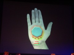
I've put the photos I took of the big screen at the last two conferences I participated in, DUX05, which ended yesterday, and Ubicomp 2005, which was in Tokyo in September. I didn't take pictures of every slide, just the ones I was interested in, but I figured that others may be interested in 'em too, even though the quality of the photography isn't always great. I've put them up on Flickr and I encourage everyone to annotate and tag them as you feel appropriate.
Here they are:
Also, in case you want to try this at home, here are my off-the-cuff thoughts for taking photos of slides at conferences:
- Set your camera's ASA as high as possible (mine goes to 400)
- Pay attention to the shutter speed. If it's super-low (like 1/4 of a second or less), you're not going to get much no matter what you do, so just listen to the talk.
- Sit roughly in the middle and 5-10 rows back; you may be able to get a flatter perspective if you sit further back, but you have less light coming from the screen so you have to zoom, which makes it more likely that the images will smear beyond readability.
- Take two pictures in rapid succession. Odds are that one of them will be less blurry than the other, usually the second one.
- Keep you camera open and turned on, people flip through slides fast.
- Don't worry about taking perfect pictures. It's just documentation for the sake of convenience. The actual slides are available elsewhere, if you really want them.
- Hold your camera with both hands.
- Never use the flash. It doesn't help and it's annoying.
- Like with a sunset, sometimes you just have to put the camera away and experience the real thing.
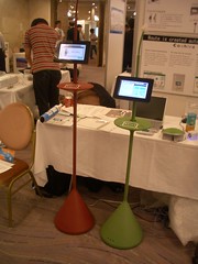
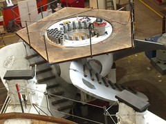
I have blog guilt from not posting much over the past couple of months. I've been writing a lot elsewhere (more about that later) and traveling. All the writing has pushed me into thinking visually in my spare time, so I've been posting a fair bit to Flickr. I post something every couple of days there because one, I'm always taking photographs and two, because putting them on Flickr is a nice break from text-based work.
Lately I've photographed:




Recent Comments