July 2005 Archives

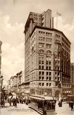
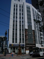
Every place that has history wears it a little differently. Some places have so much that it seeps out of every port. In Ivrea, Italy you can see where the Roman coliseum used to be by the oval pattern of the streets, but the coliseum is long gone. In Verona, they still have their coliseum, and leave it largely as a ruin, but hold big fancy operas in it all summer. In Rome, the Coliseum is essentially a monument. Every city deals with its history differently. An early influential book for me was Afterculture: Detroit and the humiliation of history. It's a bit damaged by pomo/critical theory language (ah, academia...), but it has several points to make, not the least of which is that cities are continually constructing their own histories, literally. Venice, a tourist town for 400 years, is all about giving people the image of crumbling opulence at every turn. There are even people who will artfully chip plaster so it looks extra romantic (though in many places, that's unnecessary). With this background, it's interesting to see how San Francisco, one of my homes, continues to tweak its image of itself. I noticed an interesting example recently: the uncovering of the original facade of the De Young Building on Market and Kearney. Here's the photo comparison of the original building, and its current fascade:

IMGP5604

Here's a detail of the uncovered fascade:

IMGP5605

The partial removal implies that they're only considering restoring the facade, but aren't sure yet. Although it's not framed this way, I'm sure, to me it's symbolic of a reconsideration of the role of the building's original appearance to the city image and, importantly, a rejection of Modernist ideals. It's been interesting for me to see how cities come to reconsider their histories as the generation of people raised on the utopian ideals of Modernism retire and the people of my generation, raised on Postmodern architecture, negative futures and the politics of fear (all reactions to the failed utopian dreams of Moderism...and I would argue Enlightenment-influenced scientism) take over and try to make sense where they live. In San Francisco, a city that's the product of generational boom-bust cycles and strong romantic mythologies (Gold Rush, Barbary Coast, Crime Land, Beatnik Bohemia, Hippie Heaven, Dotcom Utopia...soon to be Biotech/Stem Cell Haven) it's especially interesting to see how this mythology plays out in the fabric of the city. I think this facelift, and its recognition of the (often sordid) history of the De Young family, who went from running a frontier broadsheet to high society in less than one generation, is a telling data point in terms of San Francisco admitting its past (as Las Vegas recently did) and reimagining its next costume, its next utopian mythology.

[Man, that's a lot of "isms" and hand-waving. From someone who just put down academia-damaged writing, that's embarassing.]
My two part Adaptive Path essay on "Crafting a User Research Plan" (part 1, part 2) has been translated by uiGarden into Chinese! Woohoo! Thank you, uiGarden.

Liz and I have been playing this game of adding and crossing social trends with ubiquitous computing technologies to see where things can go. A couple of months ago, we were introduced (by new parent friends of ours) to the Happiest Baby on the Block book. One part of it is the idea that infants calm down when presented with a lot of white noise, because it's like the kind of sound they hear in the womb. You can even buy a CD of white noise that features 3 different white noise flavors:


This CD includes 3 tracks of calming white noise. First it is fast and vigorous to get a crying baby's attention. Then it is moderate to gradually guide your fussy baby to calm. Finally, it is rhythmic and womb-like to keep your infant calm and sleeping longer.

This led us to think, "well what about all of that Baby Einstein Mozart stuff? How does that fit in with this brave new world of infant audio?"

A brainstorming session on a drive led to some ideas. Here's one:

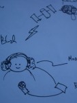
A baby-sized digital satellite (XM/Sirius) radio headphones that dynamically detects Baby's mental state (happy, crying, sleeping) based on simple noise level/audio processing and switch between XM radio stations designed to provide the appropriate sounds for the baby's internal state, anywhere on earth. A subscription model that takes the child's age into account can automatially switch between stations that are appropriate for the child's development level when selecting the right music, or special subscriptions can be made for kids who have sensory integration dysfunction, which is apparently also helped by listening to specific types of sounds.

I wrote a piece for the July/August issue of ACM interactions. It's a special issue on ambient intelligence and I wanted to share my thoughts about designing for ambient intelligent systems. To me the key is thinking about the design of everyday objects as projections of services into tools that support aspects of those services.

Now there's no reason that services must be coupled to specific objects or places, and of all of the possibilities AmI provides, the one I think may be most compelling is its ability to decouple services from individual objects.

[...]

Treating objects as representatives of a service, rather than the service itself, is a fundamental change in our relationship with the objects of our lives, but in a way that feels like a natural extension. The service becomes the focus, and the objects its avatars: the projections of a single idea into the world, rather than each embodying a different idea. This sounds lofty, but matching service to goals may lead to better overall user experiences than trying to match tools to goals. Traditional tool design focuses on enabling concrete tasks used to fulfill abstract goals. In many cases the tool becomes a necessary burden on the way to satisfying the goal, and the design of the tool is assumed to be unable to address the goal directly. Designing a service to satisfy a goal, and then designing tools that use the service to support tasks that satisfy the goal is a potentially "cleaner" way of thinking about creating a user experience than trying to enable the goal by way of designing task-specific tools.

In other words, in a world where tools communicate, store and process knowledge, every tool should not try to address every aspect of a given need. It may be easier to design tools by first designing services that satisfy the larger needs and then make tools that are tuned to facets of the service, rather than trying to do everything. (this is, btw, probably not unlike what ID calls service design)

The full text of the article(80K PDF) is available.

I've written about how I feel that given enough exposure to digital black box devices whose function is difficult to discern, people may likely start projecting psychology onto the devices, much as they project consciousness on the natural world. Gizmodo has a description of the Cure-Alpha MP3 player that


will not only allow you to listen to your favourite tunes, but it will also produce "alpha waves" that are, according to certain scientists, beneficial for the human being and the human brain. You can find alpha waves in the sound of water falling or in the noise that waves make.

(quote from Akihabara News)

I'm reminded of quack medical electrotherapy devices that appeared in the early days of electricity. Then, as now, the new technology seemed magical, and so magical properties were assigned to it. It's not surprising to see it happening again with contemporary digital technology, especially technology that's so personal and portable as MP3 players and cell phones (whose emissions have been the subject of a lot of scrutiny because, as ubiquitous objects whose actual operation can't be easily understood, they naturally create suspicion--because magic can be both good and bad, and we don't trust magic that's appeared to be all good for so long). As ubiquitous computing becomes, well, more ubiquitous, I can imagine both phenomena appearing: first, a projection of magical properties onto everyday objects; then, a backlash and suspicion (see I, Robot for an example of an expression of these fears percolating in culture already).

This, of course, is not to say that such thinking is necessarily bad, quack radiation therapy preceded therapeutic radiation therapy--and there are positive electrical therapies. I'm more making an observation about human nature and the cycle of social acceptance of technology.

When I live in Portland and I'm not working in a cafe, I work in my living room. We have a guest room/office, but it's a small bedroom and, if I'm going to be sitting around all day, I'd rather be sitting in a larger room that's right next to the kitchen (that's how I treat cafes, after all). It seems I'm not the only one, as this story from Ontario's Businss Edge describes:

"What we are seeing is that the home office has replaced the family room, and it seems to be the most utilized room in the home," says Susan Speake, owner of The Art of Working, in Oakville, Ont.

What impact does this have on the way that technology is used? Offices are traditionally the most technology-laden part of the house after the kitchen. If they're now being used as both offices and social spaces, that changes the nature of the technology that can be in them.

To utilize the passageway space, Richardson put up a full wall to block off the walkway from the dining room, but used pony walls (three feet high) that front onto the living room. The low walls provide an openness that is airy but also functional, because he can keep tabs on the kids.

"The small wall gives you all the visual separation of a room while still making the two rooms that are attached seem bigger because they are joined," he says. "It's just another trick on space without breaking a house up into teeny rooms."

I can imagine the dual-use large monitor/second TV, or a white board that works both for work and for household information sharing (much as the fridge does in the kitchen). Actual use is still unresolved--is it a situation like in the 19th century, when home businesses were more popular and people "lived upstairs" from their jobs? or more like a hobby space?--but there's likely to be a market for such flexible devices that are more specialized than just the "home entertainment PC."

Gizmodo announces that "wood inlay is the new gloss black," and I think they're right.

In Milan I saw an exhibit of appliances by Realfleet's Amadana line, which features things such as humidifiers that look like wooden rice steamers and headphones with bamboo:

The casemod community has been making wood cases for a while, so it's only a matter of time that it moves out of the garage dremel world to the industrial design world and commercial computer cases start using the material to make plastic look more sophisticated. Then (maybe) it's only a small conceptual leap to merging things that are made of wood and getting back to...furniture!

[Update: Engadget also notices the wood theme, and mentions a wood-covered cell phone by Siemens.]

Ads

Archives

ThingM

A device studio that lives at the intersections of ubiquitous computing, ambient intelligence, industrial design and materials science.

The Smart Furniture Manifesto

Giant poster, suitable for framing! (300K PDF)
Full text and explanation

Recent Photos (from Flickr)

Smart Things: Ubiquitous Computing User Experience Design

By me!
ISBN: 0123748992
Published in September 2010
Available from Amazon

Observing the User Experience: a practitioner's guide to user research

By me!
ISBN: 1558609237
Published April 2003
Available from Amazon

Recent Comments

  • Katherina: Information not just material. In our days it is a read more
  • tamberg.myopenid.com: Hi Mike, totally agree on building the IoT in a read more
  • Mutuelle: Man is the reflections of his thought, some name it read more
  • Amanda Carter: You obviously placed a great deal of work into that read more
  • Molly: You might find it interesting to connect with return of read more
  • George: You might want to change "Size" to "form" for terminal. read more
  • Mike: Thanks for the reminder, Robin. I'm aware of that article, read more
  • Robin: It's a slightly different argument (it predates most work in read more
  • Tim: This reminded me of the Pleo video Mark posted awhile read more
  • michael studli: i was wonting to know is the game fun to read more

About this Archive

This page is an archive of entries from July 2005 listed from newest to oldest.

June 2005 is the previous archive.

August 2005 is the next archive.

Find recent content on the main index or look in the archives to find all content.