March 13, 2005
Book-shaped network storage
I think this is great: a book-shaped network storage device. What's great about it is not that it's book-shaped, but that it's designed to act like a book. That shows an understanding of how to incorporate technology appliances into people's environments and a valuable way of humanizing this technology through analogy. Plus, the engineers probably conceded optimal functionality (neighboring books will probably block some of the radio waves, and heat dissipation is certainly worse than in a standalone device) in favor of a better user experience, which is a tradeoff that should happen more often.
Here's a picture of an earlier one from the same company that has a more book-like design, but doesn't sit upright like a book:

February 24, 2005
WiFi Heat Sensor
As part of the Design Engaged conference last November there was a day when we were broken up into groups and encouraged to walk around Amsterdam and brainstorm ideas about design, technology, cities and human interaction. It was a pretty broad mandate, but we shared a similar set of interests, so many of the ideas resonates and we quickly assembled a bunch of interesting ideas about new technologies. During that exercise, I started thinking about heat maps as ways of representing things other than heat.
Heat maps are maps like the heat weather maps that appear in newspapers. They represent shifting gradients of temperature, as mapped to geography. In the newspaper they consolidate a lot of potential information (think of the listing of temperatures and cities that scrolls on CNN International) by keeping one variable (geography) stable and mapping another one to it. I thought "I wonder what else can be mapped like that?" and, of course, WiFi was the immediate choice, since I'm constantly checking for WiFi strength when sitting in cafes. Mapping WiFi to heat maps has been done by several groups, with the following map taken from Chris Lentz's 2003 Dartmouth Senior Thesis as one example:
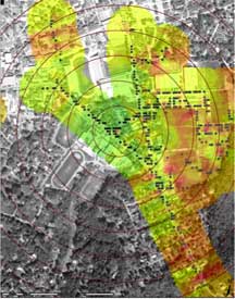
My next thought was "OK, assuming that someone is going to do some semi-automated way of doing this based on the Netstumbler database [link[, what to do with this information?"
Then, I thought of all of the other information that's already bombarding me as I walk down the street looking at potential places to sit with my laptop: I often have headphones in my ears, or I'm talking on the phone, I'm looking out for traffic and reading menus, I'm trying to find a place with a table near the window. Finding the strength of WiFi connectivity is a secondary consideration at that point, and is always going to be, but the information is there, so how to get to it?
OK, I thought, so our visual sense is totally overloaded, and our auditory sense is pretty close to it, but we have a bunch of other senses that are perfectly good and relatively underused. We can map information to these other senses. One of these is heat, so why not reverse the polarity, so to speak, and take the WiFi heat map and map it back to actual heat.
That's the long windup for the pitch of the following idea:
The WiFi heat sensor
Here's the sketch from my paper notebook, from last November:
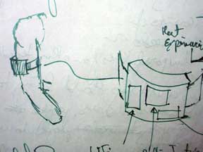
The idea is that there would be a box that you would wear that would have a WiFi detector in it, like the handheld ones that are already on the market. Rather than displaying the information in the form of LEDs, it would have a Peltier Junction, or some such heat and/or cold source in it, so it would, for example, perceptively get warmer the closer you were to a source and then perceptively cooler as you went away.
This type of shifting of data to a non-visual/non-auditory sense could have all kinds of other possibilities. Connected to a GPS (or some other way to find your place) with a database, it could tell you where there was an ATM, or a point of historic interest. Connected to a Lovegetty-like (or "Familiar Stranger"-like) device, it could tell you when there was an acquaintance nearby. It would give you a sense of the data space around you in a way that only you would know about.
My next step is to make a working one. No. Really. I have the Peltier Junctions and a hackable WiFi detector. Spidey sense here we come!
February 17, 2005
Smart Carpet
Another smart carpet project as blogged by We Make Money Not Art (who is astoundingly, shockingly, depressingly prolific in her blogging talents--I can only hope she's a grad students procrastinating from doing her dissertations; if she's not, then she can't possibly be getting anything done and if she is, then I may as well go back to streetsweeping).
User Experience in Pervasive Computing
I'm co-organizing a workshop at the Pervasive 2005 conference in May with Lucia Terrenghi, Irma Lindt and Andreas Butz. We just extended the deadline and I figured I'd announce it again.
Here's the announcement:
Paper Submission Deadline: 1st March, 2005WORKSHOP ON USER EXPERIENCE DESIGN FOR PERVASIVE COMPUTING
http://www.fluidum.org/events/experience05/
Associated with the Pervasive 2005 Conference (http://www.pervasive2005.org)
12 May 2005, Munich, Germany
Organized by Lucia Terrenghi, Irma Lindt, Andreas Butz, Mike Kuniavsky
Experience design is a design approach which focuses on the quality of the user experience during the whole period of engagement with a product: from the first approach, through its usage, to the reflection and memory of the complete relationship.As technologies for wireless networks, image capture, storage and display get cheaper and more performing, and as the internet drives up the availability of a pervasive information and communication infrastructure, it becomes possible to embed computing capabilities into a variety of environments and bring communication in a much broader set of contexts. Thus, pervasive computing and context sensitive systems allow for the design of new stimuli from which people could create their own meaningful experiences, individual or shareable. These goals raise new challenges, suggesting the need of new methods and forms of interaction patterns between users and environments, and between different groups of users. Design can play a key role in shaping new toolkits for contextualized experiences, and enhance the natural evolutions of users' sense of place and time towards the experience of living in a mixed reality, in which physical and virtual spaces are blending together, and social relationships become fluid and distributed.
Submissions:You are kindly invited to post a position paper no longer than 4 pages describing your work and interests. Submissions must be in Adobe PDF format and should conform to the Springer-Verlag LNCS style. Themes that are relevant for this workshop include, but are not limited to:
- interaction design for pervasive computing: thus addressing new scenarios for pervasive computing, interaction within instrumented environments, multi-user interaction and interfaces, multimodal interfaces, tangible user interfaces, interaction paradigms.
- design for experience management: techniques and activity theory approaches focusing on how to stimulate and support users in creating their experience within a pervasive scenario, how to engage them within the experience, how to collect, store, reflect on, share experiences.
- user experience evaluation: user experience taxonomies, understanding of users' needs and specification of requirements, evaluation methods and assessment approaches.
- design of toolkits for the authoring of blended experiences: design for ambiguity, allowing for a transparency of the infrastructure that can stimulate and support users' and designers' creativity while making a semantic relationship between physical and virtual spaces of a mixed reality.
Contacts:For further information visit the page
http://www.fluidum.org/events/experience05/for contact and submission
lucia.terrenghi@ifi.lmu.de
February 09, 2005
Ubicomp vs. The Web
Liz and I had a conversation yesterday based on my post about Neil Gershenfeld's book; specifically the part about the Web distracting people from ubicomp for most of the late 90s and early 00s.
Her point is that the Web had two big advantages over ubicomp in 1997 (whether or not it actually took resources away from ubicomp--it's not a zero-sum game):
- The barrier to entry was low. Hardware is hard. HTML is easy.
- The Web was about bringing people together, ubicomp was about making cool stuff.
The second point is really important, I think. Something that I've always talked about in UI design, and seem to have forgotten in my recent excitement with physical computing and the embedding of computation in everyday objects, is that people's ultimate goals in using any tool is to communicate with other people. There's little that's done solely by yourself, for yourself. That's a pretty boring closed system...and it's boring by definition since, by definition, we find purely solitary behavior kinda boring, on the whole.
Thus, forgetting that smart objects need to be in the service of social effects is a surefire way of making stuff that will be popular to a narrow niche, at best. An important lesson in design. Thanks, Liz!
February 08, 2005
Neil Gershenfeld's "When Things Start to Think"
Homebound with a cold in the unusually sunny Portland winter, I read Neil Gershenfled's book, "When things start to think." It's an interesting book, and still relevant to the ubicomp world, even through it was published six years ago and he was writing it eight years ago. It's an autobiography, an introduction to technological and scientific concepts, wide-eyed speculation, a polemic against everything Gershenfeld doesn't like, and a big ad for the MIT Media Lab and the students there. All in 200 pages. Sometimes, it's all of those things in a single chapter, as when he starts by talking about telemarketing, moves into a detailed history of the Protestant Reformation, slides over to the Bill of Rights and end up creating his own version of Isimov's Three Laws of Robotics. It's not as much about making deep connections as it is about associative idea surfing. It's sitting with Gershenfeld while he gives you a braindump of everything that's on his ADD mind. It's quite blog-like, actually, and if blogs had existed in 1997 that may have been a more appropriate forum than a book.
The most interesting thing about the book, which is on the whole about ubiquitous computing--even though Gershenfled doesn't like the term--is how little progress has been made since he was writing 8 years ago. Over and over I see people re-discovering the same ideas he was talking about in the book, which were old to him even then, as if they were something amazing and new. His iconic image is the shoe computer. When did the first real shoe computer come out? 2004 (the Adidas 1).
Why did this happen? I blame The Web. The Web sucked up the "best and brightest" for 10 years, and only now are people getting bored enough with it to start thinking about hardware. The pieces are there:
- Chinese manufacturing (which everyone has heard about and owns at least one product that benefitted from) is there to make it.
- The DIY movement has spawned a bunch of interest into what goes into the black boxes.
- And the ephemerality and increasing sameness of the Web is pushing smart people toward physical objects (confirming what Chicken John said years ago: "All these dotcom people, you know what they really want to be doing? They want to be working with wood.").
This book is an interesting reminder of where all of this came from, and how it's neither new nor revolutionary. However, reading it shows me how important momentum and timing are: Gershenfeld was first in many ways, but without the support of companies and individuals running with the ideas, they stagnated, and only now are we picking up the crumbs of 1997.
The end of the book introduces Gershenfeld's Things That Think Consortium. Gershenfeld is no longer a director of that program, though I get the feeling he was at the time.
January 25, 2005
Weiser's 1996 predictions for 2005, revisited
In a 1996 essay (Word document) Mark Weiser, the person who coined the term ubiquitous computing and who really defned the space, predicts:
The "Smart House" of 1955 dared to put a TV and a telephone in every room. And the "Smart House" of 2005 will have computers in every room. But what will they do?
I have yet to see a good consumer-oriented kitchen computing device, and we still mostly have dumb toilets. So is the revolution in personal ubicomp? Did the jump go from computers sitting on desks to intimate computing? iPods and cameraphones are way more popular than computers in the kitchen.
That said, it's only January, but--as always with Weiser--it's good to go back and see what he was thinking.
We will dwell with these computers, whose presence we will ignore most of the time, and they will provide us with constant clues about our environment, our loved ones, our own past, the objects around us and the world beyond our home. Computers will act like books, windows, walks around the block, phone calls to relatives. They won't replace these, but augment them, make them easier, more fun.
And, finally, some advice against focusing on technology, when it's not the technology that's interesting, it's the distractions it removes that--in his, and my view--provides the ultimate value:
We become smarter as we put our roots deeper into what is around us. The house of the future will become one giant connection to the world-- quietly and unobtrusively, as naturally as we know it is raining, or cold, or that someone is up before us in the kitchen making breakfast.Ubiquitous computing just might help to
free our minds from unnecessary work, and
connect us to the fundamental challenge
that humans have always had:
to understand the patterns in the
universe and ourselves within them.
January 22, 2005
"Attentive Cubicle"
Found here through ACM's technews:
The new attentive and more considerate office cubicle helps increase work focus for those who share space with many others. It automatically mediates audiovisual communications between co-workers by using information gained about their social orientation in an office, says Dr. Vertegaal.[...]
The attentive cubicles walls are constructed of a translucent material called Privacy Glass that consists of a glass pane with an embedded layer of liquid crystals. Overhead cameras mounted in the ceiling track the social geometry between co-workers. When potential communication partners are detected, the cubicles walls automatically change from opaque to transparent, allowing for visual interaction.
A little creepy--"HAL, please let me talk to Bob." "Dave, I'm afraid I can't do that."--but interesting.
December 03, 2004
Smart Furniture in Fiction
William sends a link to a short story about smart furniture and ubicomp.
Blebs had been around for about twenty years now, almost as long as I had been alive. Their roots could be traced back to several decisions made by manufacturersdecisions which, separately, were completely intelligent, foresighted, and well conceived, but which, synergistically, had caused unintended consequencesand to one insidious hack.The first decision had been to implant silicon RFID chips into every appliance and product and consumable sold. These first chips, small as a flake of pepper, were simple transceivers that merely aided inventory tracking and retail sales by announcing to any suitable device the product's specs and location. But when new generations of chips using adaptive circuitry had gotten cheaper and more plentiful, industry had decided to install them in place of the simpler tags.
At that point millions of common, everyday objectsyour toothbrush, your coffee maker, your shoes, the box of cereal on your shelfbegan to exhibit massive processing power and interobject communication. Your wristwatch could monitor your sweat and tell your refrigerator to brew up some electrolyte-replenishing drink. Your bedsheets could inform the clothes-washer of the right settings to get them the cleanest. (The circuitry of the newest chips was built out of undamageable and pliable buckytubes.) So far, so good. Life was made easier for everyone.
Then came the Volition Bug.
The story also has many animist elements to it. I've written about animist reactions to ubicomp before, but it's nice to see it as part of a story, since that brings the point home even better. There's also a nod to the Power Tool Drag Races.
October 19, 2004
RFID playground toystore
I was visiting my friends Moses and Lucie and their kids, Felix and Milo, in Berkeley last week. We went to a public playground near their house that had all kinds of toys scattered about (it's tellingly Berkeley that the toys don't walk away and parents regularly bring more for everyone to share). The thought of a store based on that model occurred to me: have a mall store--malls, of course are primary suburban safe play spaces for kids--where parents swipe their credit card to get themselves and their kids in. They get one of those amusement park or hospital-like plastic wristbands. Inside, it's a large open playspace and cafe, with lots of toys for the kids to play with, and new ones constantly being added. Each toy has an RFID tag in it. If a child wants the toy, falls in love with the toy, then the parents and kids just walk out with it--the RFID tags automatically charge the price of the toy to the credit card the parents swiped to get in, based on proximity with their wristband RFID.
I can see that there are a bunch of potential logistical and financial model problems with this (there's a reason that toys are kept in sturdy packages in toy stores, after all, and I bet it's primarily because of the margins). However, in terms of how a retail model can use technology and change to compete experientially in a realm where straight retail is now difficult, it seemed interesting to me.
The perfect robot
Here's a pretty hilarious story from Sync magazine, where Jake Bronstein--the author--tries to outfit his house with as many domestic robots as possible. I won't give away what happens, but his conclusion is that maybe robots that look like dogs and people aren't the future of robotics:
If I had to place a bet, I'd say when the robots take over the world, they won't look like anything we've seen in the movies. They'll probably look more like sinks. Or deep fryers. Or toilets.
I know I'm biased, but he's right.
October 07, 2004
Smart Cradle
A few weeks, old, but Victor sent me this link (to an Engadget piece) on a smart baby cradle.
Beds are a good platform for introducing technology and, more imporantly, young parents are a prime market for gadgets that make their infants safer or make their lives easier, so this makes a lot of sense. The amount of money that goes to kid tech is pretty huge, and with the continuing shift toward greater shared responsibility between parents, more dads--a prime technology consumer--are buying toys for their kids. Why else would there be $2000 titanium and leather baby strollers? (though, granted, that was a limited edition from Maclaren--but they still sold 1000--that's $2 million of titanium baby strollers sold!) Of course parents are also intensely cost-conscious as they realize how they've underestimated the costs of Baby, so technology needs to be cheaper (Neurosmith, the toy maker, probably went under because their very innovative technology toys had a price point of about $40, rather than the $20 or whatever parents were willing to pay for the technology), but technology is constantly getting cheaper, so it's a matter of time before the lines cross.
September 22, 2004
Smart Lamp
From boingboing by way of Cassidy, the gravity lamp from Front Design in Stockholm. It has a sensor and some very basic "robotics" in it (I think it pulls some wires and the rods straighten like tentpoles), but it's cute. This is the same group that did a memorable non-tech conceptual furniture piece I saw in Milan: it looks like the vase version of Duchamp's "Nude Descending a Staircase" (to see it, go to their site, click on Projects, then Design By, then Motion). They've also done some other clever technology-based design, including a robotic table that figures out how to stand, and an amusing 3D version of the glitchcore music philosophy (that's the one where the byproducts of digital recording are used as the basis of new music--Matmos and Oval are probably the ones who do it best) in the form of a candle holder, as misrendered by a rapid prototyping machine.
Cool stuff.
September 14, 2004
Virtual window
Slashdot brings a link to a fake window made of LCD panels. Superficially, this is another wacky outgrowth of the casemod world, judging by the presentation of the how the thing was put together (it's classic casemod style, complete with random anime babe desktop pattern), but I think it's also an interesting interaction between the casemod world and the ambient display world. He could easily adapt it to be like the now-classic Ljungblad and Holmquist Mondrian Ambient Weather Display and present literal content, leveraging the domestic context.
OK, that's starting to sound convoluted. I guess what I mean is that it fits into a tritely domestic setting much more easily than the minimal Modernism of a lot of ambient display, and that makes it much more likely to be accepted by the large group of people who find even IKEA Modernism too cold. Familiarity is important when designing objects for the mass home market, and this feels very familiar, even if it's actually a pretty profoundly weird thing, the inverse of the old bricked-up window.
September 11, 2004
Smart Furniture Manifesto v2
Sorry to beat this dead horse, but several people have recenly asked me for the version of the Smart Furniture Manifesto that was published in Metropolis Magazine in June. It's one of the articles from that issue that they didn't put online, so I can't just point to it. It's philosophically similar to what I wrote last year, but it expands and clarifies the ideas somewhat.
The Smart Furniture Manifesto (version 2)
The first twenty years of my father's career as an automotive engineer were spent under the hood, tweaking tiny screws on carburetors to make them produce the right mixture of air and gas. The last ten, he rarely left the cab of his test vehicle, all the tweaking done with a terminal. The difference is not just one of a new kind of technique, or comfort, but a whole new approach that embodied knowledge about engines in the form of information, instead of metal.
I'm a user experience designer, what used to be called a user interface designer. I design how people interact with technology, with software, hardware and web sites, and I'm constantly looking at the world through the lens of technological change and its affect on people.
I also like furniture. Not as a designer, but as a consumer. And it is as an outsider to the world of furniture design that I see a world trapped in amber. Furniture design is stuck in the esthetics of mid-century Modernism, looking at the world through an Industrial Revolution mindset of material manipulation. When new tools are used, it's to make the same old things, maybe a little slicker, maybe a little cheaper.
Understanding that manifestos are a dangerous thing for authorson one hand, there's the risk of militantly stating the obvious; on the other, exposing a disconnect with realityhere's my challenge to all furniture and technology designers, in the form of a manifesto:
Smart Furniture, a definition
Smart furniture is furniture that processes information about its environment, its users and other devices to be more functional and elegant to its users.As tools, current furniture designs use little of the information available to them. The Allsteel Raptor, one of the most information-savvy chairs out there, uses the weight of the user to adjust the geometry of the chair, which is clever, but the mechanics are baroque and its structure is forever fixed. It can only use a fraction of available information about the sitter and the environment.
Item 1: Furniture will be smart
It's inevitable. Information processing has permeated every aspect of our lives, and it'll end up in mass-market furniture.The question is when it will happen, what form it'll take and who'll make it. It can be cubicle walls that know who's inside them based on the IDs of the cell phones nearby and change the pictures in the picture frames accordingly, or it can be a café stereo that plays songs off of visitor's laptop playlists, or a bookshelf that lets you search the text of the books that are on it.
Item 2: Smart furniture is better than dumb furniture
If something can do its primary purpose more elegantly and efficiently because it is smart, it is better. Why else design new things? Furniture that adapts to our desires, habits and bodies, that makes our experience of the world more comfortable, is better than furniture that doesn't. Smart furniture can do this better than regular furniture, therefore, it's better.
Item 3: Furniture must become smarter now
As our lives change, the tools of our lives need to change with them. Our world seems to be increasingly flexible, diverse, and information rich than it once was. This makes it more complex. Furniture defines our living environment and is the primary tool that can reduce the complexity of our lives, but it's almost never used for this.
Imagine a child's bed that monitors her sleep patterns and adjusts to give her (and you) a good night's sleep. Imagine a club chair that through subtle, continual adjustments to its shape, allows you to spend an afternoon sitting in your living room without requiring a yoga class afterward. Smart furniture has the capability of reducing the complexity and increasing the comfort our everyday lives using information. To not begin designing it now would be to let technologyrather than people's needsdrive how it works.
Item 4: People will prefer smart furniture to dumb furniture
Smart furniture presents the possibility of building more utility and more esthetic possibilities than regular furniture. Since people like what works better for them, they'll like smart furniture more. Dumb furniture isn't without its advantages: it's simple to make and works for a long time without upgrades; it doesn't crash when the power goes outbut how much do those factors plays into people's considerations of what to buy? Furniture's function in society today is as dictated by fashion as longevity or flexibility. That makes it as frequently disposed-of as everything else. If smart furniture can satisfy people's immediate needs better than dumb furniture, many of them will prefer it. That's why they buy Ikea in droves.
Item 5: Desks, chairs and partitions will soon become as quaint as vanities and Murphy beds
As lifestyles, work styles and workplaces change, as the tools with which we live and work change, furniture adapts. The Murphy bed was an elegant technological solution to a social problem (small apartments created by rapid urbanization in the early 20th century). Suburban American homes today have little need for Murphy beds (or hat racks, or wash basins).
Smart furniture will be part of the movement toward more flexible work and living environments already underway and will, as co-evolve with the new environments to change how furniture pieces are defined and differentiated. Desks have already turned into "work surfaces." Merge those with active noise cancellation dividers in a meeting space and you get The Cone of Silence as a new type of furniture.
Item 6: Office and kitchen furniture will become smarter first, followed by the bed
Furniture that is most tool-like is likely to benefit from the potential of smart furniture first. The two areas which have the most tool-like furniture are the office and the kitchen. Trash cans, for one, are crying out to be smarter.
The bed is a particularly good candidate for becoming smart, since beds are generally close to power outlets, don't move a lot, can hide a lot of technology and are used for a fairly well-defined range of activities.
Item 7: Cars are furniture. The smartest piece of furniture today is the car
Cars are tightly integrated furniture systems tuned to a specific set of tasks. What differentiates them from a Herman Miller office suite is that they are more closely integrated and, out of necessity, they're bolted to a set of wheels and a motor.
And, yes, this means that, by extension, motorcycles are chairs. Really fast chairs.
Item 8: The Aeron is the last gasp of 19th Century Industrial Revolution thinking, even if it's comfortable
When was the last time you had to set the choke on a new car?
As a tool for work, I think that the Aeron is a best office chair design in many years, but its complexity points to an antiquated attitude to work. Its Rube Goldberg-esque array of controls belongs to an era when having a chair for a task defined a job. If the trend is away from having one task and one chair, it's away from one set of chair settings.
As a user experience designer, I see the mechanistic controls of the Aeron giving the illusion of customization and flexibility, but really creating a new set of concerns for the sitter. It assumes that someone needs to care enough to understand the ergonomic information provided to configure it, which assumes that their job is such that this is important. I bet few Aerons get configured correctly.
Item 9: Smart furniture must embrace information like dumb furniture embraced manufacturing
One of the core ideas behind Modernism was to let the materials guide the design, to maximize the possibilities inherent in the technology. Information may be the most malleable and most powerful material because it enables other materials to behave in ways impossible through other means, like the rebar in concrete. Whenever information processing has been added to a purely mechanical product, it's profoundly changed how that product is made and what it can do, generally making it both cheaper andfrom the perspective of the userbetter. It's time for furniture to join that trend.
10: YOU, furniture designer, stop bending metal and start programming!
So is Smart Furniture a panacea for all our ills? Here I must abandon my idealism and recognize that just like all technologies, there are plenty of potential downsides. On the most basic level, it can introduce all kinds of complexity and failure modes that don't currently exist. From a privacy perspective, it can reveal details about us, reveal to our employers when we're not at our desks and to our lovers when we're not in bed. But all of this stems, really, from bad design. Design without considering people's experiences. Design that happens when things are not designed at all, just built. Which may be the most important reason to start designing smart furniture as soon as possible.
August 20, 2004
MIT SmartSink
Cassidy brought me back a pamphlet describing MIT's SmartSink(a PDF paper describing the thing).
Here's the abstract, which pretty much describes it:
Considering its central role, the kitchen sink is considerably
dumber than its fellow appliances. We have built a contextaware
kitchen sink that anticipates your needs and can be
operated in a totally hands-free manner. The fixture adjusts
to your height automatically, chooses when to dispense
water and adjusts the temperature of the water based on
your needs. The water and sink surfaces act as graphical
interfaces to report the status of the water and the sink.
SmartSink is a rugged kinetic kitchen sink that can move
up and down with its supply and drain lines. Its surface is
made from soft, strong materials that absorb noise and
minimize breaking dishes. As a context-aware appliance,
SmartSink allows the user to remain concentrated on the
task at hand, only offering information in an unobtrusive
manner.
And, as to be expected from what I've said before, I agree with their concluding discussion:
SmartSink is a highly context-aware kichen appliance. The digital augmentation of traditionally simple devices can greatly enhance the comfort, safety and efficiency of tasks. In this case, SmartSink should allow users to keep their eyes and hands completely occupied with their task whenever they use the sink. The vertical adjustment should increase the comfort and accessibility of the sink.
In other words, they're looking at what people do with sinks now and are trying everything they can to augment those actions. I'd maybe quibble with the assumption that people never want to look at the sink as they do their task (what about using the contents of a sink as context for what has been done?), but it's a small point. I like the project.
And this shows that they have everything at SIGGRAPH. ;-) Thanks, Cassidy.
August 12, 2004
Wave Pillow and New Inventors
Thanks to BitTorrent, I watched an episode of the Australian TV show, The New Inventors. It seems like a decent show--a gentle cross between Monster Garage and American Idol--and very Australian (two of the three segments were about surfing and beer). (Here's the Suprnova link to the torrent).
One of the segments featured a pillow that would vibrate based on wave activity at a given surf break, so sleepy surfers can tell without getting out of bed whether to run down to the beach at 6AM or sleep until noon. It's a nice piece of interaction design and, not surprisingly, it's created by an interaction designer, Elmar Trefz (who, although Australian, was at one point one of Amy Franceschini's futurefarmers--somehow I'm not surprised this mix of interaction design, art, tech and surfing is associated with the Bay Area). The WavePillow, as its called, has its own site.
It's nice seeing ideas like "ambient display" percolating into popular culture (though without the terminology--maybe that's for the best). The judges on the show thought it was a bit too narrow in its market, but seemed to like the ideas and didn't think it was particularly outlandish. That (once again) says to me that augmenting familiar objects makes the ideas more acceptable.
August 09, 2004
"Remote Furniture" at SIGGRAPH
Ben called to tell me that he'd seen Noriyuki Fujimura's "Remote Furniture" rocking chair piece at SIGGRAPH in their emerging technologies section.
Fujimura describes the piece thus:
Each chair has a sensor and motor.These devices enable mutual interaction between the chairs. They allow one to feel the other's rocking action. The aim of "Remote Furniture," then, is to create direct and tactile touch.
The piece is designed as a nonverbal conversation between two people rocking on the chairs. It seems like much contemporary Japanese tech art, it's using technology to comment on the relationship between traditional Japanese values and how they relate to Western material culture (i.e. how the design of American and European stuff is interpreted in Japan). High tech seems to be a particularly good vehicle for this, since it is itself a hybrid Japanese-Western product.
Although it was originally presented as art--and I think it's still more expressive than functional--it's definitely on the continuum of what I see as smart furniture. It's extending familiar objects while creating subtle new ways of interacting, without requiring a large investment from the people using the things. I also see a relationship to Scott Snibbe's two fan pieces, Circular Breathing and Mirror, though those are much closer to pure art.
I think it's a great. I'm looking forward to seeing it in person at some point, though I sadly won't be making it down to LA for SIGGRAPH this week.
August 06, 2004
Adam on Smart Furniture
Adam, ever the agitator, wrote thoughtful and challenging response to my Smart Furniture Manifesto. I can't not respond to it, but it'll take me a bit. In the meantime, enjoy his thoughtful analysis. Thank you, Adam!
July 25, 2004
Smart Furniture Side Show, Part 3
The Smart Furniture Side Show, Part 3
[The concluding part of a talk I gave to the 2ad conference in April. Part 1, Part 2]The Car
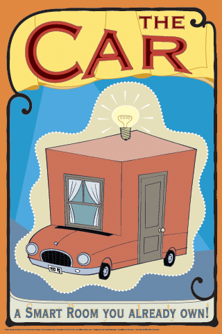
Let's look at a smart room you likely already own, your car. Not burdened with "complex" questions like "how do we automate the home?" or "how do we use technology to support collaboration in the office?" car designers just went ahead and introduced technology. Over the last 20 years, the amount of technology--tightly integrated technology--in cars has steadily increased. Many, many mistakes were made. Anyone remember the Nissan 300ZX that annoyingly told you--in a nice female voice--that your door was open, every goddamn time it was open? Sometimes it would say it in Spanish, if the wrong chip was installed at the dealership. That was 1986. But the engineers kept at it, and they keep at it. Their stuff rarely needs upgrading, it rarely crashes and it works closer and closer together all the time.
The Big Picture
The examples I've discussed are ideas, not things. I'm up here waving my arms and talking specifics, but I don't think that these things are the be all and end all of smart furniture. They may be bad examples. No, my point is that once we start thinking about furniture as a personal technology platform, we can start asking a whole new class of questions, that we must--as technologists and designers--ask these questions.My second point is that information acts like a material, it is a material, when in objects. Like rebar in concrete, it changes the fundamental properties of the things its embedded in. As monolithic computers break apart into 'devices', shards--tiny computers, networks and interfaces--embed in the objects that are already around us. And what's always around us? It's furniture.
Ladies and gentlemen, boys and girls, let this be a lesson to you. When you sit your car on the way home, or when you're at your desk, or falling asleep tonight in your bed, don't think of the freaks of the Smart Furniture Side Show. Don't think of them! Don't think of what they're going to look like, what they'll do, how many of them there will be. No, ladies and gentlemen, just think of one thing, think of how lucky you are that they're your future.
Smart Furniture Side Show, Part 2
The Smart Furniture Side Show, Part 2
[The middle part of a talk I gave to the 2ad conference in April. Part 1, Part 3]The Bed of Knowledge

Now let's move on to a more intimate piece of furniture, the bed. Beds are tantalizing objects for introducing information technology into: they're very large, so you can put a lot of "kit" into them, they're hear electrical outlets, there's a limited number of things that we do in beds, and we spend 8 hours a day in 'em. So how do we introduce technology into them?
Let's attach a simple pressure sensor to the bed. It can be under the mattress, under the legs, attached to some springs in the box spring. Somewhere. Calibrating the sensor for when the bed is empty versus when someone's in it can give us a basic understanding of when someone's in the bed.
Say that we said that an hour after someone has gotten into the bed, they're asleep. This isn't going to be right 100% of the time for 100% of the people, but maybe it'll be right 80% of the time for 90% of the people. Now we can ask questions about this information.
The first thing we can do with the information is basic home automation, in the House of Tomorrow vein. For example: If I'm asleep and it's 4AM and I get out of bed, the running lights in the hallway that lead to the bathroom should probably light up. If I get up at 7AM, the coffee maker should go on.
That's the trivial condition. We can also ask more interesting questions: "what are my sleep patterns like?" "How much sleep AM I getting?" "When am I sleeping? When is my partner sleeping?" If you have sleep problems, you can track your sleep patterns, bring them to your doctor and ask "Is this normal?" With Bluetooth-enabled phones, we can also have it act on this information, not letting calls ring through unless it's my parents' number or that important client in Japan. Since I'm not going to be actively using my DSL at night, maybe my computer can start downloading the latest alternative rock CDs from my favorite BitTorrent tracker.
[I originally talked about smart beds last November, and this largely a rehash]
The Memory Cubicle
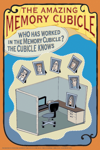
Let's go to the office. Most phones have Bluetooth built, so when you carry your phone, you're effectively broadcasting your identity, even if you aren't sharing any information. Imagine a Bluetooth-enabled cubicle (and cubicle walls already have a lot of wiring and are relatively expensive, so adding some extra tech may be only a marginal extension to what's already being made).
Let's again look at the trivial version: hoteling cubicles. With more employee movement, more outsourcing, more travel, cubicles are becoming more temporary and hoteling cubicles are becoming more popular. Imagine walking into a hoteling cubicle that recognizes who you are and forwards your office extension to the local number, brings your personal desktop on the computer and changes the smart picture frame to show your picture frames.
Now let's move to something interesting: Imagine walking into your cubicle and having your personal "shared files" directory appear in the special "shared files" directory on the machine in the cube. Say you walk to a coworker's cube. Your shared directory can be now available on their machine, but only for as long as you're in the cube. If you're all in a meeting, then all of your shared files can be available on the conference room computer.
Now let's go further. Other products, laptops also have Bluetooth. You can use the relationship between the laptop, the phone and the cube to identify activity. Are the laptop and mobile phone both in the cubicle? Then the person's probably working. Is the laptop there, but not the phone? They're probably at lunch. Are both the laptop and the cellphone gone? They're either at home or in a meeting. (and, yes, I'm ignoring the privacy considerations here)
[I elaborated my thoughts on Bluetooth phones and identity and this cubicle idea in June]
July 22, 2004
Smart Furniture Side Show, Part 1
Here's an edited version of the text I gave during my "Smart Furniture Side Show" talk at 2ad . I wrote a bit about it a couple of months, but it's taken me a while to post what I had talked about, especially since all I had there was an outline and ended up adlibbing the talk a little differently each of the 20 or so times I gave it. There's bunch of it, so I'm going to post it in several pieces, including the awesome posters that Terry Colon and Sonia Harris did for me. If you want awesome illustration and design (for conferences posters or otherwise), hire them.
The Smart Furniture Side Show!
Ladies and gentlemen! Boys and girls! Step right up! Come gaze at this emporium of technological mutation. A chair that walks! Walls that talk! A bed that knows when you're awake...and when you're asleep. Come see the Smart Furniture Side Show, and don't be afraid of what you will see insidewell maybe just a little...OK, enough of that.
In the last 10 years there has been a lot of discussion about ubiquitous computing, pervasive computing and ambient intelligence. Most of this discussion has focused on creating new objects and appliances that require learning unfamiliar modes and failure states that make them useless when they're not doing the new thing they're supposed to be doing. For the most part, they're wholly separate devices that we're supposed to incorporate into our daily existence--and that's hard.
My thesis is that there are few things that are more ambient, ubiquitous and pervasive than furniture. Furniture is already all around us. It defines our spaces, supports our work and play, and gives us tools with which to express our values. This makes furniture a great platform for augmenting people's existing use modes with information processing without adding to what they need to know. Smart furniture is an evolutionary step that softens the edge of technology adoption for the consumers and allows technology producers to understand which directions are most fruitful for taking ambient/pervasive/ubiquitous computing.
In other words, why create new objects when there is a world of existing things that can be made better, things that people already know how to use?
Let me give you some examples:
The Literary Bookshelf

Let's start with a bookshelf and books. Imagine that the bookshelf has RFID readers embedded into the shelf and the books have each been stickered with RFID tags (it would be trivial for Amazon to ship all of their books with RFID tags in them, I suspect). Imagine that there's also a way to identify a book or books, either through some kind of lighting with LEDs or maybe something more bookshelf-like, with little pieces of wood that are stained different colors and which can flip, like one of those railroad signs in Europe. What can you do with this extension of the bookshelf and books? Well, first of all you never have to loose a book again. That's the obvious utility: "Hey, where my copy of Stephanie Winston's Best Organizing Tips?
Fine. But there's a more interesting thing. Imagine linking this bookshelf to Amazon.com's database (or some database built on top of Amazon.com's database, or the Library of Congress database
something that has the appropriate metadata). You can ask a bunch of new questions of your bookshelf:
- "What books do I own on this topic? Please light them with brightness proportional relevancy."
- "What books do I own that address these two topics? Use different colors to show me which books have which topic."
- "There's some book that has some variation of this quotation in it, which one is it?" (using the "Search in this book" functionality)
- "Which of my books reference this book?"
And still more interesting are questions like
- "Which of my friends has books like this (that they're willing to tell the database about)? "
You can then expand this idea to a system of objects, using the book RFID tag in new ways: a smart book jacket with a small keyboard and display that, based on the RFID tag, downloads the full text when placed around the book, allowing you to search inside the book, etc. Or using the RFID bookshelf in new ways: misfiling books in a library would immediately become more difficult, etc.
[to be continued tomorrow]
July 20, 2004
Mindball for sale
They don't tell you how much it costs on the site, but Sweden's Interactive Productline are selling a biofeedback game table (which has appropriately Scandinavian furniture lines) called Mindball.
As interesting to me is the company, which has as its vision statement:
We will become Swedens leading development partner in commercialising research results within the experience industry.
With Menlo Park's Onomy Labs, this represents an interesting new twist on the design shop: one that specializes in deep (or deep-ish) technology transfer, rather than just surface. Nice.
(link courtesy of Slashdot).
July 14, 2004
Money for Smart Objects
So there seems to be movement in the funding of technology for use in everyday situations:
MagInk develops and markets reflective digital ink technology, considered a global breakthrough for the billboard industry. The reflective technology makes to possible for the first time, to use digital displays outdoors, without the need for energy input during the display period. Costs are substantially lower than for existing display technologies. The proprietary technology has a very wide range of applications, including digital furniture, billboards, and building materials.[...]
MagInk's technology is basically an ink that changes color at a computer command. The company's is presently focusing on the billboard market, but it envisions entering other industries. Poliakine says, "Imagine wall paint that changes the color of your office and living room at a computer command. In the future, it will be possible to send digital broadcasts without the need of televisions. That's the vision."
From Globes Online
And this odd collection of ideas that are an attempt to extent a consumer audio brand to smart furniture:
Symphonix Ltd, the Huntingdon based manufacturer of loud speakers, including the world recognised Mission brand, has been acquired by Fundamental eInvestments Plc, the Harlow based audio visual solutions provider.[...]
Symphonix will work in close association with other group companies and will handle the manufacturing side of the Purely Plasma Limited (PPL) business to include a Plasma Bed, a range of wooden Retro LCD Screens and a range of household furniture centered around flat screen technology.
From Business Weekly
Fascinating. Where there's money smoke, there's technology fire and I'm interested to see where this stuff is going to go. It's also good to see that it's not just Philips and Sony. When the little guy gets into the act, that means that there may actually be a market.
May 27, 2004
Two Furniture Fairs (part 3)
One of my goals in going to Milan and New York was to see where the industry currently stood in terms of my smart furniture ideas. I mean, I'm an outsider, so who knows if I'm reinventing the wheel? If these fairs are representative, I may be barking up the wrong tree, but I'm not reinventing the wheel (if you know what I mean).
LEDs
Molly tells me that in Ivrea they have a (pejorative) saying about how others perceive interaction design: "If it has an LED, it's interaction design!" I think that's an accurate description of a stage of evolution in the design of products: LEDs are probably the easiest electronic component to incorporate into a design, so they get used first. For the most part, this is where furniture's state of incorporating information processing currently stands (for the most part). Most treat LEDs are replacement for miniature light bulbs, but it's a start:
There was also a nice LED lighting piece in New York by British designer Emma Caselton called "The Stretched Convention." I didn't get a picture of it. It featured columns and plates of LED's diffused by various fabrics. Very pretty and would make a good platform for ambient display. Emma sent me pictures!
Here's a speaker/light made by a Korean designer. The sound modulates the emitted light:
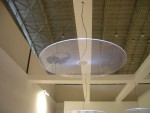
Element Labs presented a nice set of enormous LED tiles that can be stitched together into big walls of individually-addressable color blocks.
The best LED lighting piece, however, was in New York. "Lume," by Divalli, is a diffuser fabric with embedded LEDs. It was designed by some MIT people and the manufacturer and it looks like glowing, shimmer cotton batting (and they were savvy enough to vary the color temperature and spacing of the LEDs to give it a nice visual texture). The Globe and Mail provides good background. And, again, no pictures (on that note, if anyone in Bristol has found a Pentax Optio s4i digital camera, let me know ;-).
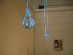
Not an LED, but there was also this nice ironic light made from electroluminescent wire at the Milan Salone Satellite:
Smart Furniture (unironic)
Now to smart furniture. Frankly, there was very little. Between two massive shows, which probably featured 100,000 different furniture designs between them, I found two pieces. Maybe I missed some, so please send suggestions if you have any. Probably my favorite smart piece in the whole show was the table designed by RISD for their "Trace" restaurant design in the food design show in Salone Satellite (which I was so entertained by that I forgot to take pictures--doh!). Primarily a decorative piece, it used technology cleverly and transparently. Translucent tables had cameras mounted underneath them: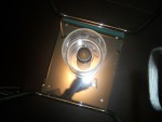 The images from the cameras, underneath shots of outlines of plates, silverware and hands, were projected onto the walls of the restaurant, subtly layered so that it wasn't obvious where the images came from. What I liked was that the piece worked when people didn't know how it worked or how to affect it, when they knew what it was, but not how they could change it and when they knew what it was and how they could affect it. That's pretty much the definition of how an ambient piece that extends the functionality of an existing object should work, which is what attracted me to it.
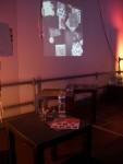
A similar idea was explored by Ivrea students, but in a more literal way, but with cameras above the tables:
In New York, I saw what may be the first standalone piece of commercial smart furniture by Glide, a small design/consulting company. They have a cabinet that uses fingerprints and Bluetooth to lock and unlock a tabletop cabinet. It's a small step, but the design is clearly aiming toward high design esthetic (it has rounded corners and it's orange!), the technology is thoroughly integrated and the tech is clearly extending the base functionality of an object with an existing mode of use. I'm not sure how I would use it, but I was really excited to see it.
Smart Furniture (ironic)
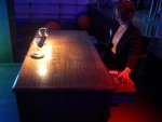
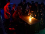
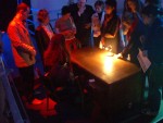
Let me explain why I created this category: the majority of furniture design that incorporates information processing technology is heavily influenced by the work of Bill Gaver, Tony Dunne and Fiona Raby at the RCA and their critical design philosophy. I've said what I think about critical design before, so I won't again, but I still feel it important to put these piece in a section by themselves. OK, maybe one more thing: furniture fashion, like any other, depends not just on innovation, but on reference and context (as so painfully analyzed in Barthes Fashion System). Irony and commentary are clearly part of that mix, but when the scale tips towards so heavily toward irony that nearly all else (like functionality) is secondary, it gets its own section. First up is Crispin Jones' Invisible Force table, exhibited in the Interaction Ivrea section. I like this piece a lot, primarily because it really extends the existing piece of furniture and because the craftsmanship really respects the original table from which it was made: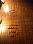
Some Ivrea students also made this great smart wallpaper as an ambient display medium:
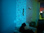
One stripe displays text by changing color (it's impregnated with heat-reactive dye and has small heating elements connected to a PIC behind it), another lets you change the brightness of a lamp (it uses small switches embedded in the paper), another changes color based on humidity and I can't remember what he final one does, but I liked it.
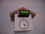
Finally, there was a great set of clever objects by Victor Vina and Hector Serrano, grouped under the name netObjects. These are a set of everyday objects augmented with technology, and as humorous objects of contemplation, they're great.
My favorites were a cuckoo clock that displays news, with a switch to choose between left wing or right wing news:
And an umbrella that shows weather forecasts:

I think that all of these pieces point the way toward a whole new generation of furniture, a new way of thinking about how to use information. This may be the bleeding edge of the wedge (while we're mixing metaphors), but I'm incredibly excited to see this kind of work. I can't wait.
February 21, 2004
Smart Speaker in NY Times
The NY Times covers a B&O speaker that adjusts its tone to suit the shape of the room:
As its downward-facing deep bass driver, or woofer, emits several test tones, an onboard microphone at the bottom of the speaker picks them up. Then a servomotor moves the microphone several inches so that it protrudes from the bottom and can pick up reflections from the room, and the tones are emitted again. A signal-processing chip within the speaker analyzes the difference between the two tests and digital equalization circuitry, also on board, adjusts the sound.
Nifty. Sadly, the design they went with is way too Jetsons for me.
February 14, 2004
Rich Gold on Smart Objects
Peter points me to this excellent slide presentation, now 10 years old, by the late Rich Gold. He asked a bunch of great questions--some real, many clearly hyperbolic--that try to understand the boundary between technology as a means to an end and technology as the end itself (or at least that's how I read it). For example:
How smart does the bed in your house have to be before you are afraid to go to sleep at night? Which is smarter: awnings over the windows to keep out the sun or a massive interactive, cybernetic cooling system that attempts to keep the temperature of the house within one degree of optimal?
Some are precient of what would happen just a couple of years after he wrote the slides:
If it turned out that you would get 25% discount on the price of your home if instead of paintings, you had to place advertisements on the wall, would you do it?
In the end, his questions are about technologically mediated experiences versus real experiences, design for people versus design for design's sake, personal responsibility versus responsibility delegated to machines. It's a great palette cleanser after consuming so much technology-as-panacea thinking. And though it stands the test of time, I'm not sure if the 10 years have answered any of the questions, or ever will, yet the world has really changed, probably for the better, because of technology.
January 31, 2004
Drift Table and Critical Design
Viz Gizmodo via Metafilter via (someplace else) come pictures of Bill Gaver's Drift Table, clearly a product of the RCA's interaction design program. I heard about this some months ago, but I wasn't able to find a picture of it, so it's funny to have it show up on a gizmos site.
Where should I start? It's nifty, it's smart and it's furniture. I like it. Why don't I think it's Smart Furniture (as per my definition)?
First of all, I don't think it's using the information around it in a way that's actually useful to its user. It's description does little in the way of defining a need that it's solving:
The Drift Table allows people to float slowly over the British landscape from the comfort of their own home. The distribution of weight on
the table controls the slow scroll of aerial photographs displayed on a central viewport. Progress is slow, but the Drift Table can be used to visit favorite places, look at geographical features, or simply watch
the world go by.
[...] The Drift Table is designed to allow exploration and daydreaming, rather than to fulfil any particular task.
Though I don't think that all objects need to be absolutely utilitarian, this seems to be a pretty tepid explanation for why all the work went into making the thing. Which brings me to a rant, and you'll have to excuse me (especially if you're one of the people I mention in my rant), but I've been meaning to get this off my chest for a while.
RANT:
Like many of the RCA things, this object seems to cross the design-installation art line in a way that I'm uncomfortable with. In November I asked Noam Toran, an RCA grad who did a project at Ivrea called "Objects for Lonely Men," a question about how he defined design. I loved his project, but I disagreed with his definition of design. He said that design to him is a medium. I think it's a process.
And that's to core of my problem with "critical design," the process that Dunne and Raby practice/teach at RCA. Maybe because I was a design school dropout I have a primitive view of what design is. It seems to me, however, that design is a practice that is neither particularly an efficient or an effective process through which to explore ideas about society and the practice of design, which is what critical design is an attempt to do. It seems like a shoehorning of critical theory into a design program in order to not be left behind by the revolution that happened in other university departments in the 80s. I get it, but it's confusing the messenger with the message (maybe intentionally).
Design, to me, is the process of projecting the explorations of science, art and industrial production onto everyday life in a way that uses those discoveries to enhance people's lives in an immediate and tangible way. That covers a lot of ground, but it kinda requires that there be some immediate real utility, which critical design seemingly intentionally avoids. Despite all of the frustrated artists who enter the field (I among them), design is an applied art. Sometimes it can transcend its utilitarian nature to become art in itself, but the objects must first be applied, then art, not the other way around.
That said, I believe that design can learn a whole lot from art, specifically from tech art and installation art, and it should. But redefining design to be the medium of industrial production--i.e. everything that's produced or looks like it was produced using industrial processes--is a disservice to both design and art.
RANT OVER.
Which is a very long-winded way of saying I still like the Drift Table and I'm willing to be convinced otherwise, but I think it shouldn't be confused with a product that belongs on a gizmo site.
Oh, and it's part of a larger series of objects, that are all interesting and all kinda suffer from the same set of problems.
January 11, 2004
Grenoble Smart Objects Conference
Following the threads of the Ambient Intelligence stuff I just found, I found the Grenoble Smart Objects conference that happened last spring. Again, it looks much along the lines of what I've been thinking and I'm very happy to have found it. It's not surprising--Don Norman DID write The Invisible Computer like five years ago--but it was all theoretical then. It's nice to see that it's becoming real now.
Even better, they have the proceedings of the conference online. That's the way it should be.
December 15, 2003
Ad-hoc car networks
One of my favorite new tech ideas is the low-power ad-hoc network. It's simple, powerful and leverages the fact that people in a given geographic location are likely to have similar interests. I like it because it's a fundamentally human-level concept, rather than being about making the technology somehow more efficient (though it does that, too, by reducing the amount of communication that's likely unrelated to what people are interested in and thus reducing the needs for filtering/routing information).
While stuck in traffic in Turin, I had the idea of making ad-hoc automotive networks that could reduce traffic congestion. When you're pulling up a long line of cars, you generally have no idea how long the line is or how quickly it's moving. From the foreshortened perspective on the tail of the line, it's virtually impossible to judge whether you should pull off at the next off-ramp, wait it out or offroad across the median and go the other way. However, a tight pack of cars is the perfect situation for an ad-hoc network:
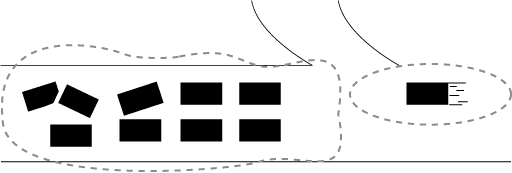
As a car approaches a pack of other cars, it connects to their network. The pack of cars can tell the new car the average speed and size of the network (and if there's GPS information, maybe even the beginning and end of the pack), which the driver--maybe with the help of some mapping software--can use to determine whether to stay in the pack or get off at the next available opportunity:

Moreover, once the network is established, there can be all kinds of things that the network can do. There can be games, shared music collections, chat, dating, whatever. Moreover, this removes the need for a large all-seeing/all-knowing centralized traffic control system, which I think has been one of the problems of the intelligent highway world, and not all cars need to participate in it--just enough for a network to be established (though this one fact--the sparse network effect--could be the one thing that slows/prevents adoption of this system). The WiFi caravan shows that it can be done technically.
...oh, and this idea doesn't even take into account information that could be passed to the network, and to individual cars, by oncoming traffic--they know all kinds of things about the road we're about to travel on that we don't, what can they tell us?
December 03, 2003
Robotic Chair Thing
Gizmodo led me to a story about a robotic chair. This one appears to be of the "prelude to armored exoskeleton" design philosophy and is a replacement for a wheelchair, rather than a general-purpose tool, but it's an interesting development in the merging of technology and furniture.
November 24, 2003
A photogeoblog sketch
After last years' ETech and CHI conferences, where location-based information seemed to appear more frequently then before, I started thinking a lot about location-based data and how it will be a big part of the way that we use smart electronic devices on a daily basis. Location is one of the bridges between the data world and our lives--where we are makes a difference to the kind of information we want. There are several different kind of location identification technologies available (cell phone location and GPS) and there are now companies such as Landmat starting to exploit it, so it's going to be here soon (Landmat already did a Time Out City Guide to London that uses your cell phone location to give you customized information).
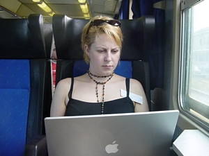
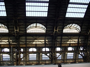
So I decided to try my hand at thinking about what location-associated service I would like and came up with the location-aware camera idea. I looked at cameras that would do this, but at the time they were all too expensive (they've since come down in price), so I decided to do a quick sketch of how a vacation with a location-aware camera could be documented. I did this over the summer with a digital camera and a bunch of maps I had picked up on a trip Molly and I took, but didn't get to posting it until just now. Here it is.
The context for the trip would be provided by a dynamic map like Bryan Boyer's Indy Junior:

And the rest of the trip would be documented with photographs matched to maps matched to day and time information. This would allow readers to follow the trip as it happened, to see when and where cool things were and to provide some of the feel of the flow of the trip. Services like GeoSnapper do part of this, but not the whole thing (presumably because only some of the information exists and it's tough input it manually).
6/13/03 4:47PM
|
 |
 |
| 4:47PM |  |
 |
| 5:13PM |  |
 |
| 5:25PM |  |
 |
| 5:31PM |  |
 |
| 5:34PM |  |
 |
| 6:49PM | 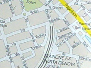 |
 |
| 8:11PM | 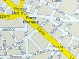 |
 |
| 8:46PM |  |
 |
| 9:16PM |  |
 |
6/14/03 10:25AM |
 |
 |
| 10:57AM |  |
 |
| 1:20PM | 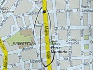 |
 |
| 2:16PM |  |
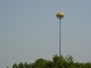 |
| 2:17PM |  |
 |
| 7:19PM | 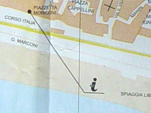 |
 |
| 8:15PM |  |
 |
| 10:05PM | 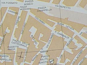 |
 |
| 10:13PM |  |
 |
| 11:33PM |  |
 |
6/15/03 10:19AM |
 |
 |
| 10:19AM |  |
 |
| 11:13AM |  |
 |
| 12:49AM |  |
 |
| 3:25PM |  |
 |
| 4:05PM |  |
 |
| 5:00PM |  |
 |
| 7:16PM |  |
 |
November 04, 2003
Smart Furniture: Beds
Arrived in Ivrea a couple of days ago to visit Molly. Inspired by Elizabeth Goodman and Mariojn Misilim's Sensing Beds paper and Dunne and Raby's Design Noir book, I started thinking of smart beds. Beds seem like a pretty logical platform for incorporating intelligence into furniture. Beds are large, stationary, near electrical outlets and as Goodman and Misilim point out, used every day, pretty much at the same time. They're primarily used for three purposes: sleeping, sex and recuperation from illness.
I decided to brainstorm on the question: "How can beds use information from the environment around them to help with sleeping and health?" [Smart beds as sexual aids will be considered at another time] Here's what I came up with:
Sleeping
There appear to be several different techniques for detecting sleep. All require attachments, but maybe there could be a way to detect sleep without needing to wear a strap or skin sensor. If a bed could detect when its occupant(s) were asleep, it could do any number of things:- tell their phones to go directly to voice mail
- tell their doorbell ringer to spit out a message
- tell parents that "all is well" with their kids without having to peek in
- log the times and use that to build the sleeper a profile of their sleep cycle so they could once and for all know how much sleep feels like it's the right amount
- Etc.
Snoring and sleep apnea
There's a whole industry to tackle these problems that could leverage off of smart beds. A bed with a microphone could tell when snoring became louder than a certain threshhold and either wake the snorer or slowly reposition them to a better breathing position. Sleep apnea could be detected/monitored/logged and could trigger actions using technology that already appears to exit.Health
Medicine is where the most technology is currently applied to beds (and bed-like devices like operating tables) and is likely to be where smart beds first appear. There are bed wetting sensors, bed exit alarms that trigger when someone has left their bed and patient positioning technology used to in cancer radiotherapy. (Here's an example of an experimental rig that seems like it could actually be fun to ride). Tying such sensors together with shared information could allow their environment to adapt to the person's condition or needs:- a crib breathing monitor could detect Suddent Infant Death Syndrome
- a heartbeat monitor could monitor a cardiac patient's state
- a breathing sensor could sense an asthmatic's night-time breathing difficulties (asthma often worsens at night)
- Etc.
Room flexibility
How can smart beds make bedrooms into more flexible spaces? Bedrooms are of fairly limited use and although McMansions in the US have more floor space than people know how to use, there are still places where population density is a such that space is at a premium.The key to all these ideas is that the bed mostly serves as the sensor and communicates data to other devicesideally wirelesslyrather than trying to do everything.
Other Smart Bed Links
- Static Charge Sensitive Bed
- NAPS (Non-Invasive Analysis of Physiological Signals)
- The Bed, a medium for intimate communication
October 19, 2003
Smart Furniture: what's been done?
In following up to my Smart Furniture Manifesto I decided to do a little research as to what's been done. My criterion for inclusion was to look for pieces of furniture that used environmental information in a deliberately functional way (rather than, say, Dunne and Raby's Placebo Project objects, which intentionally use information in a way that's only marginally useful).
I've come up with (only!?!) two:
- The chair version of Maribeth Back and Jonathan Cohen's Listen Reader, where kids sat in a chair (which contained the electronics and a speaker system) and flipped through a RFID-enabled story book. Depending on which page of the book they were on, the chair would make sounds that provided an appropriate soundtrack to what was on the page.
- The Trinity College Smart Couch which uses people's weight to determine who's sitting on it and make various things happen (there was a similar kind of technology being used in luxury cars back in the 80s to set mirror and seat position, I believe, but nowadays it seems to only be used for making safer air bags).
Are there any others out there?
[10/27: Found Purdue's Sensing Chair project. Here's a better description.]
October 17, 2003
An essay on Animism and Ubiquitous Computing
An essay I wrote over the summer and have revised several times to include some of the thoughts I've posted on this blog is now on the Adaptive Path site. It's the most public airing of ideas I've mulled over in the last year or so and I'd appreciate others' thoughts on the subject. Feel free to post feedback about it here.
October 07, 2003
Smart Furniture Manifesto Comments
I'm writing this in the jury waiting room in the San Francisco Criminal Courthouse, waiting to find out whether I'm going to be picked for jury duty. The place is incredibly full of a remarkably broad group of people, like an airport waiting lounge during a snowstorm. The 1960s clock is broken, always pointing at 8:45, and there's a sign underneath it (printed in rainbow colors) that says "Decorative Clock Only." That's one solution.
So this is the perfect time to address to all of the responses to my smart furniture manifesto. First of all, thank you to everyone who responded. I like the dialogue. Second, I restate your points below, partially to condense the length and partially as an exercise to understand what it is that you're saying so that I can respond to it appropriately. My apologies if I misrepresent your statements.
- Peter asks for a definition of smart furniture. The manifesto is my definition of smart furniture, but if here's one more like a dictionary definition: Smart furniture is furniture that uses the information technological advances of the last 30 years to make furniture more functional and elegant.
- Andrew asks what the connection is between furniture and information other than the literal one (computers have to sit on something). The connection is that furniture, as it's currently designed, has a poor information processing model. If you think of furniture as tools, then current furniture designs are using very little of the information available to them. Some pieces use the weight of the person (the user) to adjust the geometry of the chair, which is clever, but the mechanics are baroque (though not as baroque as the Aeron) and there's so much more information available about the user and the environment that isn't being used.
- Cassidy asks why smart furniture is better than dumb furniture. Paraphrasing: Dumb furniture is simple to make, simple to use, lasts a long time without upgrades and won't tell on you if you do something it doesn't like on it. All true. And I don't think that dumb furniture is bad. In fact, I love dumb furniture and I don't think it's going away. Whenever you sit on a rock you're essentially making that rock into dumb furniture, and I don't think people are going to abandon sitting on rocks or hanging their jackets on trees any time soon. However, I also think that furniture—the tools of our lives—will be
- Dave says
several things, which although meant in jest actually seem to
support my thesis
Dave says I hear Furniture is not dumb, people are dumb People aren't going to get any smarter, but furniture can and should compensate for our failings when it can. Really this applies to all technology, and I think furniture design can do better. People weren't designed to sit in most chairs Current furniture is often designed for looks rather than comfort—smart furniture would allow more flexibility to achieve both You will pry my Aeron from my cold, dead ass Yes, Aerons are undoubtedly comfortable and an achievement, but they're like an HR Geiger monster mechanically and I think, unnecessarily. The Murphy bed is a great space saver and closer to smart than most Absolutely. It was an elegant technological solution to a problem (small apartments created by rapid urbanization in the early 20th century). It cleverly leveraged off of the metalworking expertise that was created in the late 19th century. We should have more of those today, leveraging off of the information technology expertise created in the late 20th. - Lane takes dayment's facetious comment about beanbags and points out that beanbags pay more attention to and are more responsive to the needs of the body, unlike Aerons which are difficult to adjusted, and don't adapt to the shifting needs of your back, arms and neck. He then points to chapter 2 of Galen Cranz's book "The Chair" as required reading. I haven't read it yet, so I can't comment on the book, but I agree with the beanbag comment. Beanbags are also a product of the technology of their time, since most of them were actually not filled with beans, but with styrofoam pellets, and utilized the adaptive property of those pellets to create a novel and more easily managed update of the traditional pile of floor pillows.
- Molly agrees with the fact that cars are furniture and succinctly defines them as furniture incorporated into little capsuled environments. I agree completely. She then asks if smart furniture is better than dumb furniture and what the relationship is between smart objects and smart furniture (i.e. do you need smart furniture if you have smart objects)? I think smart furniture is better than dumb furniture. If it can do what its primary purpose is more elegantly and efficiently because it's smart, it's better. I also think that the issues with making furniture smart and having smart furniture as part of an animist environment are two separate issues, connected by the underlying technology but little else. She's also creeped out by furniture that can reveal details about us that we're accustomed to keeping private. I agree. I think that there are a lot of potentially negative issues with the animist environment I've outlined.
- Erikpoints to "Chasm City" by Alastar Reynolds, where furniture is "aware" of the environment. He remembers they may have moved out of the way (no stubbed toes) or in your way (a place to sit). I think to some extent that's exactly right, and Erik's comment that it's pretty cool shows that the ideas are attractive. Why shouldn't your surroundings adapt themselves to your life? I, too, would like to have my dining room set arrange itself for the 6:30 dinner party listed in my calendar. I think that dinner parties are a rare enough event that it's likely that that wouldn't be a big consumer sell, but a footstool that scoots itself under my feet when I lifted them may be popular with the La-Z-Boy market, which already welcomes "nontraditional" furniture technology.
- Michael points to what he calls my earlier manifesto. Thanks for pointing out the similar style, but that's less of a manifesto than a succinct summary of my book. ;-)
- Adam first asks whether I'm jonesing for is some sort of utility fog. No, not in the extropian nanotech sense. The basic utility fog premise assumes a generic technological platform that can create tools on the fly from basic quasi-intelligent nanobots (or something like that). I'm actually going the other way: I think that tools need to become more specialized and enable specific activities.
Adam then makes several points:Adam's points My responses Desks and chairs are part of a system, and good ones are designed to be reconfigured by the user to suit their needs, rather than some program of the designers. That's one of the reasons why integrated seating/working surfaces fail. I completely agree that all of these things need to be part of a system, and nowadays designing technology (which furniture has always been, even when it was made of wood, wool and iron) in isolation no longer makes sense. Allowing for adaptability is a tricker question, though. Sure there should be flexibility in the design, but one of the reasons that traditional furniture had ambiguous function was that it had to. Then, again, it would be weird to have six Aerons at the dinner table or a leather club chair next to a work surface, so it's not like "traditional" furniture design is all that flexible, either. Besides, maybe smart furniture would present possibilities for more flexibility? Adam likes his Murphy bed and doesn't see why it should be quaint. I'm not saying it should be quaint, just that it is. It's of a class of furniture, like wash basins and hat racks, that are no longer nearly as popular because of how our society functions. Modern McMansions are build under different social considerations than when your house was built, so they don't have drawing rooms or root cellars, but they do have media rooms. The Murphy bed is a reminder of that time, so it comes off as quaint. Dumb furniture is easier to maintain and doesn't depend on the electrical grid to work. I agree that dumb furniture is easier to maintain, but I'm not sure how much that plays into people's considerations anymore, so I'm not sure how much it matters to my point that furniture needs to become smarter. With the exception of people who seek out older furniture (which is a sizable chunk of the population, but probably not the majority), its function in society is as dictated by fashion as anything else. That makes it as frequently disposed-of as everything else. I too like furniture that lasts (in fact most of my furniture is pre-Modern antique), but my values are clearly not those of the majority of Ikea visitors.
And so many things aren't going to work when the grid goes out that I'm not too worried that maybe my smart table won't work as advertised. Granted, key devices should still more-or-less function even without juice, but that's part of good design.September 28, 2003
The Smart Furniture Manifesto
Manifestos are a dangerous thing for the author. On the one hand, you risk saying the obvious in a militant way that shows your naivety. On the other, you risk an incomprehensibility that shows how out of touch you are. In either case, you risk your credibility as someone who can be reasoned with about a topic.
That said, here's my
Smart Furniture Manifesto, version 1
- Furniture will be smart
- Smart furniture is better than dumb furniture
- Furniture must become smarter NOW
- People prefer smart furniture to dumb furniture
- Desks, chairs and partitions will soon become as quaint as vanities and Murphy beds
- Office and kitchen furniture will become smarter first, followed by the bed
- Cars are furniture. The smartest piece of furniture today is the car
- Smart furniture replaces springs and levers with electronics and motors
- The Aeron is an abomination of 19th century industrial thinking, even if it's comfortable
- Smart furniture must embrace information like dumb furniture embraced manufacturing
- YOU, furniture designer, stop bending metal and start soldering!
I genuinely believe that these statements are true and I will be acting accordingly.
August 26, 2003
Conversation notes
Molly and I were having drinks with our friends and next-door neighbors Michael and Joy a couple of nights ago and I started pontificating on my current thoughts about people's relationship to technology. As is often the case, when forced to vocalize ideas, they're clearer, so I decided to capture some of that clarity (which I admit may still be far from clear) in writing.
Anyway, the two interesting thoughts of the evening were:
1. Ubiquitous communication technology is recreating interpersonal relationships that existed before transportation technology and growing populations caused human contact to become much more attenuated. Sure it's the Global Village thing, but I think that it's deeper than just the "everyone can talk to everyone" interpretation that's been the traditional global village take I've heard. Gillette take pictures of who buys their razors and Japanese office ladies send photos of the dates their to their friends for discussion and advice (as described by Justin Hall last year). At the same time, a reality TV channel is set to be launched. That kind of pervasive observation (I hesitate to all it panoptic because that term is too absolute) doesn't seem all that different to me than what was possible in a tiny village. Village boundaries are close, and everyone knows all the nooks and crannies, so every corner is pretty much visible and what people do in those corners is pretty well known (if not always acknowledged). That doesn't seem all that different than the tracking of acquaintance clusters that these new technologies are enabling, except now the boundaries aren't physical, but social (how many people you know, the circumstances by which you're connected to them, etc.). Of course all kinds of things are different between a geographically-bound village and an acquaintance cluster, but in terms of the relationship of the individual to the people they know, it seems like a return to a situation that existed fairly recently, until transportation technologies allowed people to loose site/track of each other, so maybe it's not so new and different after all?
2. There's a parallel between people's relationships to computers and ways of interacting with religion. I don't mean this in a "computers and spirituality" way, but there seems like an interesting--maybe only superficial--similarity. There's an old description of mainframe operators as a kind of priesthood. In this relationship the priests are the only ones who can commune with the higher intelligence. Similarly, the one-to-one relationship between personal computers and their users is not unlike that of a "personal savior" and worshippers. Here, the priesthood has been removed and the communion with the higher power is up to each individual, but the assumption is that there's still only a single entity, even though everyone now has access to it. So what happens when there's not a single entity (per household, or for all "computational" tasks), but a distributed set of intelligent devices, none of which may be as powerful as a single entity, but all of which exhibit some kind of intelligence? I believe that the relationship in that case becomes animist.
So what causes these attitudes? Are people projecting their understanding of religion onto technologies? I bet not, though I think that religious metaphors do influence the ways we relate to the world, if only because they're so prevalent and act as models that we build on when trying to understand new phenomena. This is an incredibly broad characterization, but I suspect that there is a single kind of process at work here which leads to priesthood-style models when a resource is scarce (or made scarce) and to animist models when it's pervasive (or defined as such). What does that mean? Well, maybe we--as designers--need to be more attuned to people's attitudes and the larger models they're part of when designing experiences.
[I'm indebted to Genevieve for her introduction of religion into discussions of people's relationships with technology--I think we're coming at it from somewhat different directions, but she's lecturing about it and that makes me think that maybe I'm not totally crazy for even bringing this up. I also wish I could attend the UbiComp 2003 workshop for which she's one of the sponsors: Intimate Ubiquitous Computing. Good luck!]
Posted by mikek at 01:22 AM | Comments (3)August 18, 2003
Smart Skins for Dumb Objects
One of the nicest projects I saw in Ivrea's student show was Rikako Sakai's Smart Skins for Dumb Objects. Now I see the Smart-Its project.
In a sense, both of these seem to have the same goal of retrofitting intelligence to transition objects between the dumb object world we live in now and a world where many more domestic objects have intelligence, or to move intelligence between dumb objects.
I think that's an excellent approach to exploring the possibilities of these object and a way to introduce them to people's lives. If useful functions for these kinds of symbiotic brain prosthesese (is that a word?) are to be found (oh boy, it's so easy to slip into biological metaphors here and slide into the cyborg world discussion, which is a total rat-hole and leads to all kinds of big words and hazy ideas... ;-) and people are to accept them, attaching smarts to familiar objects is certainly the way to go.
I like Sakai's approach a bit better than Smart-Its, based on what little I know about that project. She seems to have started with human needs and is working toward technological solutions, whereas Smart-Its seems to be grounded in the wires and trying to create a technological platform first and then figuring out how to apply it. Yes, there needs to be back-and-forth between understanding the capabilities of the technology and thinking about its applications. However, thanks to the proliferation of wireless devices (specifically WiFi) the potential in small technological units that can talk each other is pretty obvious, so I'm not sure how another hardware platform is really going to change things (though I'm still open to discussing it--clearly a bad choice of hardware will delay the acceptance of the technology), but there is plenty of need for interesting ideas about how to apply this stuff.
Moreover, what I liked about her stuff is that although it's in the same vein as, say Tony Dunne and Fiona Raby, it seems less self-referential and more about people's actual needs, rather than a commentary on the technology.
Anyway, this thought is that I believe that we're at a point where these things are an engineering reality and now the challenge is to make them a human reality.
