May 27, 2004
Two Furniture Fairs (part 3)
One of my goals in going to Milan and New York was to see where the industry currently stood in terms of my smart furniture ideas. I mean, I'm an outsider, so who knows if I'm reinventing the wheel? If these fairs are representative, I may be barking up the wrong tree, but I'm not reinventing the wheel (if you know what I mean).
LEDs
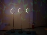
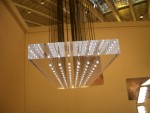
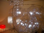
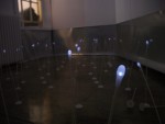
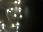
Molly tells me that in Ivrea they have a (pejorative) saying about how others perceive interaction design: "If it has an LED, it's interaction design!" I think that's an accurate description of a stage of evolution in the design of products: LEDs are probably the easiest electronic component to incorporate into a design, so they get used first. For the most part, this is where furniture's state of incorporating information processing currently stands (for the most part). Most treat LEDs are replacement for miniature light bulbs, but it's a start:
There was also a nice LED lighting piece in New York by British designer Emma Caselton called "The Stretched Convention." I didn't get a picture of it. It featured columns and plates of LED's diffused by various fabrics. Very pretty and would make a good platform for ambient display. Emma sent me pictures!
Here's a speaker/light made by a Korean designer. The sound modulates the emitted light:
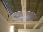
Element Labs presented a nice set of enormous LED tiles that can be stitched together into big walls of individually-addressable color blocks.
The best LED lighting piece, however, was in New York. "Lume," by Divalli, is a diffuser fabric with embedded LEDs. It was designed by some MIT people and the manufacturer and it looks like glowing, shimmer cotton batting (and they were savvy enough to vary the color temperature and spacing of the LEDs to give it a nice visual texture). The Globe and Mail provides good background. And, again, no pictures (on that note, if anyone in Bristol has found a Pentax Optio s4i digital camera, let me know ;-).
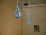
Not an LED, but there was also this nice ironic light made from electroluminescent wire at the Milan Salone Satellite:
Smart Furniture (unironic)
Now to smart furniture. Frankly, there was very little. Between two massive shows, which probably featured 100,000 different furniture designs between them, I found two pieces. Maybe I missed some, so please send suggestions if you have any. Probably my favorite smart piece in the whole show was the table designed by RISD for their "Trace" restaurant design in the food design show in Salone Satellite (which I was so entertained by that I forgot to take pictures--doh!). Primarily a decorative piece, it used technology cleverly and transparently. Translucent tables had cameras mounted underneath them: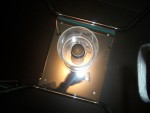 The images from the cameras, underneath shots of outlines of plates, silverware and hands, were projected onto the walls of the restaurant, subtly layered so that it wasn't obvious where the images came from. What I liked was that the piece worked when people didn't know how it worked or how to affect it, when they knew what it was, but not how they could change it and when they knew what it was and how they could affect it. That's pretty much the definition of how an ambient piece that extends the functionality of an existing object should work, which is what attracted me to it.
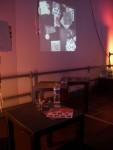
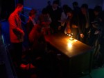
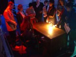
A similar idea was explored by Ivrea students, but in a more literal way, but with cameras above the tables:
In New York, I saw what may be the first standalone piece of commercial smart furniture by Glide, a small design/consulting company. They have a cabinet that uses fingerprints and Bluetooth to lock and unlock a tabletop cabinet. It's a small step, but the design is clearly aiming toward high design esthetic (it has rounded corners and it's orange!), the technology is thoroughly integrated and the tech is clearly extending the base functionality of an object with an existing mode of use. I'm not sure how I would use it, but I was really excited to see it.
Smart Furniture (ironic)
Let me explain why I created this category: the majority of furniture design that incorporates information processing technology is heavily influenced by the work of Bill Gaver, Tony Dunne and Fiona Raby at the RCA and their critical design philosophy. I've said what I think about critical design before, so I won't again, but I still feel it important to put these piece in a section by themselves. OK, maybe one more thing: furniture fashion, like any other, depends not just on innovation, but on reference and context (as so painfully analyzed in Barthes Fashion System). Irony and commentary are clearly part of that mix, but when the scale tips towards so heavily toward irony that nearly all else (like functionality) is secondary, it gets its own section. First up is Crispin Jones' Invisible Force table, exhibited in the Interaction Ivrea section. I like this piece a lot, primarily because it really extends the existing piece of furniture and because the craftsmanship really respects the original table from which it was made: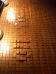
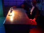
Some Ivrea students also made this great smart wallpaper as an ambient display medium:
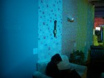
One stripe displays text by changing color (it's impregnated with heat-reactive dye and has small heating elements connected to a PIC behind it), another lets you change the brightness of a lamp (it uses small switches embedded in the paper), another changes color based on humidity and I can't remember what he final one does, but I liked it.
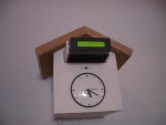
Finally, there was a great set of clever objects by Victor Vina and Hector Serrano, grouped under the name netObjects. These are a set of everyday objects augmented with technology, and as humorous objects of contemplation, they're great.
My favorites were a cuckoo clock that displays news, with a switch to choose between left wing or right wing news:
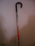
And an umbrella that shows weather forecasts:
I think that all of these pieces point the way toward a whole new generation of furniture, a new way of thinking about how to use information. This may be the bleeding edge of the wedge (while we're mixing metaphors), but I'm incredibly excited to see this kind of work. I can't wait.
Posted by mikek at May 27, 2004 04:03 PM | TrackBackMike
I created the say about leds, the full version is:
"if it's got an led it's design, if the led is blinking then it's interaction design while if the led is fading it's art" :)
