December 06, 2003
Tracking the Flu
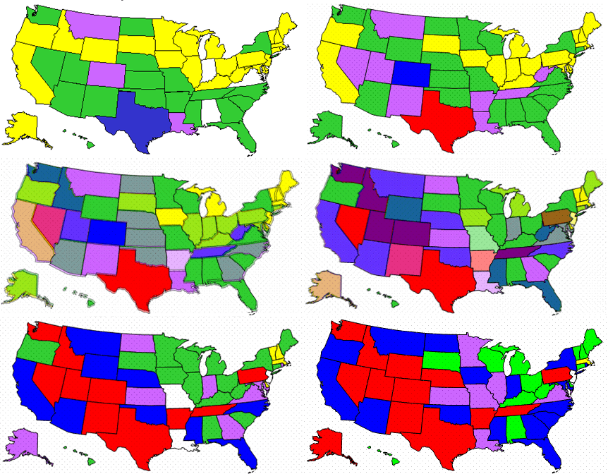
I got a flu shot yesterday because a friend of mine is sicker than she's been since high school and I figured I'd do my bit to fight the global pandemic. This morning I decided to see what the global pandemic was up to, and in doing so found the CDC's Influenza Tracking Reports, which have a nice week graph of where the flu is now. However, jumping between various graphs made it hard to see what was actually happening, so I decided to put the graphs side-by-side. That gave me the idea that they could actually be put on top of another, like an animated weather report, so I made this animated graph of how the flu spread across the country over in the last five weeks:

Sadly, the CDC graphs only look like they're identical. Whoever put 'em into the report every month actually uses a different size every time, so you'll have to excuse the ghosting. Also, I created intermediate images between each week's graph to ease the transition.
Posted by mikek at December 6, 2003 10:44 AM | TrackBackpoker me up
Posted by: poker me up at January 2, 2005 01:53 AM